1237
Olympics Logo
As you probably noticed, the network is now actively ridiculed and criticized everything related to the upcoming Olympic Games in Sochi, including logo. In this regard, I suggest you look at the logos of past games, which perfectly capture the time in which established.
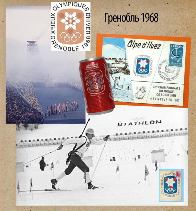
Definitely the most beautiful logo was at the Games in the French Grenoble. Just look how nice.
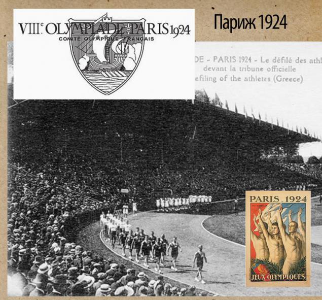
1924. Paris, superb beautiful logo, though monochrome. No Olympic rings also did not exist.
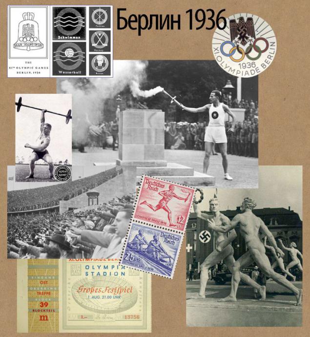
Bell Olympic Games in Berlin in 1936 - nothing special, right in the ideological sense of the game played a huge role for a young Nazi country. Probably everyone knows that it is with these games originated the tradition of the torch relay.
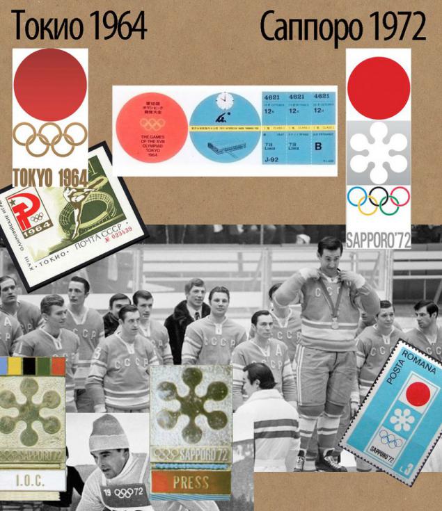
Japanese. Laconic and zamorocheny. Logo at all times and it is immediately clear which of them winter.
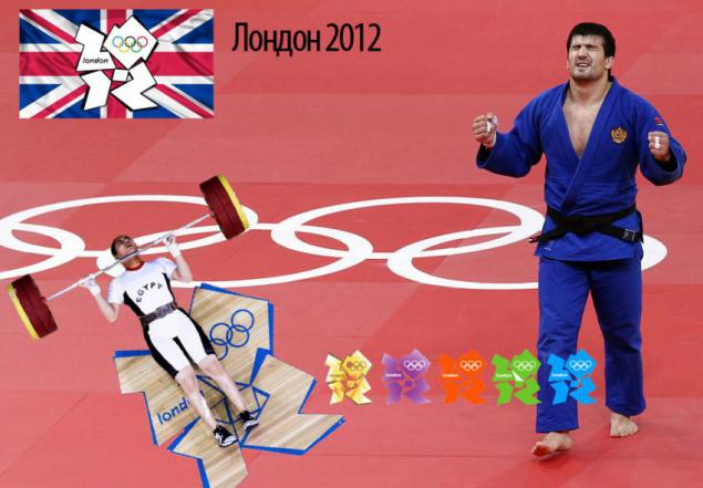
London, 2012. In my opinion - the most unpleasant, strange and sordid logo.
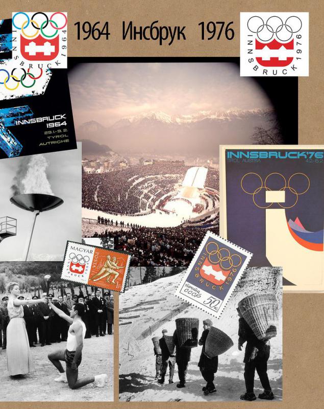
Innsbruck hosted the Winter Olympics twice. Noteworthy is the fact that in 1976 they held not in Denver, because Denver residents voted in a referendum against. It is difficult to like in Russia, even after 50 years. But with the logo did not try at all, not only is almost the same, but still just copied from the coat of arms of the city.
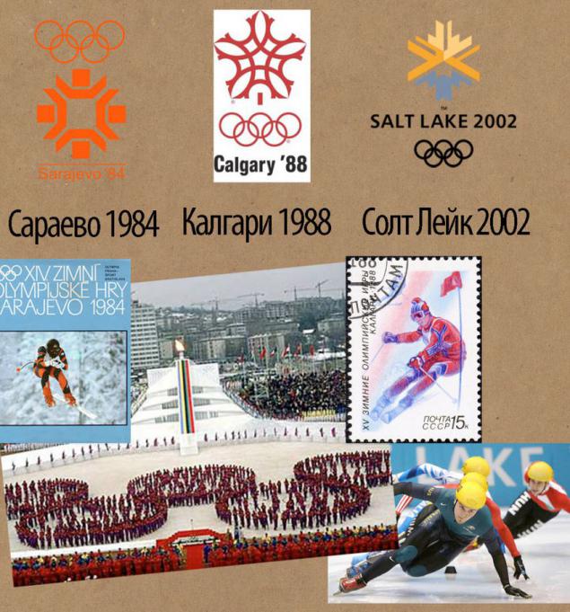
Harping on the theme of snowflakes. Even without knowing the dates, you can kind of guess about a year logo.
What's Sochi? Hot California. Modest Squaw Valley was the little-known ski resort with three lifts as the main attractions and a hotel with 50 seats. Millionaire Cushing made every effort to achieve a major sporting competitions.
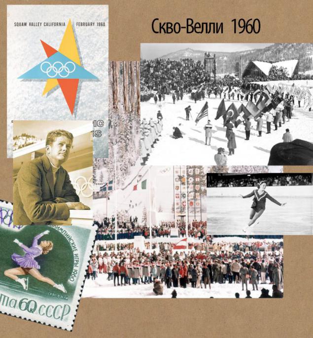
This collection of logos of the Olympic Games, the theme of "I draw people like a freak».
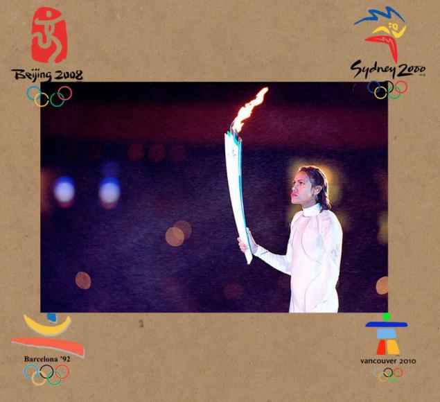
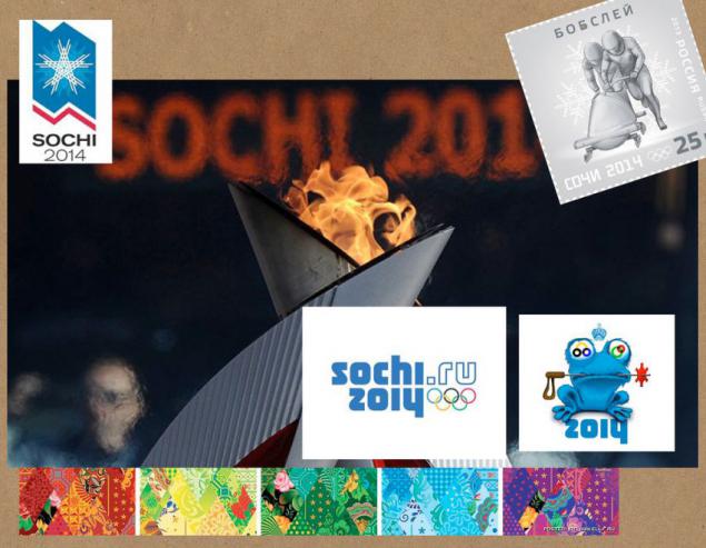
Logo of the Sochi Olympics, so many questions to which the population is quite normal, restrained. There are, however, still spelling «sochi.ru», apparently, passed under Medvedev to emphasize these "nano-tweet" the direction of development of mills.
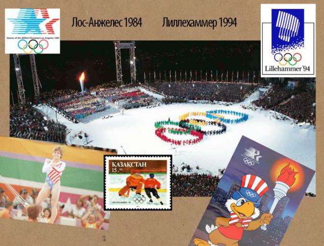
The symbols of the Games in Los Angeles and Lillehammer very accurately convey the tradition of his time drawing.
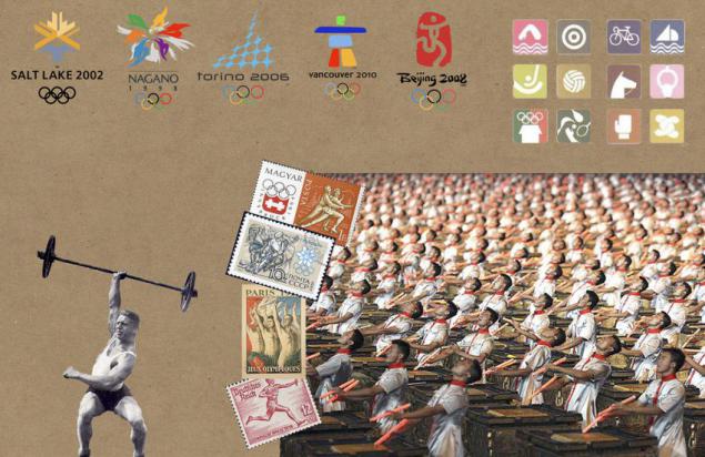
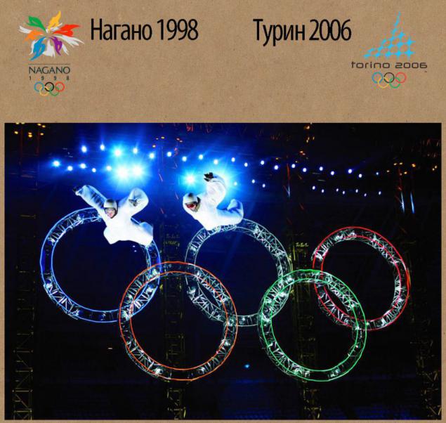
From today, perhaps the most pleasant - Nagano and Turin. However, twenty years later, there is some clever and write "pfff typical zero, e-May»
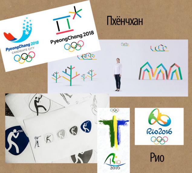
What awaits us next? In 2016 the logo of the Games in Rio will be a modern and attractive, but South Korea's pretty weird, but even at the level of the applicant was perfectly edible, Koreans, that they take.
Source: shadrapa.livejournal.com