1109
Here's how familiar to us map misrepresents the actual size of
We're all used to that card look that way as, for example, on Google Maps. Were you ever wonder what the actual size of, say, Greenland? We are in the Website
If you cut Greenland, such as it is shown on a conventional map and impose, for example, in Africa, it will turn the whole size ice desert and even a little more.
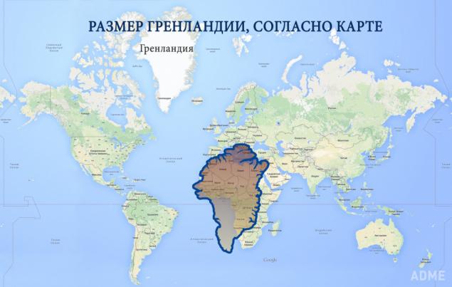
But whether Greenland is so vast? The problem is that the earth has a spherical shape, and to display it plausible sites on the surface, for example, on a computer screen it, the surface should also be spherical.
There are several ways that you can project the sphere on a flat screen, each of which has its advantages and disadvantages. Google Maps are close enough to the Mercator projection. Imagine a cylinder around the earth, which regards the earth at the equator. At the same time it bit by bit drawn objects of our planet.
This projection is quite close to reality. However, it involves the distortion of objects the size of some of the Earth: the farther from the equator, we look, the more everything seems bigger.
This is especially true for Greenland due to its farthest position. In fact, compared with Africa, Greenland looks like.
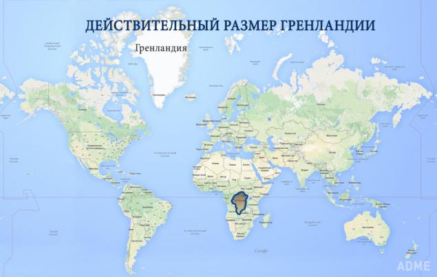
It is not so impressive, right? Greenland Area - 2,131,000 sq km, while the area of Africa - 30,220,000 km².
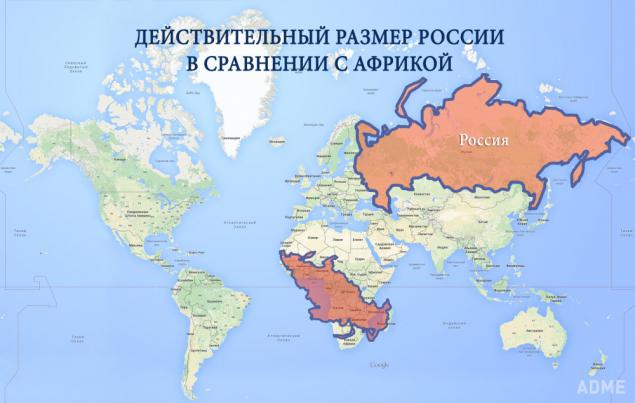
Something similar happened with Russia, which at first sight is huge. In fact, Africa is almost twice that of Russia in the area: 30,220,000 sq km against 17.1 million square kilometers. And really it looks like.
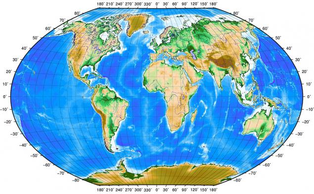
Here is a map that reflects the real extent of the objects in the world.
via # image627160