1357
5 RULES GOOD leaflet
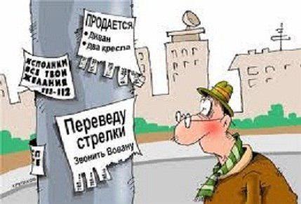
Small changes in the layout of your flyer can improve efficiency in the distribution of leaflets in several times. But there are also leaflets, which are cheaper to throw. To your flyers were at least effective, we present to you 5 basic rules that should fit well leaflet.
1. First on the leaflet should be evident essence of the advertising offer (clothing, deposits, home products, etc.). Here we use the largest font. This should attract the attention of potential clients from a distance, and then he will understand that it is worth while to take a flyer. If he does not see what he was interested immediately, it may simply not respond to the flyer and pass.
Location of key phrases is not critical, because a quick survey of the leaflet read not so much from the top down, but from the text of the largest (most significant) to the very small ones. But you should not abuse it.
2. In the second place on the flyer into account the need to get "attractive" (large size, high interest rates, etc.). It is clear that "attractive" to be, or leaflet does not cause much interest even those who are interested. The font used for them smaller than the first, but much larger than the rest of the text.
3. Promotional leaflets text should be simple and sound yes (not through the "no"). Ie proposals should be a maximum of six words that are understandable to everyone who can barely read. And they should not have negatives (like this). They need to sound positive (as).
C simplicity understandable preoccupied customer can simply enter the deeper meaning of your advertising message on the first try. So write as simply as possible.
Now, why should not write advertising copy and slogans through a "no". The fact that the mind of man thinks and perceives things in a straight line just as if passing particle "no". Therefore, what one reads, he had imagined.
A simple example. What do you imagine when you read the following phrases: "These machines do not break." "We do not deceive you." "With us, there are no problems." What do you believe more?
One of our client, despite our arguments made in the leaflet slogan, beginning with the words "Do not forget ...". What do you think, what was the effect? Absolutely. So keep this in mind.
4. The text should not be much. It is clear that in order to accommodate a maximum of information in a small leaflet, the easiest way to reduce the font. But think about those people who have poor eyesight, and those who will read the leaflet on the move or in the shivering transport. Some of them are not physically able to read the text, and the majority simply will not strain your eyes. So it's better to just write the most important thing, it's still a leaflet, and not an article.
5. The handbill should have its own value. In other words, there must be a reason for which it will retain. To do this, you can associate it with anything or just rename it. Call flyer discount coupons, coupons for tasting, or even just the invitation card.
If the leaflet has a long-term effect and is designed for some storage, before it will use, you can make it as a carrier of useful information, such as: subway map, mesh size ratio, a list of relevant phone number or address. Only in this case it is better to place advertising and useful information on one side of the leaflets, or when it is hung on the wall, put under glass or lay down twice ... you know, huh?
Following all these rules during layout handbill, of course, can not guarantee you the incredible success of the advertising. But, at least, you can expect that this leaflet will be effective.


