Fat burning creative
 Bashny.Net
Recently, there are more notable campaigns for fitness centers, home gyms and treadmills. It is understandable: in the spring comes a surge in sales of sports shops and fitness over the winter klubah.Nazhity bearish stock on the flanks, abdomen and thighs must somehow remove, or dressing up in light dresses and tight T-shirts do not be painless.
The site looked through all the campaign for fitness, comes out in recent years, I have chosen the most interesting and brought a few basic approaches that can be used as a starting point in the creation of advertising for this category.
Virtually all directions and insights in an advertisement fitness clubs and gyms are in the same plane - a great physical form as a result. But to come to this subject vary.
1. One of the main and most obvious areas - a "work on yourself, self-improvement" .Posyly similar to those what they say in their campaigns sports giants Nike and Adidas. Whether it is better to do something never done before, all in your hands and so on and so on and so forth. The starting point of treatment, "and so you do, but something can be better goraaaazdo».
A recent, very clear example of this approach - Russian Lowe Adventa advertising campaign for World Class.
A series of nine prints under the slogan «Improve Yourself» («improve ourselves") is not just marketing, but also the aesthetic value, which is rarely the case with the Russian advertising. In campaign Mighty copywriting and excellent visual style illustrations Victor Melamed.
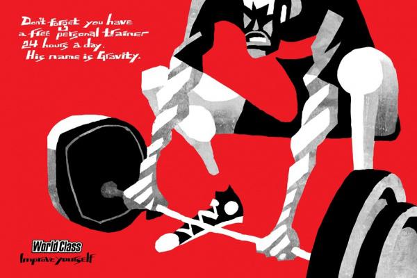
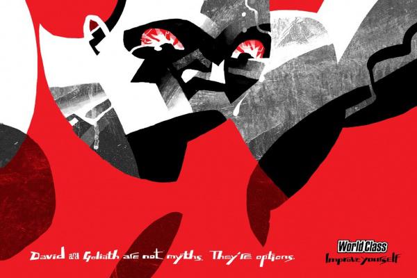
The series of prints in 2004 that encourages people to fitness.
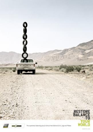
Armed with road machinery, the agency Draft (New Zealand) advertises the most popular programs in the world of group fitness workouts Les Mills. Creative concept for example cars demonstrates that promise these programs.


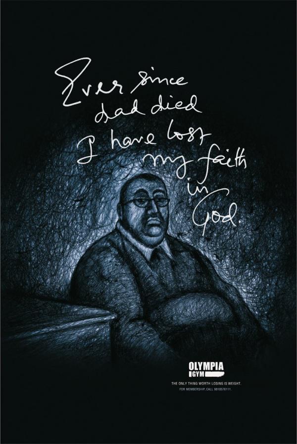
2. The starting point of recourse to the audience falls. Strategists are turning their gaze on the people whose weight is far from ideal, and very worried about it. And - voila! - At the creatives have an excellent topic for advertising eternal insight: "It is bad to be fat" .Indiysky office of Young & Rubicam introduced a campaign on the theme: The only thing worth losing is weight («The only thing that stands to lose - weight»).
In a series of prints depict obese people who lament the failures in life. Authors beat the word "lose", saying that instead of losing faith in life, in myself or in God, it is better to lose weight.

Folds of fat, and secondary sex characteristics in advertising sad sports center Speed-Fit.
Two sad little faces that Jung von Matt «Drew" on rather well-fed bodies of men and women - pretty expressive model. Fat folds depict a sad face and are intended to convey the meaning tagline: "You are unhappy with their shape?».
Creators Beijing Guangdong Advertising Agency created the original guerrilla "articles" for the fitness center.
By putting cardboard on traditional sumo wrestler kryshu- "tie", made in the form of a wave, creators have the visual effect of concavity - like an overweight athlete pushing their weight middle of the roof. Fat people are known to be very worried that under them might have something to break or bend here so impressively.
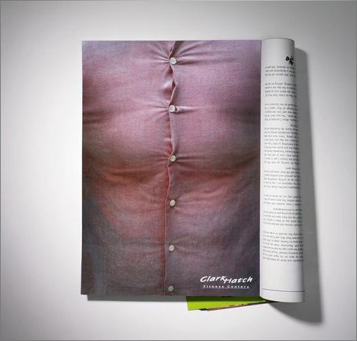
Fitness center «Clark Hatch» (USA) used a fairly old idea with inverting the magazine upside down in a fresh and interesting treatment. Leafing through the magazine, the reader sees an advertisement, where close-ups shown a complete male body in the jacket - is clearly visible at the bottom of the stomach breaks out.
Wondering what it might mean, he sees a sign in the left corner printed "upside down." He turns the log to read it and see the transformation of the figures:

The Israeli branch of the agency Mccann Erickson used the true joke about the "mirror" disease in advertising fitness center. Garage guarantees that a certain diligence when it happens and complete men see "his friend" whom they have not seen for years.
Tagline: See the friend you have not seen in years.
3. "And we also treat" In addition, a fitness not only solves the problem of shape and overweight.
Many people in today's world can not feel good because of the abundance of problems and issues that need to be addressed. And from which so swollen head. And this is also a fitness cope.
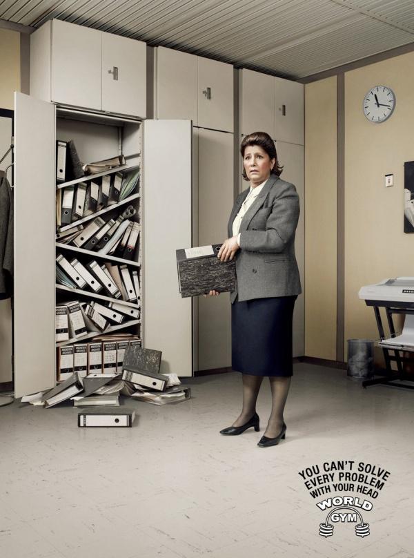
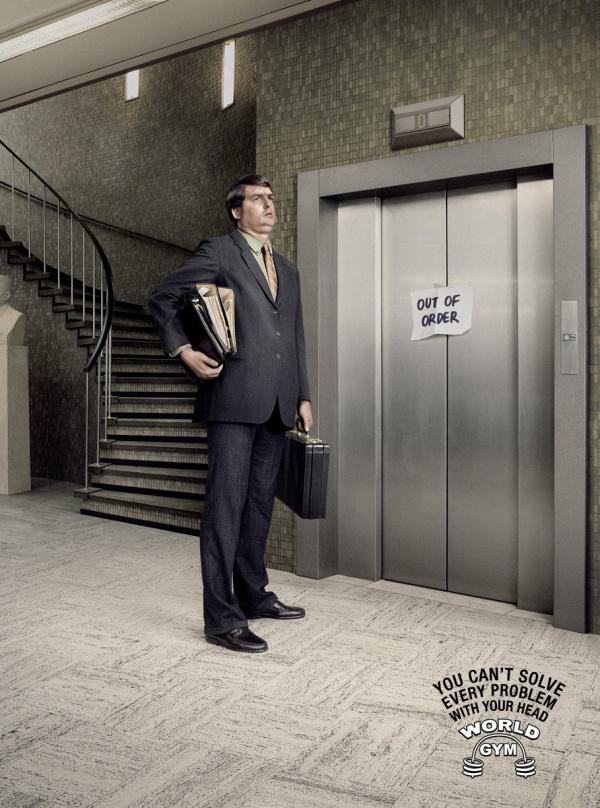
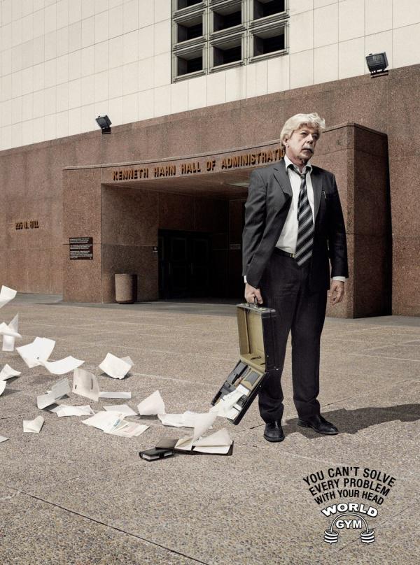
LG & F, Belgium developed a series of prints for World Gym, which clearly showed the situation of helplessness of the head.
Since childhood we have been taught that smart people solve all the problems head on. But finally, thanks to the efforts of the Health Club, justice has been done. We clearly showed those small situations in everyday life, in which the head is completely helpless.
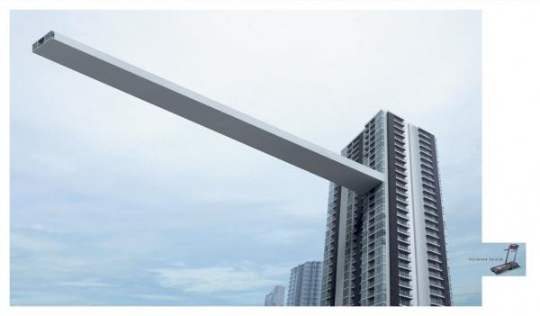
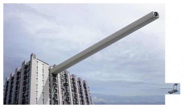
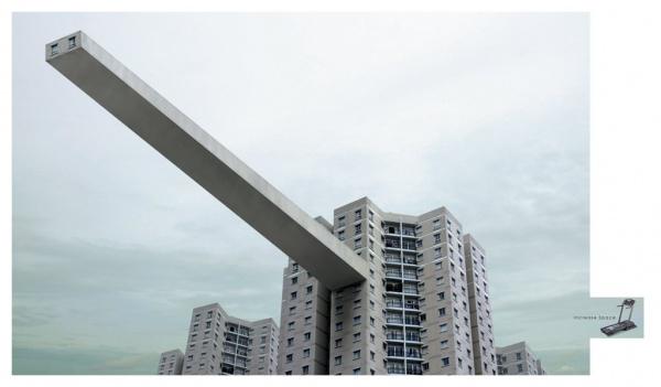
Y & R Bangkok presented a new idea for training machines Turbo Fitness, which, thanks to a moving treadmill "expand your square meters».
Thai advertisers showed how to use Turbo Fitness replaces the cross-country walk in the streets, where there are no problems with free space.
4. "Be with us, we will be like, be better than us," as the world .Stary method of placing people in the media, which wants to be like the audience was filled and stretched to his ideal. In our case it is the athletes and athletes with a perfect body, demonstrating its power and prowess.
And if we add to this interesting move in hosting or design, the standard approach sparkle with new colors and will attract a lot of attention.
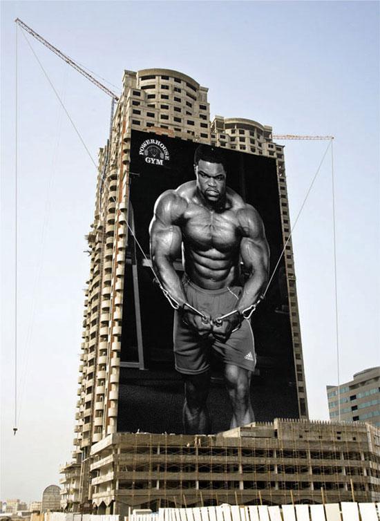
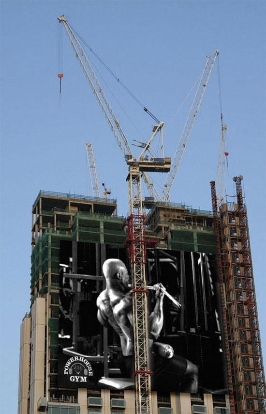
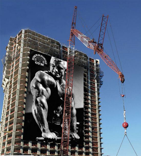
How, for example, student work done in the framework of training Savannah College of Art & Design, for a fitness center Powerhouse Gym. Bodybuilder with posters used as a load cranes and other equipment.
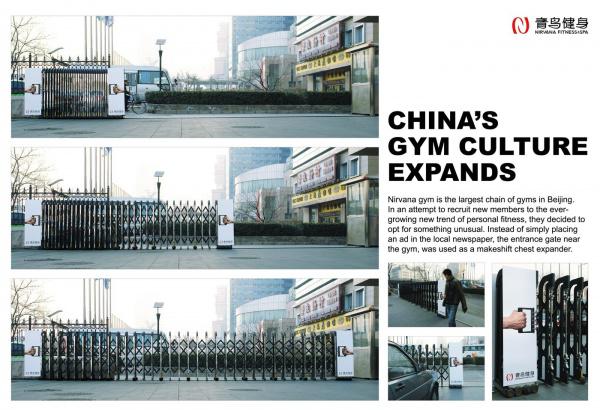
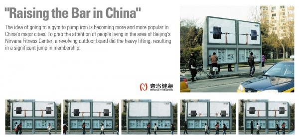
Ogilvy, Beijing discovered a new advertising media for Nirvana Fitness Center.
Gyms Nirvana - the largest network of halls in Beijing. In order to attract new visitors to Ogilvy, Beijing decided to choose an unusual advertising medium. Instead of simply placing an advertisement in the press, near the gates of the hall had been turned into the expander.
It is also curious that outdoor advertising campaign.
In addition, to be strong and beautiful, people want to have sex. For a long time, passionately and with great pleasure. Canadians from the agency Trampoline used blurred photos erotic content in advertising fitness center Aerobics First. The idea is based on the Insa that many who engaged in aerobic exercise - feel better physically and therefore more enduring sex.
On the pictures are fuzzy phrase, somehow pushing aerobics for your future enjoyment.

5. "... And Justice for All" .Adepty this trend in advertising fitness centers broadcast audience reports that fitness a) is ubiquitous, it surrounds us, and you need only to notice it and join the ranks of people looking for them; b) suitable for the strongest of all.
This creatives and their clients can speak quite differently: from the posts on the forehead, "we are waiting for all and always" ending area of advertising.
American Network of fitness centers «Crunch» launched a rare fitness trends television campaign to strengthen its position among the market leaders in fitness.
Their philosophy is & quot; No judgement «-« No evaluation ", allowing many years to position itself as a club, which can feel free to come to the people of any shape, size, and athletic opportunities, this year received a new incarnation - 7 assorted funny characters« crunchers », compiled from many different typecasting actually engaged regularly in clubs «Crunch».
Handmade cartoon creatures - from hippie lover of yoga to boxing granny - in exaggerated form are all members of the chain clubs - their motivation, their features and other qualities that make them unique.
The campaign «We all crunch», developed by the agency Mother / New York, a network of «Crunch» is presented as a place to have fun at all sorts of people. Practically all the characters of the campaign and a little eccentric "frikovaty" but, according to the creators of the campaign, "this is something that should make the club even more attractive and interesting».

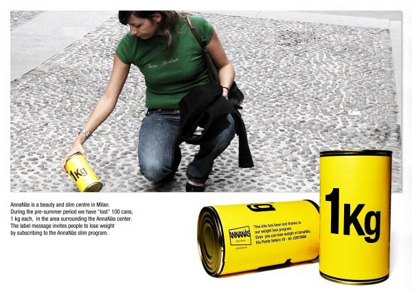
The Italian unit within the Leo Burnett advertising campaign in Milan fitness center AnnaNas «lost» in the area of the center 100 tin cans of 1 kg.
The finder of a woman reading a bank on it as follows: "This kilograms was lost due to our weight loss program. You too can lose weight in AnnaNas ». In addition to the original stroke is still involved and associative factors: a clear demonstration of the volume of kilograms of excess weight.
The same agency a year later held a non-standard outdoor campaign for the fitness center Sparring Partner Gym.
Idea Agency is a standard constriction in the role of the crossbar to pull. Strengthen transparency effects posters, making people look at them more real.
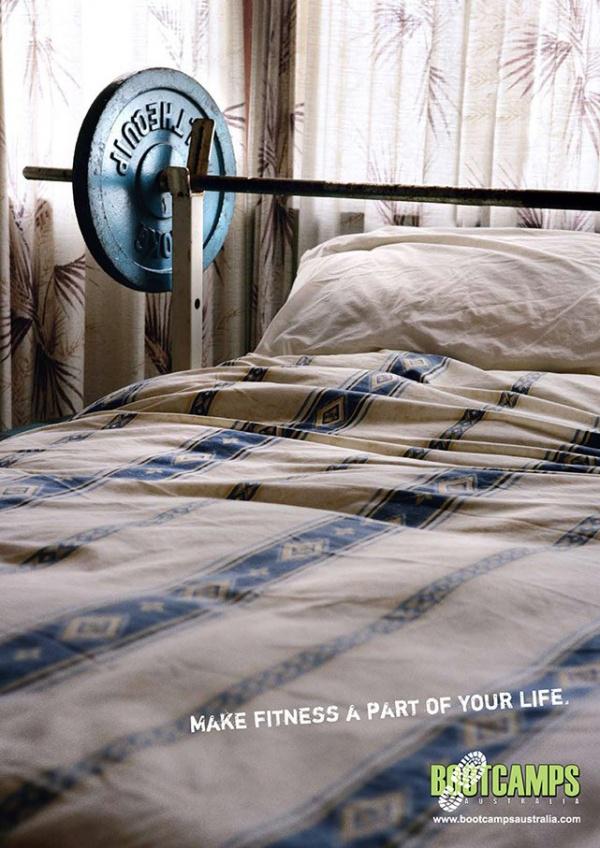
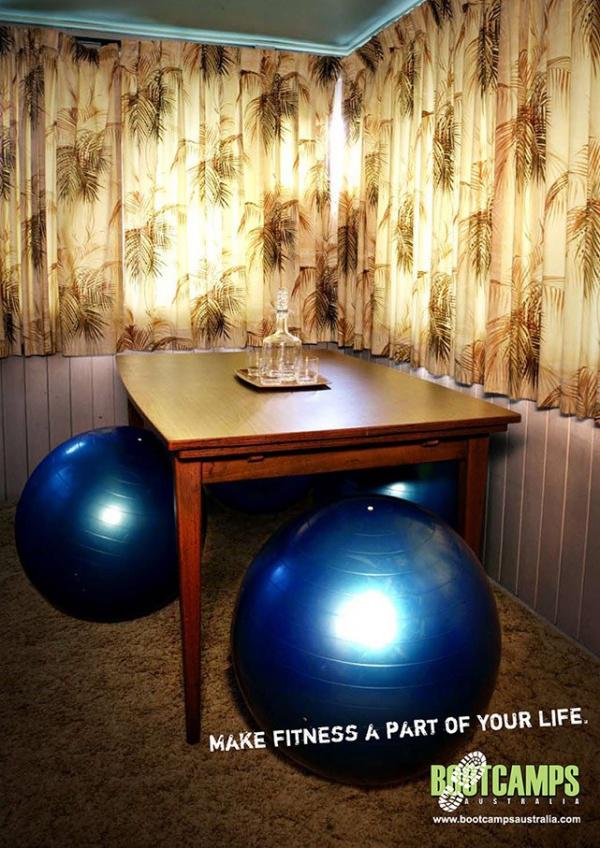
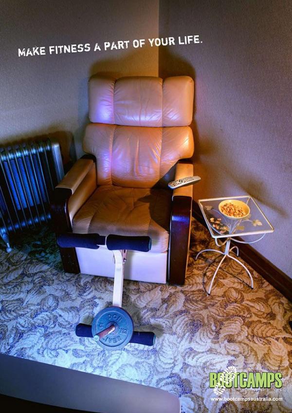
In Australia, there is an organization BootsCamp - a network of sports and recreation complexes, whose main goal - to pull people out of chairs and provoke them to sports and an active lifestyle in general. For example, in one of their campaigns, the main theme appears "we have always and everywhere a fitness».
You will not have long to go, and nowhere to go. In this camp fitness is always at hand, and every minute of the desired load.
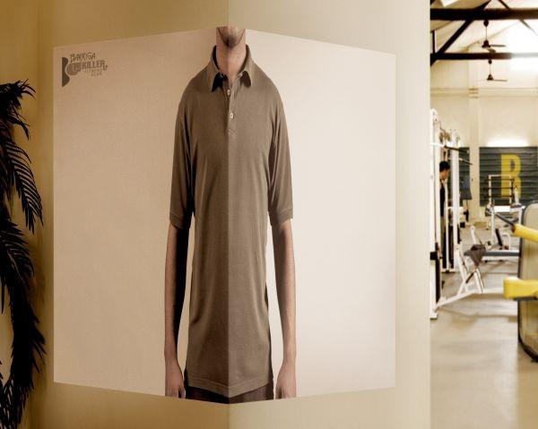
The Portuguese branch of the network agency FCB developed angular advertising Potrugalii popular in fitness clubs Barriga Killer.
The unusual angular placement of posters should convey the harmony of people. If you look at the poster from the corner, then by the laws of perspective body will look narrower than it actually is

6. Humor - a win-win advertising. Fitness tozhe.V Brazilian network of fitness clubs Ezens Sport Center concept of "body language" taken literally. "Your body tells a lot about you," - they say.
Run Run Advertising agency Leo Burnett. It turns out that anyone can smile back, waist and lead to blink his eyebrows ... In general, as long as the body is not too much whispered.
How to turn an ordinary stomach muscular relief in the press?
Normally, the correct answer - go to the gym. But advertising agencies - has its own song. To add to the layout of blocks, sometimes it is enough to glue it on a brick wall.
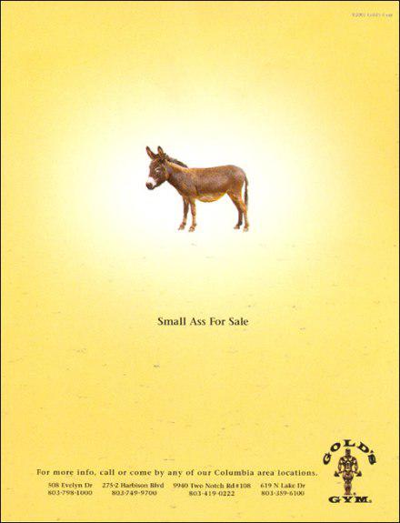
Advertising aimed, apparently, women, contains a picture and text malennogo donkey "sell small donkey» (Small Ass for Sale).
It is not difficult to guess, the authors had in mind the concept is not a donkey and the other meaning of the word Ass.
The Italian branch of Verba / DDB has developed a series of prints for the fitness center Fisic, showing exaggerated perfectly flat stomach. The idea shows a male and female bottom in different clothes very hard and very flat surfaces.
Placed layout with a simple and rigorous design stand out from the other ads Pestryaev paints and female bodies. That was the idea the agency proposed the target audience of the newspaper does not pay for the services of prostitutes. The slogan of the campaign "Stop paying for it!» (Stop paying for it), implies that the use of the fitness center, all free will accrue.
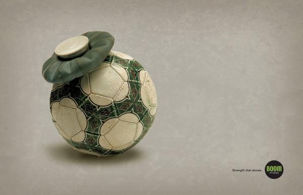
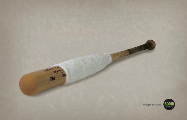
Advertising agency Tom has developed a series of prints for the fitness center Boom Fitness.
Sports - a very dangerous occupation by definition. Soccer ball can leave a huge bruise on the body, a baseball bat may cause a sprained hand, if the player gave up the slack muscles. But things can change if you go to a fitness center Boom Fitness. Then you do not, and most ball and bat threatening damage of varying degrees. Campaign slogan - "The Power, which can be seen».
via # image5917055
The site looked through all the campaign for fitness, comes out in recent years, I have chosen the most interesting and brought a few basic approaches that can be used as a starting point in the creation of advertising for this category.
Virtually all directions and insights in an advertisement fitness clubs and gyms are in the same plane - a great physical form as a result. But to come to this subject vary.
1. One of the main and most obvious areas - a "work on yourself, self-improvement" .Posyly similar to those what they say in their campaigns sports giants Nike and Adidas. Whether it is better to do something never done before, all in your hands and so on and so on and so forth. The starting point of treatment, "and so you do, but something can be better goraaaazdo».
A recent, very clear example of this approach - Russian Lowe Adventa advertising campaign for World Class.
A series of nine prints under the slogan «Improve Yourself» («improve ourselves") is not just marketing, but also the aesthetic value, which is rarely the case with the Russian advertising. In campaign Mighty copywriting and excellent visual style illustrations Victor Melamed.


The series of prints in 2004 that encourages people to fitness.


Armed with road machinery, the agency Draft (New Zealand) advertises the most popular programs in the world of group fitness workouts Les Mills. Creative concept for example cars demonstrates that promise these programs.


2. The starting point of recourse to the audience falls. Strategists are turning their gaze on the people whose weight is far from ideal, and very worried about it. And - voila! - At the creatives have an excellent topic for advertising eternal insight: "It is bad to be fat" .Indiysky office of Young & Rubicam introduced a campaign on the theme: The only thing worth losing is weight («The only thing that stands to lose - weight»).
In a series of prints depict obese people who lament the failures in life. Authors beat the word "lose", saying that instead of losing faith in life, in myself or in God, it is better to lose weight.


Folds of fat, and secondary sex characteristics in advertising sad sports center Speed-Fit.
Two sad little faces that Jung von Matt «Drew" on rather well-fed bodies of men and women - pretty expressive model. Fat folds depict a sad face and are intended to convey the meaning tagline: "You are unhappy with their shape?».
Creators Beijing Guangdong Advertising Agency created the original guerrilla "articles" for the fitness center.
By putting cardboard on traditional sumo wrestler kryshu- "tie", made in the form of a wave, creators have the visual effect of concavity - like an overweight athlete pushing their weight middle of the roof. Fat people are known to be very worried that under them might have something to break or bend here so impressively.
Fitness center «Clark Hatch» (USA) used a fairly old idea with inverting the magazine upside down in a fresh and interesting treatment. Leafing through the magazine, the reader sees an advertisement, where close-ups shown a complete male body in the jacket - is clearly visible at the bottom of the stomach breaks out.
Wondering what it might mean, he sees a sign in the left corner printed "upside down." He turns the log to read it and see the transformation of the figures:


The Israeli branch of the agency Mccann Erickson used the true joke about the "mirror" disease in advertising fitness center. Garage guarantees that a certain diligence when it happens and complete men see "his friend" whom they have not seen for years.
Tagline: See the friend you have not seen in years.
3. "And we also treat" In addition, a fitness not only solves the problem of shape and overweight.
Many people in today's world can not feel good because of the abundance of problems and issues that need to be addressed. And from which so swollen head. And this is also a fitness cope.
LG & F, Belgium developed a series of prints for World Gym, which clearly showed the situation of helplessness of the head.
Since childhood we have been taught that smart people solve all the problems head on. But finally, thanks to the efforts of the Health Club, justice has been done. We clearly showed those small situations in everyday life, in which the head is completely helpless.


Y & R Bangkok presented a new idea for training machines Turbo Fitness, which, thanks to a moving treadmill "expand your square meters».
Thai advertisers showed how to use Turbo Fitness replaces the cross-country walk in the streets, where there are no problems with free space.


4. "Be with us, we will be like, be better than us," as the world .Stary method of placing people in the media, which wants to be like the audience was filled and stretched to his ideal. In our case it is the athletes and athletes with a perfect body, demonstrating its power and prowess.
And if we add to this interesting move in hosting or design, the standard approach sparkle with new colors and will attract a lot of attention.
How, for example, student work done in the framework of training Savannah College of Art & Design, for a fitness center Powerhouse Gym. Bodybuilder with posters used as a load cranes and other equipment.


Ogilvy, Beijing discovered a new advertising media for Nirvana Fitness Center.
Gyms Nirvana - the largest network of halls in Beijing. In order to attract new visitors to Ogilvy, Beijing decided to choose an unusual advertising medium. Instead of simply placing an advertisement in the press, near the gates of the hall had been turned into the expander.
It is also curious that outdoor advertising campaign.


In addition, to be strong and beautiful, people want to have sex. For a long time, passionately and with great pleasure. Canadians from the agency Trampoline used blurred photos erotic content in advertising fitness center Aerobics First. The idea is based on the Insa that many who engaged in aerobic exercise - feel better physically and therefore more enduring sex.
On the pictures are fuzzy phrase, somehow pushing aerobics for your future enjoyment.

5. "... And Justice for All" .Adepty this trend in advertising fitness centers broadcast audience reports that fitness a) is ubiquitous, it surrounds us, and you need only to notice it and join the ranks of people looking for them; b) suitable for the strongest of all.
This creatives and their clients can speak quite differently: from the posts on the forehead, "we are waiting for all and always" ending area of advertising.
American Network of fitness centers «Crunch» launched a rare fitness trends television campaign to strengthen its position among the market leaders in fitness.
Their philosophy is & quot; No judgement «-« No evaluation ", allowing many years to position itself as a club, which can feel free to come to the people of any shape, size, and athletic opportunities, this year received a new incarnation - 7 assorted funny characters« crunchers », compiled from many different typecasting actually engaged regularly in clubs «Crunch».
Handmade cartoon creatures - from hippie lover of yoga to boxing granny - in exaggerated form are all members of the chain clubs - their motivation, their features and other qualities that make them unique.
The campaign «We all crunch», developed by the agency Mother / New York, a network of «Crunch» is presented as a place to have fun at all sorts of people. Practically all the characters of the campaign and a little eccentric "frikovaty" but, according to the creators of the campaign, "this is something that should make the club even more attractive and interesting».


The Italian unit within the Leo Burnett advertising campaign in Milan fitness center AnnaNas «lost» in the area of the center 100 tin cans of 1 kg.
The finder of a woman reading a bank on it as follows: "This kilograms was lost due to our weight loss program. You too can lose weight in AnnaNas ». In addition to the original stroke is still involved and associative factors: a clear demonstration of the volume of kilograms of excess weight.

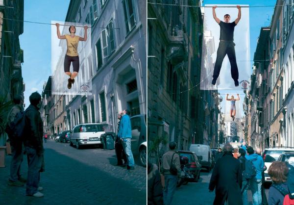
The same agency a year later held a non-standard outdoor campaign for the fitness center Sparring Partner Gym.
Idea Agency is a standard constriction in the role of the crossbar to pull. Strengthen transparency effects posters, making people look at them more real.

In Australia, there is an organization BootsCamp - a network of sports and recreation complexes, whose main goal - to pull people out of chairs and provoke them to sports and an active lifestyle in general. For example, in one of their campaigns, the main theme appears "we have always and everywhere a fitness».
You will not have long to go, and nowhere to go. In this camp fitness is always at hand, and every minute of the desired load.


The Portuguese branch of the network agency FCB developed angular advertising Potrugalii popular in fitness clubs Barriga Killer.
The unusual angular placement of posters should convey the harmony of people. If you look at the poster from the corner, then by the laws of perspective body will look narrower than it actually is


6. Humor - a win-win advertising. Fitness tozhe.V Brazilian network of fitness clubs Ezens Sport Center concept of "body language" taken literally. "Your body tells a lot about you," - they say.
Run Run Advertising agency Leo Burnett. It turns out that anyone can smile back, waist and lead to blink his eyebrows ... In general, as long as the body is not too much whispered.
How to turn an ordinary stomach muscular relief in the press?
Normally, the correct answer - go to the gym. But advertising agencies - has its own song. To add to the layout of blocks, sometimes it is enough to glue it on a brick wall.
Advertising aimed, apparently, women, contains a picture and text malennogo donkey "sell small donkey» (Small Ass for Sale).
It is not difficult to guess, the authors had in mind the concept is not a donkey and the other meaning of the word Ass.

The Italian branch of Verba / DDB has developed a series of prints for the fitness center Fisic, showing exaggerated perfectly flat stomach. The idea shows a male and female bottom in different clothes very hard and very flat surfaces.
Placed layout with a simple and rigorous design stand out from the other ads Pestryaev paints and female bodies. That was the idea the agency proposed the target audience of the newspaper does not pay for the services of prostitutes. The slogan of the campaign "Stop paying for it!» (Stop paying for it), implies that the use of the fitness center, all free will accrue.
Advertising agency Tom has developed a series of prints for the fitness center Boom Fitness.
Sports - a very dangerous occupation by definition. Soccer ball can leave a huge bruise on the body, a baseball bat may cause a sprained hand, if the player gave up the slack muscles. But things can change if you go to a fitness center Boom Fitness. Then you do not, and most ball and bat threatening damage of varying degrees. Campaign slogan - "The Power, which can be seen».


via # image5917055
Tags
See also
10 most bizarre and interesting animal species discovered in recent years
Facts about the strangest things we've found in the universe lately
Strange things that we have found in space lately
A business making candy bouquets
Green eyes are rightly boundlessly mysterious and magical