1055
Characters Russian advertising (23 photos)
In this article we have collected a few dozen examples of successful and unsuccessful advertising characters Russia.
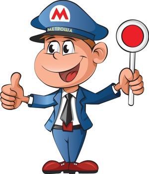
creators of the character of the Moscow metro describe it as a little man, dressed in a uniform of the subway. "Cartoon" infantile Metrosha smiling from ear to ear under any circumstances, and talks about what to do in a given situation. He says it's normal adults. Children who in theory could be interesting Metrosha in the Moscow subway statistically significant minority. Not the best way draw the boy's uncle was selected from six options Dmitry Gayev, head of Metro. He came up with the name of the mascot.
In 2008, the Savings Bank of the characters by name and Sberik Sberochka, previously available only in the corporate newspaper, began to be used in BTL. Symbols of the largest and most "difficult" bank of the country are ozhivshuyu emblem logo, which in turn is the symbol of the purse.
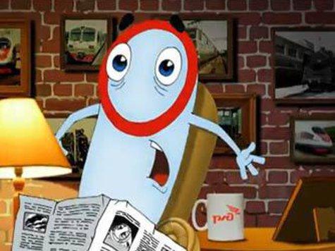
"Sapsanchik" appeared in messages Railways, when it was launched online campaign with cartoons, which obscure the target audience told how bad throw stones at Peregrine as Sapsanchik suffering, but comforted, because he has good friends. Creators assured that continue the traditions of Soviet animation, but no one disagrees with them.
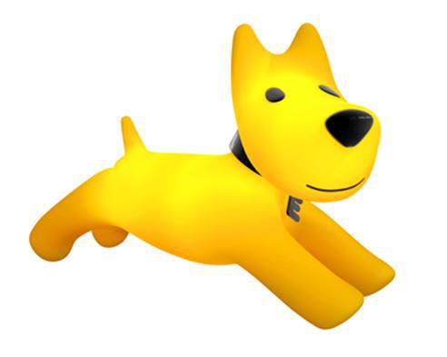
The "Euroset" in the course of the rebranding, announced in March last year, there was a character in a yellow dog, reminiscent of the fox terrier. He's cute, positive, but little sense, except suggestion buyers feeling friendly, no responsibility. Rebranding more than 4 thousand salons Euroset had to do 4 billion rubles.
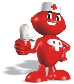
Pharmacy Network "Farmakor" chosen as the hero of his communication red brilliant man with bandaged finger. And called it correctly ... "Farmakosha».
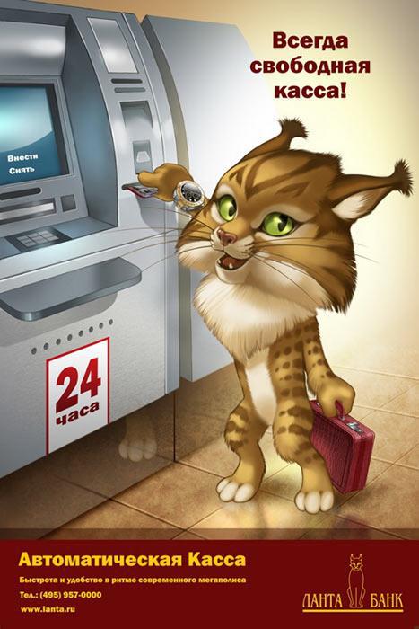
Rysenok - the hero of advertising Lanta-Bank, which has predicted a lynx in its logo.
Nastika - the fruit of imagination of management of the insurance company "Nasta". Why not just Nastya?

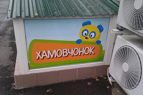
Children who come to the children's club in Khamovniki meets Hamovchonok.
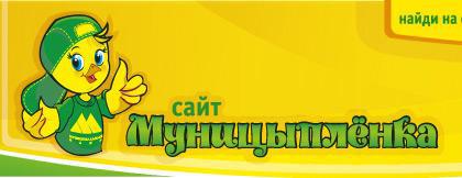
In Novosibirsk municipality - Munitsyplenok! The place cartoon.
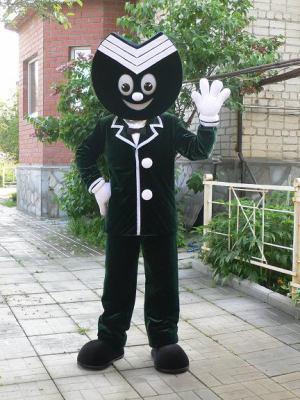
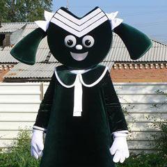
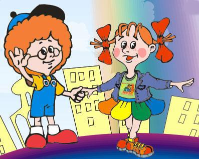
Sometimes it happens scary, and similar characters acquires the whole city. Gorodovichok and Obinushka - Mascots already mentioned Novosibirsk.
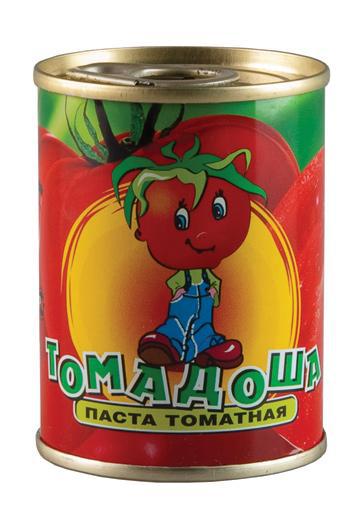
In the food industry, apparently, it is assumed that people are much more likely the food with which you know personally. Therefore, for example, almost all poultry farms logos adorn funny chickens, offering themselves to the plate. Or anthropomorphic tomatoes, from which tomato paste is made. Eat your friends and acquaintances!

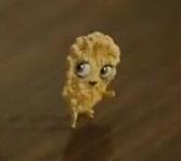
Flapper Lyubyatovo come up in the agency Leo Burnett Moscow. Flattened and processed grains with eyes, legs and arms is designed to embody the naturalness of cereal Lyubyatovo and emphasizes the close connection with nature. At the end of the video firecrackers, which found their relatives finally, happily ate.
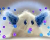
Shaggy, offends human character ever invented Health Agency ARMI Since 2009, the health care, are even getting married and having children is a central element of the creative concept Imunele. With a light hand of the Odessa "Just Radio» Health acquired a new name - Babayka.
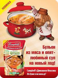
Bank soup "Kempbell's" gained worldwide fame as an art object of the era of pop art, a symbol of the era of mass consumption, becoming a source of inspiration for a series of works by the American artist Andy Warhol. Russian brendmendzhery decided that the brand character of the legendary soup should be the house. It is worth noting that a similar Brownie is a symbol of tea "Conversation».
The traditional American Children's Culture "gingerbread man" bought in advertising the insurance company "Guta Insurance" corporate green. The origins of its acquisition of Guta unknown, as well as the meaning of the presence of a strange anthropomorphic green cookies in advertising of insurance services.

Aunt expectoration of cough remedies advertising ACC invades the human bronchi and trying to establish where their orders. Animation, and then come up with a lively Sputum agency Lowe Adventa.
The Danone Group several years ago attempted to launch a line of dairy products for children, out-of-age consumption Rastishka. The line is called "skeletons" - namer and the top management of the campaign rightly decided that children aged 7 to 10 years nestrashnye love horror. But buyers, frightened parents and name, and the four characters. After some time, a line had to turn.
The niche was empty as long as it did not take Wimm-Bill-Dann to "Zdrayverami" focused not only on children but also to their mothers.
"Wimm-Bill-Dann" was trying to compete with the "Marshmallow Froot Loops" with the product lines "Red Up". The fun and energy in advertisements aired ginger cheburashkopodobny animal.

Delmi margarine creature, like a big yellow bean, long since disappeared from the TV screens, leaving anecdote & quot; - What are we going to cook, Delmi? - Dad, mum again talks to margarine & quot ;.

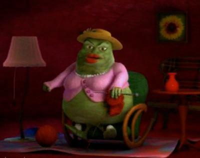
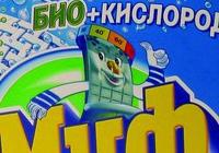
The hero of the poem Korney Chukovsky in advertising washing powder "myth" is a woman and talks about the advantages of this particular means. With this character is associated a small conflict between Procter & Gamble, the owner of the brand "Myth" and the granddaughter of Chukovsky is applied to the P & G's court. As a result, the claim was rejected and Moidodyr comes to the hosts without royalties descendants of the writer.
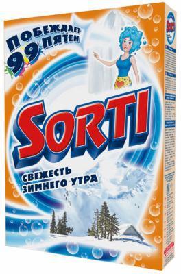
Cheap detergents Sorti («Nefis Cosmetics») for more than five years of advertising "diligent crumbs Sorti», invented itself in the art department of the holding company and by using the AC Production. Hardworking crumbs on the idea should be to create a hostesses have the impression that the household chores are now based not on them but on the magical creatures of the powder.

creators of the character of the Moscow metro describe it as a little man, dressed in a uniform of the subway. "Cartoon" infantile Metrosha smiling from ear to ear under any circumstances, and talks about what to do in a given situation. He says it's normal adults. Children who in theory could be interesting Metrosha in the Moscow subway statistically significant minority. Not the best way draw the boy's uncle was selected from six options Dmitry Gayev, head of Metro. He came up with the name of the mascot.

In 2008, the Savings Bank of the characters by name and Sberik Sberochka, previously available only in the corporate newspaper, began to be used in BTL. Symbols of the largest and most "difficult" bank of the country are ozhivshuyu emblem logo, which in turn is the symbol of the purse.


"Sapsanchik" appeared in messages Railways, when it was launched online campaign with cartoons, which obscure the target audience told how bad throw stones at Peregrine as Sapsanchik suffering, but comforted, because he has good friends. Creators assured that continue the traditions of Soviet animation, but no one disagrees with them.

The "Euroset" in the course of the rebranding, announced in March last year, there was a character in a yellow dog, reminiscent of the fox terrier. He's cute, positive, but little sense, except suggestion buyers feeling friendly, no responsibility. Rebranding more than 4 thousand salons Euroset had to do 4 billion rubles.

Pharmacy Network "Farmakor" chosen as the hero of his communication red brilliant man with bandaged finger. And called it correctly ... "Farmakosha».

Rysenok - the hero of advertising Lanta-Bank, which has predicted a lynx in its logo.

Nastika - the fruit of imagination of management of the insurance company "Nasta". Why not just Nastya?

Children who come to the children's club in Khamovniki meets Hamovchonok.

In Novosibirsk municipality - Munitsyplenok! The place cartoon.

Sometimes it happens scary, and similar characters acquires the whole city. Gorodovichok and Obinushka - Mascots already mentioned Novosibirsk.

In the food industry, apparently, it is assumed that people are much more likely the food with which you know personally. Therefore, for example, almost all poultry farms logos adorn funny chickens, offering themselves to the plate. Or anthropomorphic tomatoes, from which tomato paste is made. Eat your friends and acquaintances!

Flapper Lyubyatovo come up in the agency Leo Burnett Moscow. Flattened and processed grains with eyes, legs and arms is designed to embody the naturalness of cereal Lyubyatovo and emphasizes the close connection with nature. At the end of the video firecrackers, which found their relatives finally, happily ate.

Shaggy, offends human character ever invented Health Agency ARMI Since 2009, the health care, are even getting married and having children is a central element of the creative concept Imunele. With a light hand of the Odessa "Just Radio» Health acquired a new name - Babayka.

Bank soup "Kempbell's" gained worldwide fame as an art object of the era of pop art, a symbol of the era of mass consumption, becoming a source of inspiration for a series of works by the American artist Andy Warhol. Russian brendmendzhery decided that the brand character of the legendary soup should be the house. It is worth noting that a similar Brownie is a symbol of tea "Conversation».

The traditional American Children's Culture "gingerbread man" bought in advertising the insurance company "Guta Insurance" corporate green. The origins of its acquisition of Guta unknown, as well as the meaning of the presence of a strange anthropomorphic green cookies in advertising of insurance services.

Aunt expectoration of cough remedies advertising ACC invades the human bronchi and trying to establish where their orders. Animation, and then come up with a lively Sputum agency Lowe Adventa.

The Danone Group several years ago attempted to launch a line of dairy products for children, out-of-age consumption Rastishka. The line is called "skeletons" - namer and the top management of the campaign rightly decided that children aged 7 to 10 years nestrashnye love horror. But buyers, frightened parents and name, and the four characters. After some time, a line had to turn.
The niche was empty as long as it did not take Wimm-Bill-Dann to "Zdrayverami" focused not only on children but also to their mothers.

"Wimm-Bill-Dann" was trying to compete with the "Marshmallow Froot Loops" with the product lines "Red Up". The fun and energy in advertisements aired ginger cheburashkopodobny animal.

Delmi margarine creature, like a big yellow bean, long since disappeared from the TV screens, leaving anecdote & quot; - What are we going to cook, Delmi? - Dad, mum again talks to margarine & quot ;.

The hero of the poem Korney Chukovsky in advertising washing powder "myth" is a woman and talks about the advantages of this particular means. With this character is associated a small conflict between Procter & Gamble, the owner of the brand "Myth" and the granddaughter of Chukovsky is applied to the P & G's court. As a result, the claim was rejected and Moidodyr comes to the hosts without royalties descendants of the writer.

Cheap detergents Sorti («Nefis Cosmetics») for more than five years of advertising "diligent crumbs Sorti», invented itself in the art department of the holding company and by using the AC Production. Hardworking crumbs on the idea should be to create a hostesses have the impression that the household chores are now based not on them but on the magical creatures of the powder.