847
Top 10 ugliest forms of football
via designfootball.ru
In the history of football it was released a huge amount of football shape.
Some of them were beautiful, but now let's talk about the ugliest.
Now it seems that the then designers have done everything possible, what would the players looked ridiculous.
10th
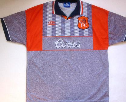
10th place goes to exit the form of London "Chelsea" of 1995. Somehow, then consider making beautiful shapes color of asphalt. Fashion probably ...
9th
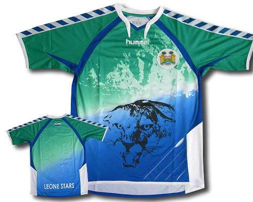
9th place goes to the home form of the national team of Sierra Leone for the season 2010/11. This T-shirt is unusual for this period and probably looks like the shape of the '90s. Hummel tried to make t-shirt as possible nalepili beautiful and a lot of unnecessary elements.
8th
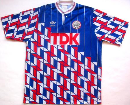
8 took the form of an exit Ajax sample 1989/90. It's not the company Umbro, which we are used to seeing today. Now we are used to seeing from the minimalism of Umbro, but then they tried to make a t-shirt as possible harder! A bunch of obscure and contrasting elements together has allowed this form to get in our top. Already sick eyes ...
7th
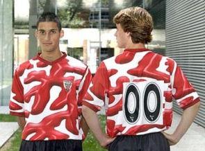
7th place gets home form Atletico Bilbao sample of 2004. It is noteworthy that this T-shirt was made for the centennial of the club. Who knows who the manufacturer of the "masterpiece" otpishite, please.
6th
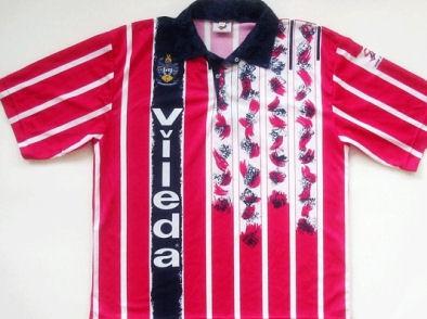
6 took the shirt of Huddersfield in 1993. If you make a red shirt with white stripes, it would look nice. Add to this black collar - too bad. But apparently the designers have designed this T-shirt was not enough and they decided to add a black border and some flowers. It is this and allowed it to occupy an honorable 6th place!
5th
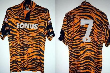
5 took the form of Hull sample 1992-93. Perhaps it is no secret, the second naming this team - "Tigers» (The Tigers). The designers, apparently, understood literally, and forced to walk in the shoes of Tiger whole season!
4th
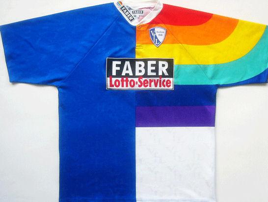
4th place goes to Bochum home shirt 1997/98 season. Designers decided to combine the two into a single T-shirt, and that's what they have left. It deserved 4th place of our "hit parade".
3rd place
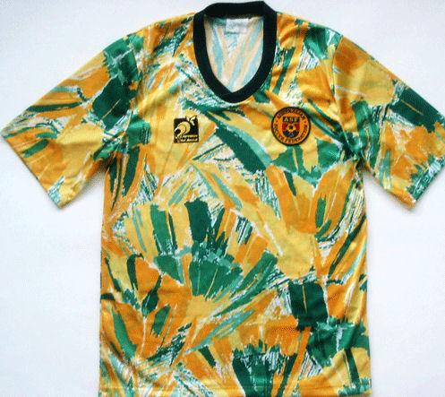
3rd place takes home T-shirt Australian team in 1990. Usually, the Australian team is very beautiful shape, but in 1990, the designers decided to experiment. I think they just took the traditional colors of Australia and randomly struck her T-shirt. It remains only to add a logo.
2nd place
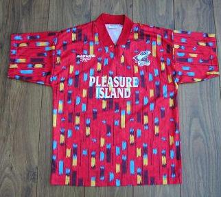
2nd place gets fairly shirt Scunthorpe United in 1994. It is said that it sold a lot of T-shirts. True though people bought but never wore it!
1st place
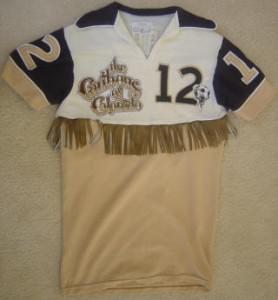
And our winner (or loser - you decide)! Colorado Caribou could hold on only one season in the big leagues, but they will remember for a long time. And especially their home shirt. This form should be used more in the rodeo, but not in football. Deserved first place!
Source: ">