Food advertising
 Bashny.Net
Advertising - the motor trade, which is constantly changing and offering more and more creative solutions. But comparing the advertising image of the product and its real kind we often disappointed, because the species is really not pleasant. That there is too little stuffing (which often happens), if not the product resembles an object invasions of mice. For some reason I did not go into comparisons bought things and their advertising prototypes, although it would be necessary. We both want to make a fool of, but we are pleased to be deceived ...

Take a look at the difference between the type of product by advertising its "true nature." From this difference would be desirable to narrow eyes and say, "Yes, it is not so!", But it's true, and most of us are victims of advertisers.

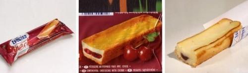
It looks very neappetitnenko ...
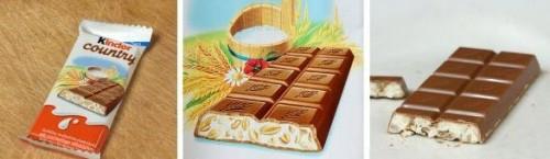
I love this Kinder, but the view from this sweetness is really fundamentally different and very different from that on the wrapper.
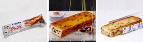
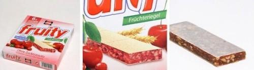
Fillings with gulkin nose ...

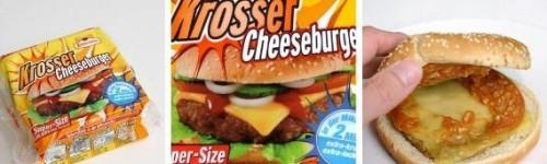
Buee ... Guys, well, why are you?

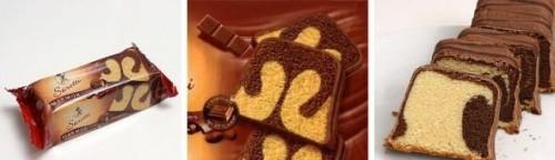
Food for the nebrezglivyh!

Differing only in color. Not bad!

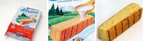
Marmalade cat laugh
Khokhloma patterns blurred ...
I do not recommend eating a "meal" may be indigestion.

Two adherent misunderstandings

And what a beauty on the package is called a "check it out and compare».
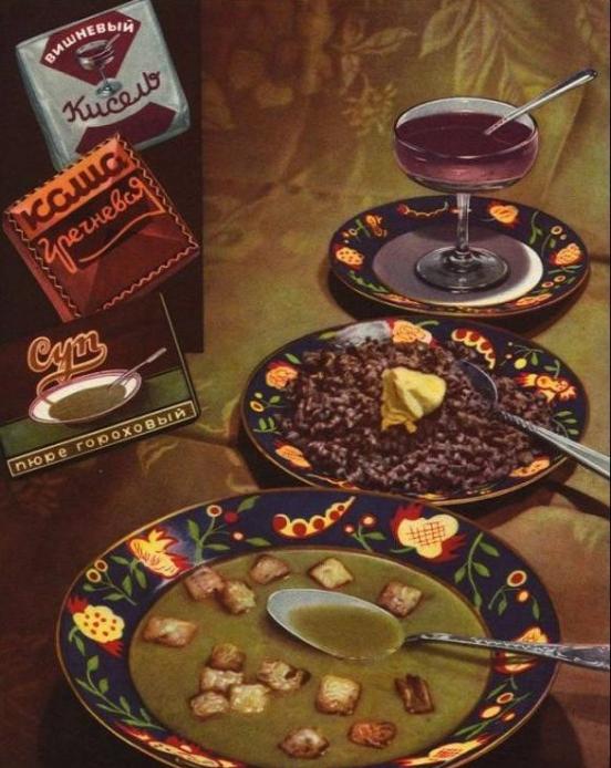
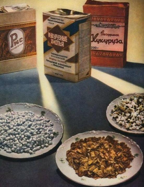
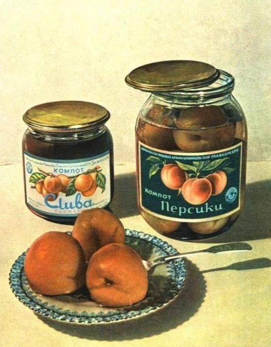
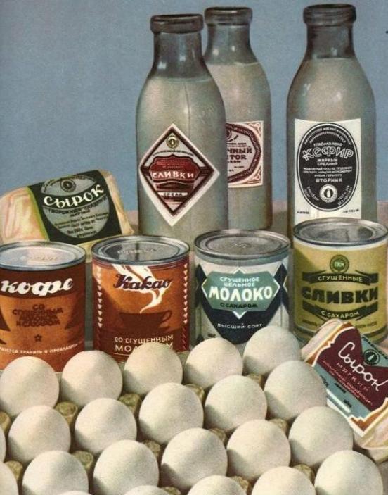
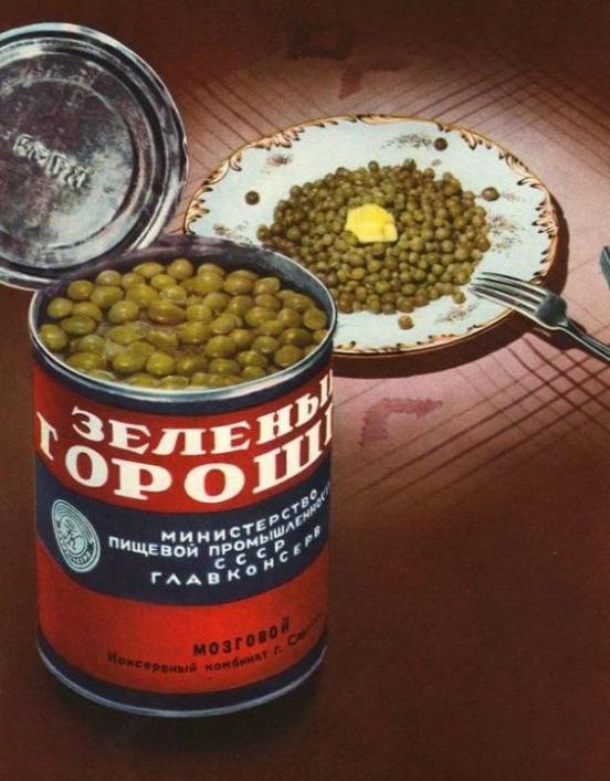
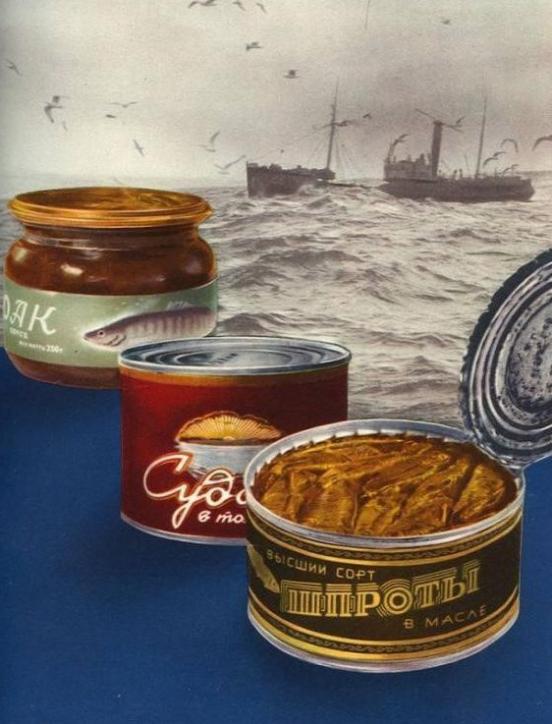
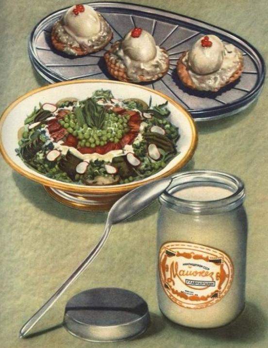
But to compare photos of our Soviet advertising without any frills. Clearly, simple and clear.


Take a look at the difference between the type of product by advertising its "true nature." From this difference would be desirable to narrow eyes and say, "Yes, it is not so!", But it's true, and most of us are victims of advertisers.

It looks very neappetitnenko ...

I love this Kinder, but the view from this sweetness is really fundamentally different and very different from that on the wrapper.

Fillings with gulkin nose ...


Buee ... Guys, well, why are you?

Food for the nebrezglivyh!

Differing only in color. Not bad!


Marmalade cat laugh

Khokhloma patterns blurred ...

I do not recommend eating a "meal" may be indigestion.

Two adherent misunderstandings

And what a beauty on the package is called a "check it out and compare».

But to compare photos of our Soviet advertising without any frills. Clearly, simple and clear.


Tags
See also
The best advertising USSR (113 photos)
Lying on the packaging or marketing ploys 10
World conspiracy
A selection of brilliant tricks, raised their advertising to a new level!
15 examples of how advertising can bordered on genius
Myths about food (15 photos)
Dubai, Thailand, Cambodia, Hong Kong
Advertising doping
Everything you were afraid to hear about the Russian advertising. "Soundtracks poor, old-fashioned hairstyle, what the hell is going on here?"
Sweet food is more dangerous than fat