Once again about smart logos
 Bashny.Net
Seeing that the previous material has become of interest to our readers, the decision was made wider to reveal the "subject" show more symbols and hint at meaning in the work of designers.
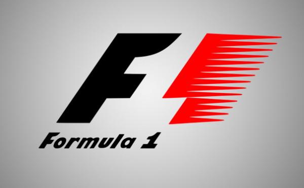
Let's start with a couple of well-known and actually existing brands. See how wonderful the empty space in the middle of the figure turns into a logo for Formula 1 races.
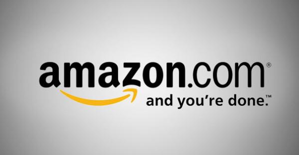
The logo of one of the most popular online stores in the world shows that here you will find everything from A to Z. In addition, the arrow is seen as a smile.
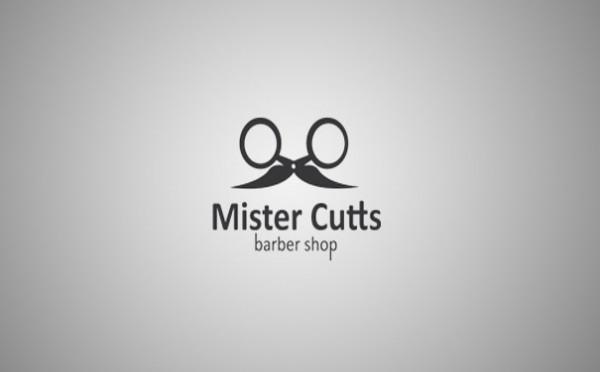
The store is very eloquent hairdressing supplies Logo :) Then you and scissors, and a mustache for them.
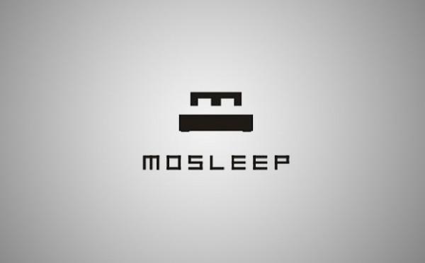
Logo medical organizations concerned with the lack of sleep in humans. The letter «M» is similar to the part of the bed.
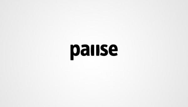
Logo fitness center «Pause» - where else laconic :)
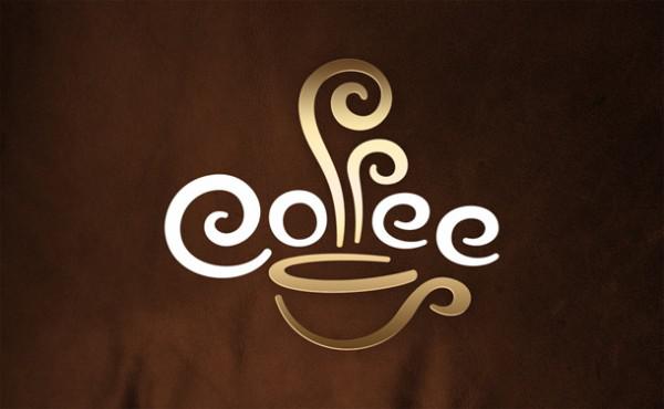
Work for coffee «Coffee Cup» (coffee cup). It looks to us from above and below the word coffee cup. But if you look closely, the cups in place, you will see the second part of the name - cup.
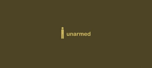
Unarmed (literally - armless).
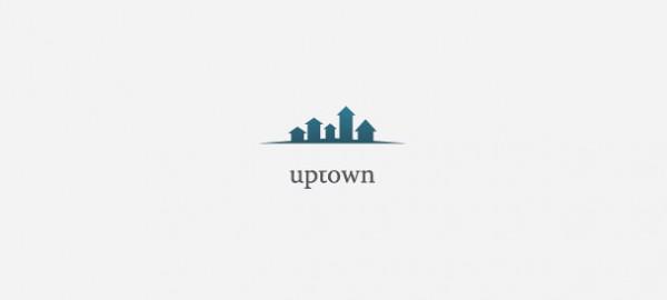
Uptown (consists of two words up - up and town - city) - the house grows right before your eyes!
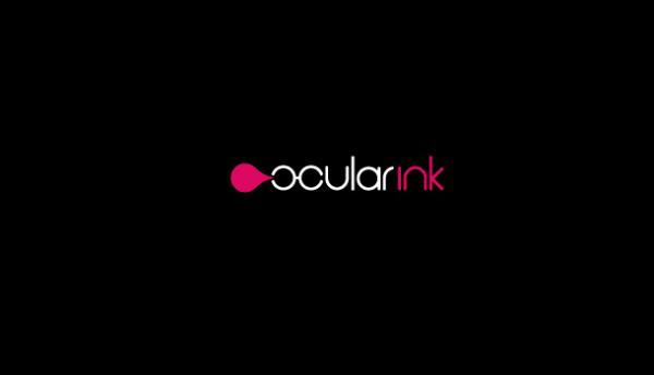
Ocular Ink (Points + black). Logo visible on glasses and a drop of ink.
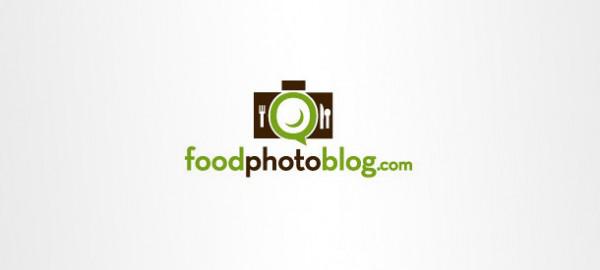
The logo for the blog about food and photography. Plate is also the lens.
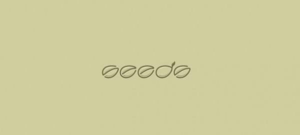
Seeds (seeds) - all letters in the form of seeds, and the letter «d» - as the seeds germinated.
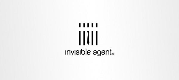
Invisible agent (invisible agent) - only tie distinguishes it from the general picture in the logo.
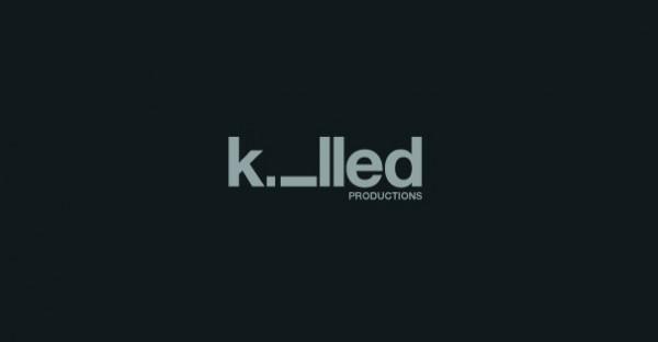
To kill - kill. The letter «i» on the logo seems to be dead :)
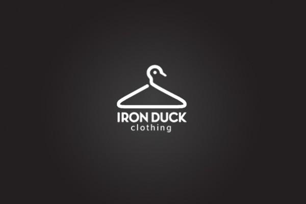
Clothing company «Iron Duck» (iron duck). Something in between trempel and duck.
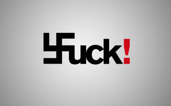
The logo symbolizes a protest against Nazism and racism.
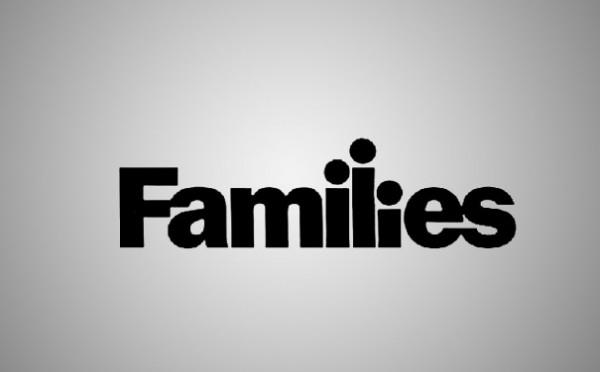
Family - the family. Only the blind will not see here mother, father and their child.
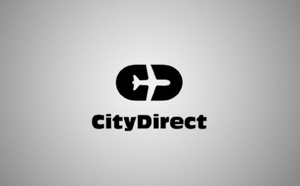
Tour operator City Direct - between capital letters visible silhouette of the aircraft.

Tags
See also
Interview with the assessment of the company's founder $ 2,000,000,000. Stepan Pachikov about his bad experience in high-tech business, "Do not stick your fee will not be in the business"
Once again about yesterday
Cakes, pies and cakes again!
Once again on the flight attendants (cabin crew)
The battle for the "Electro-L"
Smart logos
"I thought that if I ask one more time, I'll look stupid ..." Ask not hurt
Again about the space
10 questions to gubenatoru California by GQ magazine