The modern view of art
 Bashny.Net
Consider a situation when customers comment on the world of art that adorn the walls of museums and private collections.
Everything seems to be good in the picture, but a little something.
Sandro Botticelli "The Birth of Venus»
Overall, okay, a couple of important amendments:
1. Chest the lady at the center should be larger. Much more.
2. The color of the handkerchief right of a woman we do not like. It is desirable to make it light green, and if it does not - even clean or replace the leather sword belt buckled. Of course, green.
3. Flowers on a background of neither here nor there. This is not a wallpaper! Remove them down, close to the reeds, where they belong.
4. Correct the expression on the left by a man working. It seems that he pukes, not blowing. It should be similar to the girl next door, one thing they are busy.
Jan van Eyck "Arnolfini Portrait»

We liked your option, it was amazing! Simply super. But redo. Guys, well, we have to bear the happiness of the people, not melancholy! Therefore, all you need razvesilit.1. Orange in the layout is not enough positive. A green looks enough ekologichnym.2. The dog did not dear, to replace that Hachiko li.3. We need to think about the interior, it is obsolete. If you do not know what inspired, go to the ikeyu.4. Characters: why a man like Putin? this is some trend? let's better to be Brad Pitt, Angelina Jolie and the woman, and let everyone will be happy.
Karl Bryullov "Horsewoman»
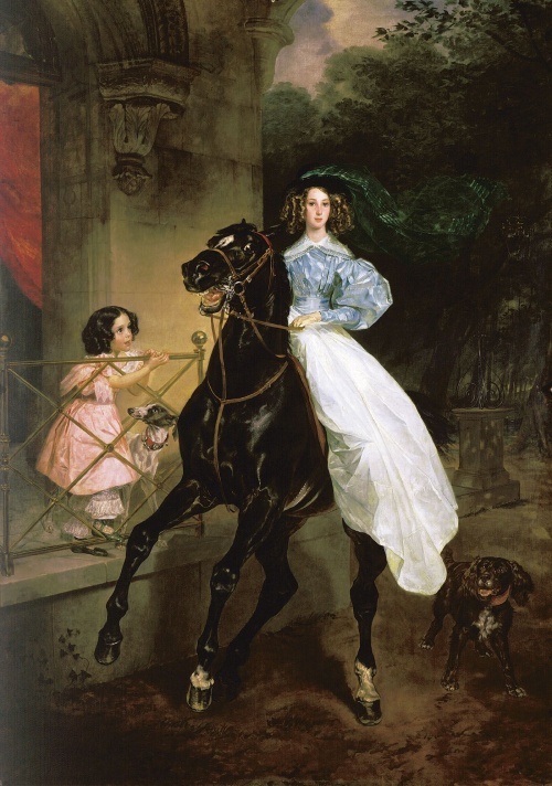
You know, we have opened your layout, and somehow there was no such that "ah!". We are, frankly, more of you ozhidali.1. The horse is not in good looks, play with her look, it should be more visionary and express the philosophy of our company. Difficult, but postaraytes.2. She liked a good deal, but change their clothes in her red evening plate.3. You draw from nature? Next time, please contact us affirm all modeley.4. The girl on the balcony replace the young man, and his eyes must be healthy interes.5. Change the stucco on the wall. We need something more avant-garde.
Michelangelo's "Creation of Adam»
Colleagues, we understand that today take the layout to print, but we still have small changes: 1. Incomprehensible hand bottom as if opening a can of beer. Ubrat.2. Current background color we do not like, want something perky, try printy.3. Adult bearded man and a cluster of boys around him will not pass censorship. How to solve this nibul problemu.4. Red rag on the right shaped like an ear, correct. We have too much and anatomy in the layout! 5. A guy from the left went perfectly. We see that you have tried. To make it even cooler, let's change to a more dynamic posture - let it be a jump.
Leonardo da Vinci's "Lady with an Ermine»
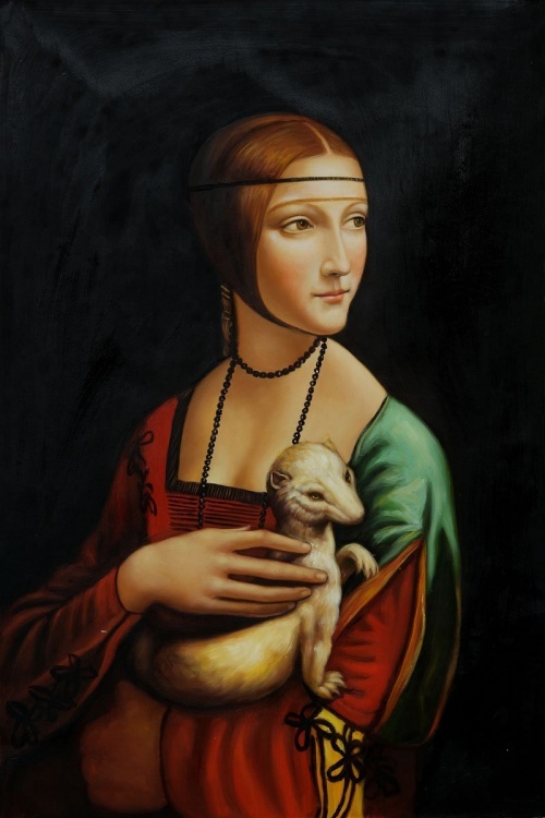
A sincere thank you for a wonderful layout, but still have a couple of small comments: 1. What kind of mutant in the hands of women? Replace sweet sobachku.2. The image of the girl lacks the glamor, let's replace the black background to pink breasts bigger and necklines glubzhe.3. If the output is to the fore hand, do not forget to varnish nails. This obviously begs red! 4. What's wrong with looking girl, no commitment and credibility. Oh, let it looks straight! And let smiles like Mona Lisa! So we create a puzzle! 5. Accessories on the neck of the girl is not in fashion this season, look for something from Swarovski.
Source: www.adme.ru Random page -
Tags
See also
Space architecture Zaha Hadid
Andrey Maksimov: the Kids who ordered grow up to be slaves
Programmers speak their own language
Helmets bikers
10 animals, whose accomplishments far surpass your own
Winter's painting Baranova
To find a moral compass
How to create attentive family