10 rules how to tell stories on the Internet
 Bashny.Net
The Creator of Tilda platform Publishing — about a new way to tell stories online.The Internet is a wonderful medium that allows very cool to talk and convey thoughts and feelings. We are still learning to live in it and develop new formats. I think that soon will come the new era of digital storytelling. This is the Golden age of Russian literature — only on the Internet. Digital storytelling is a rather noble format is a skill — as a beautiful, coherent speech.
Initially, the texts were published on the Internet on the analogue principle: the material was placed on the page, broken into paragraphs, supplied a few photos. Realizing that to understand the unformed sheets no one wants, a edition abandoned the large format in favor of small news. In General, the mechanics of the text has changed. Due to the fact that the increased flow of information with the advent of social networking, we have learned to filter content and to read selectively — but we still want to read.
Soon will come a new era — the era of digital storytelling. This is the Golden age of Russian literature, only in the Internet.
At the end of 2012, on the wave of popularity of the iPad, the editorial Board began to rethink the future of the reading experience. The designers and publishers of the new era formed their own standards under the General title Digital Storytelling. Many are experimenting with special versions of their publications for tablets, but the greatest success was a new format of storytelling — interactive story Snowfall of the New York Times made a revolution in online publishing, and has created a new standard of content delivery. I would like to develop and teach this format to others. Our task is to create a global community of storytelling. Creating a "Tilde", we set a goal to give people a simple tool in order to enable them to tell their stories. This platform helps to create content-centric projects and publish them on the Internet. Working on its own platform and studying the format, we have formulated basic rules that help in the work on visual stories.

Material Snowfall of the New York Times scored 80 thousand likes, and his name became a household word for all articles of this type.
How to tell an interesting story?
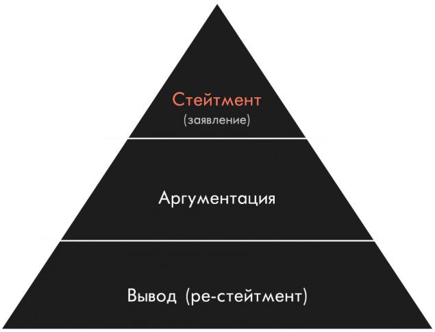
Good material should be interesting and useful to the reader. Think about what is valuable and new people will get from reading your material. To be well digested the story, use the pyramid information. When the plot is designed, think about what can complement and help to develop a theme. The presence of multiple points of view and different contexts is always beneficial. Good content, direct speech expert and high-quality visual design will give the amount of interesting and comprehensive material.
It is a deep study of the subject distinguishes a good story from the surface. There are concepts of primary and secondary research that should be addressed by everyone who tells a story on the Internet. Any designer or editor, working on material, should be able to quickly take in the subject.
Find beautiful pictures
Storytelling — it's like a movie that plays while you scrollery. That is the visual part helps to convey the atmosphere, to reveal theme and to immerse the user in the context. Think about what could help your story to unfold. This can be, for example, photo shoot, ambient video, illustrations or infographics. Starting to make history, immediately sagacitas matter of creating visual content.
The title should be telling. A good title is of interest and indicates the subject of the article, without provocation and distortion of its essence. For the conversion to work well, the headings, figure titles-questions, and statements. To interview works very well in the headline scathing quote. For example — "the Whole discourse of terrorism aimed at the establishment of the national audit office:" an interview with Jonas Staal".
"Wladimir Klitschko is the strongest in the EBU"
Puns in the titles that were popular with the middle zero, in recent years came to be considered bad manners (for example, a review of cold summer soups: "Soup of mine, I miss you").
Will always be popular titles with a number (which is dictated by the genre of the compilation or listing): "25 places in Russia, where very fun to live with", "20 pictures of how fun being kids." There are quite yellow options — "This workout is 9 minutes to replace the proper session in the gym." It is important to find a balance between the attractiveness of the title and its provocative, because no one likes to frustrated expectations.
Design multiple layers of reading
There are two types of reading: first — line. First is the assessment of the material, then reading the text in order. Traditional option. The second cross-reading (skimming): reading is only for headings, insets, and so on. Plus, if you come across something interesting, stop to read the text.
It is important to consider the reading of the second type. Make sure that the structure of the material was read without any problems even a cursory glance.
Designers accumulated experience shows that there are better ways to convey different types of information. The concept of "design pattern" refers to a specific element or group of elements repeated on many sites for the same purpose. For example, a dozen different ways to make the direct speech, over time, survive two or three most successful.
The pattern design of the header section, header, lid.
Visiting a couple of dozen modern sites, the attentive viewer will easily distinguish characteristic patterns of the design of art galleries, listings of chips, calls-to-action.
Design patterns can and should be used in their work, adapting them to their own content and style.
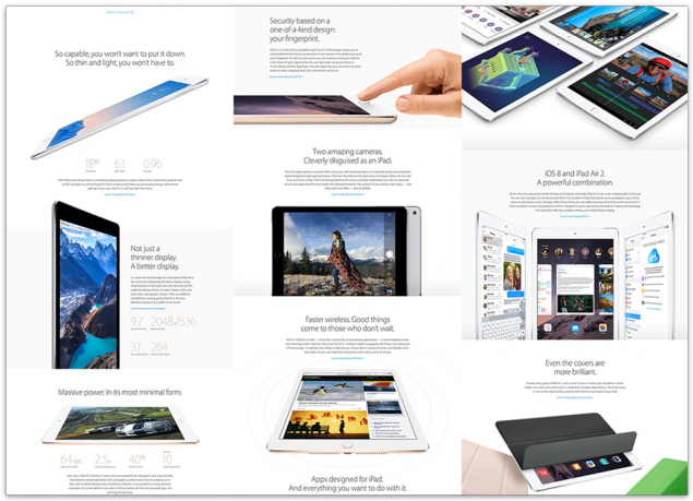
Think about what and in what sequence the reader will see. The presentation of the material should be varied. Good pattern, applied 10 times in a row, can become an eyesore, almost as much as a sheet of text. Consider, for example, as out the Apple designers: with only one object, they found 9 ways to show it in new ways.
Use large margins between blocks. Don't be afraid of the air, let the information breathe. When the text big space, it expands and becomes chitemene.
Don't go overboard with the design and colour — abundance of styles pulls attention and interferes with the absorption of information. Cultivate ascetic.

Each time that you use a particular intake design, be careful that he always served the same function. For example: think of one style (size+style+line spacing) header, cutout, and captions, and work only with them. Add new styles you need — with the appearance of new entities.
Find the right tone Well to consider the cultural context of fonts. For example, the article about new York would be logical to look Helvetica (used in urban navigation, reflects the ideology of modernism), and about Venice — Bodoni (one of the oldest Italian fonts are still widely used by designers).
For well-designed article is, only one font. It is also possible to use two fonts to create a bold contrast.
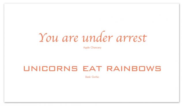
The nature of the font influences the tone of the statements.
Don't forget to put social buttons. It is better to use the so-called "sticky" buttons that remain in view when scrolling the page.
You may want to use a motivating text (call to action) in combination with cherami. It is on the basis of the badge in the feed Facebook or on the website of the media people decide whether they watch or not.
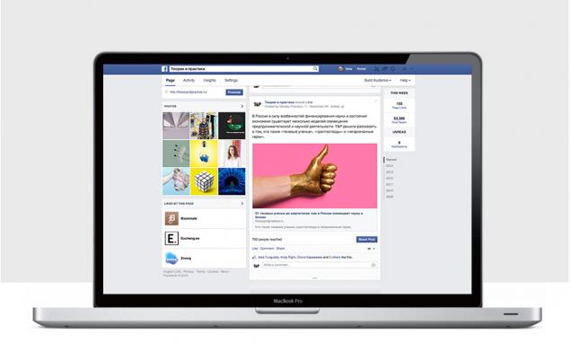
Think again over the title. Make it viral. Use beautiful images, write interesting lead, and check the badge using the Facebook Debugger.
Source: theoryandpractice.ru
Initially, the texts were published on the Internet on the analogue principle: the material was placed on the page, broken into paragraphs, supplied a few photos. Realizing that to understand the unformed sheets no one wants, a edition abandoned the large format in favor of small news. In General, the mechanics of the text has changed. Due to the fact that the increased flow of information with the advent of social networking, we have learned to filter content and to read selectively — but we still want to read.
Soon will come a new era — the era of digital storytelling. This is the Golden age of Russian literature, only in the Internet.
At the end of 2012, on the wave of popularity of the iPad, the editorial Board began to rethink the future of the reading experience. The designers and publishers of the new era formed their own standards under the General title Digital Storytelling. Many are experimenting with special versions of their publications for tablets, but the greatest success was a new format of storytelling — interactive story Snowfall of the New York Times made a revolution in online publishing, and has created a new standard of content delivery. I would like to develop and teach this format to others. Our task is to create a global community of storytelling. Creating a "Tilde", we set a goal to give people a simple tool in order to enable them to tell their stories. This platform helps to create content-centric projects and publish them on the Internet. Working on its own platform and studying the format, we have formulated basic rules that help in the work on visual stories.

Material Snowfall of the New York Times scored 80 thousand likes, and his name became a household word for all articles of this type.
How to tell an interesting story?
Good material should be interesting and useful to the reader. Think about what is valuable and new people will get from reading your material. To be well digested the story, use the pyramid information. When the plot is designed, think about what can complement and help to develop a theme. The presence of multiple points of view and different contexts is always beneficial. Good content, direct speech expert and high-quality visual design will give the amount of interesting and comprehensive material.

It is a deep study of the subject distinguishes a good story from the surface. There are concepts of primary and secondary research that should be addressed by everyone who tells a story on the Internet. Any designer or editor, working on material, should be able to quickly take in the subject.
Find beautiful pictures
Storytelling — it's like a movie that plays while you scrollery. That is the visual part helps to convey the atmosphere, to reveal theme and to immerse the user in the context. Think about what could help your story to unfold. This can be, for example, photo shoot, ambient video, illustrations or infographics. Starting to make history, immediately sagacitas matter of creating visual content.
The title should be telling. A good title is of interest and indicates the subject of the article, without provocation and distortion of its essence. For the conversion to work well, the headings, figure titles-questions, and statements. To interview works very well in the headline scathing quote. For example — "the Whole discourse of terrorism aimed at the establishment of the national audit office:" an interview with Jonas Staal".
"Wladimir Klitschko is the strongest in the EBU"
Puns in the titles that were popular with the middle zero, in recent years came to be considered bad manners (for example, a review of cold summer soups: "Soup of mine, I miss you").
Will always be popular titles with a number (which is dictated by the genre of the compilation or listing): "25 places in Russia, where very fun to live with", "20 pictures of how fun being kids." There are quite yellow options — "This workout is 9 minutes to replace the proper session in the gym." It is important to find a balance between the attractiveness of the title and its provocative, because no one likes to frustrated expectations.
Design multiple layers of reading
There are two types of reading: first — line. First is the assessment of the material, then reading the text in order. Traditional option. The second cross-reading (skimming): reading is only for headings, insets, and so on. Plus, if you come across something interesting, stop to read the text.
It is important to consider the reading of the second type. Make sure that the structure of the material was read without any problems even a cursory glance.
Designers accumulated experience shows that there are better ways to convey different types of information. The concept of "design pattern" refers to a specific element or group of elements repeated on many sites for the same purpose. For example, a dozen different ways to make the direct speech, over time, survive two or three most successful.

The pattern design of the header section, header, lid.
Visiting a couple of dozen modern sites, the attentive viewer will easily distinguish characteristic patterns of the design of art galleries, listings of chips, calls-to-action.
Design patterns can and should be used in their work, adapting them to their own content and style.
Think about what and in what sequence the reader will see. The presentation of the material should be varied. Good pattern, applied 10 times in a row, can become an eyesore, almost as much as a sheet of text. Consider, for example, as out the Apple designers: with only one object, they found 9 ways to show it in new ways.

Use large margins between blocks. Don't be afraid of the air, let the information breathe. When the text big space, it expands and becomes chitemene.
Don't go overboard with the design and colour — abundance of styles pulls attention and interferes with the absorption of information. Cultivate ascetic.

Each time that you use a particular intake design, be careful that he always served the same function. For example: think of one style (size+style+line spacing) header, cutout, and captions, and work only with them. Add new styles you need — with the appearance of new entities.
Find the right tone Well to consider the cultural context of fonts. For example, the article about new York would be logical to look Helvetica (used in urban navigation, reflects the ideology of modernism), and about Venice — Bodoni (one of the oldest Italian fonts are still widely used by designers).
For well-designed article is, only one font. It is also possible to use two fonts to create a bold contrast.

The nature of the font influences the tone of the statements.
Don't forget to put social buttons. It is better to use the so-called "sticky" buttons that remain in view when scrolling the page.
You may want to use a motivating text (call to action) in combination with cherami. It is on the basis of the badge in the feed Facebook or on the website of the media people decide whether they watch or not.

Think again over the title. Make it viral. Use beautiful images, write interesting lead, and check the badge using the Facebook Debugger.
Source: theoryandpractice.ru
Tags
See also
Magadan online
The evolution of the brain
Nokia tells the story of how your story will be heard in a new way
16 different sites that will teach new
35 free training sites
For virtual "love" tend to dependent people.
Gabor Mate on the root causes of drug abuse and how to fight it
Sergey Savelyev: Society casts out smart
As a C bypass honors in business
How to live a love story Galina Vishnevskaya and Mstislav Rostropovich