Everything you were afraid to hear about the Russian advertising. "Soundtracks poor, old-fashioned hairstyle, what the hell is going on here?"
 Bashny.Net
Michael Paredrakos, Account Executive of Lowe Worldwide, Greece
Lee Washington, Account Manager at Cake Group, London
Serge Fenenko, Strategy Director of Novocortex, the Netherlands / Ronald ter Voert, Executive Producer of RTV Media (ex-Endemol and SBS), the Netherlands
Oliver Voss, Chief Creative Officer of Jung von Matt, Germany
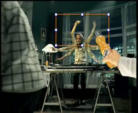
1. Fanta - Photoshop
Michael Paredrakos:
Oddly enough spot. We do not realize it until the end. Overall, it looks as if inspired otvyaznyh drug hangouts. It seemed to us or a company coming off at the rave party teens so pumped up "Phantom"? Especially strange it is that in Greece "Phantom" is really focused on a younger audience, and we do not understand in Russia is admitted to the air?
However, the special effects are really good. But many viewers do not offer - a creative decision to leave us indifferent.
This was quite strange ... we did not understand it at all! Overall it looked like it came out of the drug party scheme! It seems to us that these are a bunch of kids partying at an illegal rave party while drinking fanta ?! Which is rather bizarre since Fanta in Greece usually targets really young audiences, so how the Fanta in Russia allowed this to air we simply do not get !!! Overall the visual effects are quite good, but simply has nothing to offer to the viewer while creativity wise it left us very indifferent!
blockquote> Lee Washington:
Crazy advertising! The message seems to be that drinking orange "phantom" "Send" you into a psychedelic journey where you will be able to multiply the number of limbs in people, to make them dance on the ceiling or transported to the moon.
Music - miserable and hairstyles guys - in the style of the 80s. I find this movie funny, but not in the right way. He did not force me to go for a bottle of "Phantom", that's for sure. And the slogan "Pimp reality" suggests a connection with the drug product. A spoon of honey: the special effects are good, and the question, "What the hell is going on here?" Arises when viewing motivates Share this video with your friends.
This advert is crazy! The message appears to be that drinking the bright orange drink that is Fanta sends you on a drug induced trip where you have the power to give people multiple limbs, make them dance on the ceiling or transport yourself to the moon.
The music is cheesy and the guys haricut is very much in the 1980s style. I find the advert funny, but probably not for the right reasons. It does not make me want to go buy a bottle of Fanta that's for sure and with the byline «upgrade your reality» it does make it sound like a drug! On a positive note, the special effects are good, and the 'what the hell is going on?' Element, makes you want to share it with friends.
blockquote> Serge Fenenko / Ronald ter Voert:
At present the energy spot. The idea is clear and well implemented. We're not quite sure that this movie will be noticeable on the background of other advertising aimed at young audiences. There are quite a few clichés - parties, DJs, break-dance, smiling people. And we doubt that young people are familiar with the interface Photoshop 'a. We think the OK button at the start of a clear audience.
We like the theme of "Pimp reality." It can be implemented in many media (outdoor advertising, Internet, mobile phones) in the framework of an integrated campaign. Fanta could offer the audience to share their bleed the reality on the web. Or invite them to plunge into reality, invented Fanta. Narimer, visitors could upload their own photos and insert them into an altered reality Fanta. Or Fanta could organize voting for the best party or a club with a pump over reality. The use of interactive media could make the campaign more effective. And we have added a video call to action to engage viewers in an advertising campaign and bring them to the site: "Come on Fanta. ru and become part of the pump over the reality ».
This spot has a lot of energy in it. The idea is clear and well executed. But we are not sure whether it would stand out from other commercials made for the young audience. Because it's full of clichés - parties, DJs, break dancing, smiling people ... And we doubt whether the target audience is acquainted with the Photoshop interface. We think that the OK button in the beginning is more familiar to the viewers.
We love the communication theme «Upgrade your reality». This concept can be used across many media (outdoor, internet, mobile) in an integrated campaign. Fanta could invite the viewer to share his / her upgraded reality on the website. Or to enjoy the reality Fanta has upgraded for us. For instance, site visitors could upload their photos that would become part of this upgraded reality. Or they could vote for the Best Upgraded Reality Party or Club, sponsored by Fanta. Use of interactive media would make the campaign more effective. And we would add a call to action to the commercial to engage viewers into the campaign and to generate traffic to the website: «Go to Fanta.ru and become part of our upgraded reality».
blockquote> Oliver Voss:
Not bad for a Fanta. I worked for this brand a couple of years ago, and the material I gave out was worse. I liked the idea a youth with a computerized world and how it is used because it is close to the CA (my parents do not understand it, but that's okay, because they do not drink and Fanta).
7 out of 10 points.
Not bad for a Fanta ad. I did work for Fanta a couple of years ago and the stuff I did was worse. I like the young device from the computer world and also how it's used, because it's so close to the target group (my parents would not get it, but that's okay, they do not drink Fanta anymore).
7 out of 10.
blockquote> 2. Maxibon - Double pleasure
Michael Paredrakos:
From this video we have the most fun. In general, the plot is resourceful and quite lively. It gets our voice has for what made us smile.
We enjoyed this one the most! Creativity wise the products transcends to the screen and it was done very well! Overall very cute and kind of smart! This one gets our vote since it put a smile to our face!
blockquote> Lee Washington:
I liked this movie - he is pleasant and not without a sense of humor. Nothing besides the beach, the sun and the two models to talk about ice cream. They denounced the idea of the two sides of the ice cream with the help of jokes about "bilateral" people - it will have an effect.
I like this advert as it is friendly and has a sense of humour. There is nothing like a beach and sunshine and two models to advertise an ice cream! The way they convey the message that there are two sides to it is effective with the joke that people are also the same is executed well.
blockquote> Serge Fenenko / Ronald ter Voert:
We think that this movie is too focused on the physical properties of the product - on a combination of chocolate ice cream and white, brown and white colors. We doubt that this is the only such ice-cream on the market. And we could not find a "double pleasure" in the video.
The theme of "Double pleasure" is much more creative options to make it a true symbol of an ice cream treats for the target audience. We do not know whether Maxibon stake "fun" in the Russian market. But even if the "fun" is already occupied by competitors, Maxibon may declare that it will double any ice cream treat. We do not know whether the agency deliberately plays with the theme of "above and below the belt" in the video (above- the- line and below- the- line). But they might well reveal the topic of fun "below the belt" in the viral campaign and online community for singles :-)
We think that this commercial focuses too much on product features - on combination of chocolate and vanilla ice-cream, of brown and white colors. We wonder whether this is the only ice cream on the market that has this combination. And we could not find any «double pleasure» in the ad.
«Double pleasure» offers much more creative opportunities to make this ice cream a symbol of pleasure for the target audience. We do not know whether Maxibon can claim «pleasure» on the Russian market. But even if «pleasure» has already been claimed by a competitor, Maxibon can claim that it will double any pleasure. We are not sure whether the advertising agency deliberately created associations with above-the-line and below-the-line in the commercial. But they could explore the below-the-line pleasure in virals and online :-)
blockquote> Oliver Voss:
Classical advertising. And so it is very tiresome. Beautiful world, beautiful model and a mediocre idea. I change the channel if stumble on this spot.
1 out of 10 points (1 for the ice cream, which looks very appetizing).
That's classical advertising. And therefore annoying. A beautiful world, beautiful models and a mediocre idea. I would fli the channel if it came on.
1 out of 10. (the 1 is for the ice-cream which looks yummy :-)
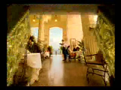
blockquote> 3. Sochi 2014 - Russia. The Door is open
Michael Paredrakos:
We believe that this movie is entirely aimed at attracting tourists, with no claim to the creative delights. Opening the door, one after the other representing different scenes - it's too easy. Very similar to the solution that has been created for the Greek bank Millenioum. This movie does not affect the viewer on an emotional level. It looks like a PowerPoint-presentation ovsky.
We believe that this is quite touristy and does not has much to offer creativity wise! The doors opens and reveal the themes one by one it is simple as that! Its very similar to an ad that was playing in Greece for Millenioum bank. Overall it does not connect to the viewer in any emotional level..its seems rather like a power point presentation directional wise!
blockquote> Lee Washington:
I have not heard anything about Sochi and the fact that the city is preparing to take the 2014 Games and, from that perspective, the movie reached the goal. However, it seems a little early to associate the campaign with an event that will take place only after 7 years. Take the London: we do not have any advertising on Olympic themes, although the Games logo and caused a burning interest.
In terms of creativity, progress with opening doors is quite interesting, it is a visual touches and brings a message that Sochi is open for business investment. It creates the feeling that Sochi - an unusual place filled with beautiful buildings and a rich culture that makes me want to visit this city. Probably still worth it to complete the video link to the website where you can get more information about the Sochi and the Olympics.
I had not heard of Sochi, nor was I aware that it was hosting the 2014 Olympic games and therefore this advert has already achieved it's goal. However, it seems quite early to be advertising an event that does not take place for another 7 years. Here is London, we have not had any advertising for the Olympic games, although the rather interesting Olympic logo received a lot of interest.
Creatively the door opening is an interesting technique that is visually striking and gets the message across that Sochi is open for business. It creates the impression that Sochi is a sophisticated place filled with beautiful buildings and culture which make me want to go and visit it. Perhaps the advert could have ended with a website that the viewer could then visit to get more information about the city and the Olympics.
blockquote> Serge Fenenko / Ronald ter Voert:
The idea of this movie is quite simple. It seemed to us that the author was inspired by hotels advertising on CNN: «The same room, the same service, no matter where you were." The theme "Gateway to the Future" almost literally translated into the concept of opening doors. And this is done in a rather old-fashioned way (compare that open the door to the trailer and in the movie "The Matrix. Reloaded"). Our association with the video called "Gate to the past", and not in the future.
And we did not have very strong emotions related to sports and the Olympics. Turn off the sound, you can not understand that the ad was created for the grand sports event. And we could not find an answer to the main question: "Why do we have to visit Sochi?". What makes Sochi unique? What distinguishes the Olympic Games in Russia from the Olympic Games in other countries?
The idea of this commercial is quite simple and straight-forward. Our first impression was that its authors were inspired by commercials for hotel chains on CNN: «Same rooms and same service wherever you are». The communication theme «Gateway to the future» was quite literally translated into the concept of open doors. And this was done in an old-fashioned and 'uncool' manner (compare it to the open doors in «Matrix Reloaded»). It felt more like «Gateway to the past» than to the future.
We also miss strong emotions associated with sports and the Olympic Games. Turn off the sound and you can not tell that this ad is created for a great sports event. And we did not get an answer on the most important question: «Why should we visit Sochi?» What makes Sochi unique? What differentiates the Olympic Games in Russia from the Games in other countries?
blockquote> Oliver Voss:
Suffice it to an old idea - opening doors. But recently we have seen it in the advertisement German Telecom. Production seems to be too cheap. This is not Hollywood standards - with such scenarios need to do something, because in them the idea is mainly based on the damaging video and qualitative prodakshene.
3 out of 10 points.
Quiet an old idea to open these doors. But we just saw it in a huge TVC in Germany as well - for the german telecom. The production looks a bit cheap to. It's really not hollywood standard - and you need to do that with a script like that, because the idea is mainly based on great looks & production value.
blockquote> 3 out of 10 points.
For a preview of the campaign benefited magazine Campaign Brief Asia.
via / samoreklama / 2007/05/30/18263 /

Tags
See also
12 ways to get whatever he wants:
Everything you wanted to know about Rome, but were afraid to ask (facts + video)
All you need to know about Cuba
The best advertising the second half of November 2012
Don'ts PARENTS
Admiral's mouth
All you need to develop a "dynamic thinking"
Bob Scarpelli: The man who invented the "Vazzap"
All that is looking for a woman already has within itself
Debbie Shapiro: All that You hold in your mind will reflect in Your body