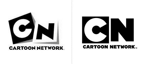
The most noticeable change logos 2010
 Bashny.Net
Site explore the most striking examples of change logos in the world and Russia to be able to assess the trends of the year, and in what area of the largest efforts focused branding kompaniy.Vse large and small companies with varying frequency resort to rebranding and change of corporate identity. Some update the visual representation of the brand - a tribute to fashion trends in logotipostroenii, for some - a reason to create a buzz around the brand or make has finally modern look on his face, and someone in the past year, so even expressed their environmental stance. This year there were no total landscaping.
See also the most noticeable change logos 2009.
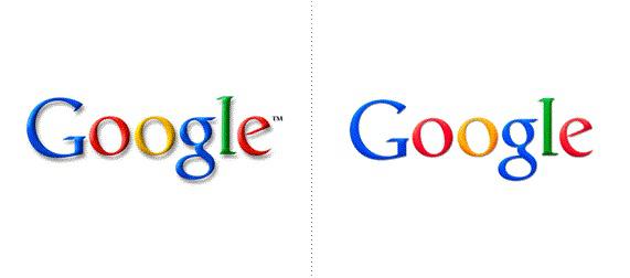
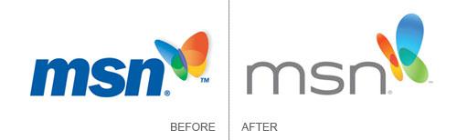
GoogleSamaya popular search engine of the world in May, without the noise and loud announcements not only modified the search results and add a virtual keyboard, and updated logo.
Now, under the colored letters Google is almost no shadows that have long been out of fashion identity-- if they dropped lower on the surface. Logo began to look brighter, but also more subdued and did not lose bulk.
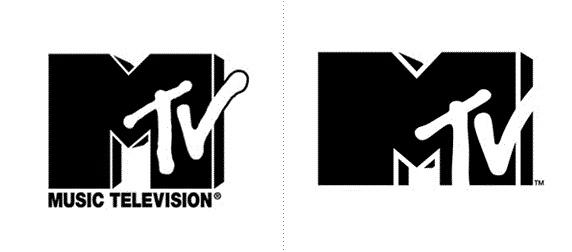
MTVV February, the first time in its 29-year history MTV channel conducted a rejuvenation and face lifting of its logo.
The main innovation is a departure from the consoles «Music Television» / «Music TV". MTV began to position itself more like an entertainment, not a music channel.
C first glance it seems that the old logo just cut the "legs" and removed a thin stroke. But, in general, the new logo became more brutal and concise.
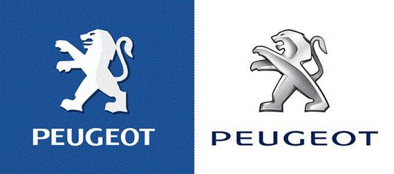
PeugeotKompaniya Peugeot has updated its brand positioning right after the new year.
Updated logo Peugeot brand is a lion, but the changes. Peugeot designers have simplified his drawing, given the dynamism of the logo, a sense of movement, joined in two symbol texture of the material, matte and glossy, as well as "otrehmerili" him. In addition, the lion is no longer the language.
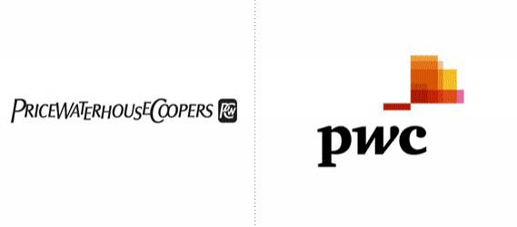
PricewaterhouseCoppersPricewaterhouseCoopers, one of the most well-known auditing companies, in September this year updated its positioning to be more recognizable and modern in the eyes of customers and employees worldwide.
As part of the new brand logo «pwc» - reducing the first letters of the name written in lowercase.
Since the company's inception in 1998. The reduction of PwC and the full name of PricewaterhouseCoopers were interchangeable in external and internal communications. The official short form of the name of one of his easier use by all firms of the international network of PwC.
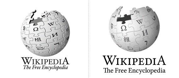
WikipediaSvobodnaya Encyclopedia introduced in May 2010, 3D-model of its famous logo of a globe puzzle.
After several attempts to create a real souvenir Globe puzzle on Wikipedia reflect on the creation of a virtual 3D world, completely covered with signs written alphabets in the world. On the creation of 3D-models 3D-logo work animator, art director and graphic designer Philip Metschan, previously worked at Industrial Light, Magic and Pixar.
In addition to being a globe made three-dimensional, change the font Hoefler on Linux Libertine and abandoned italics. All this is done in order to facilitate the work of the volunteers involved in the adaptation of Wikipedia and its logo on 250 languages of the world.
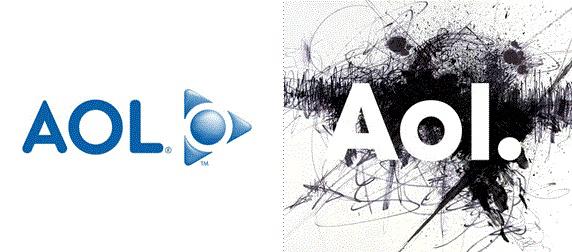
AOL10 December, the American media conglomerate Time Warner Inc. withdraw from the company's subsidiary problematic Internet unit AOL. An independent company has intentions to return to its former glory started working on their own new brand.
In addition to the three letters A, O, and L logo contains the background and the end point as a sign of independence. Brand development was carried out jointly with the consulting firm Wolff Olins and by Universal Everything, which was engaged in rebranding international television network MTV.
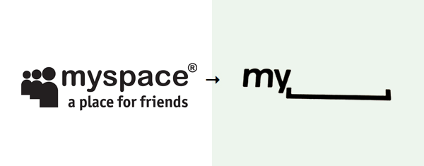
MySpaceV new logo MySpace human figures have disappeared, and the word «space» in the new logo was replaced by a space. The word «space» in the English language as the value of "space" and to "gap».
«MySpace - a place where everyone can be what he wants, so we decided to offer users some free space for creativity and self-expression," - commented on the changes Vice President MySpace Mike Macadaan.
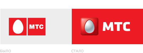
RossiyaMTCKrupneyshy Russian mobile operator MTS has updated its logo, retaining its main graphic element - the egg - white and red colors, but, as reported in a press release by a tech style. Egg using BBDO Branding has gained volume and type of icons for twitter or facebook, and the abbreviation MTS - the new writing.
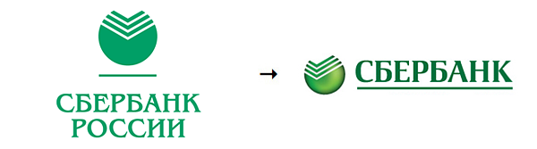
SberbankS on December 14 last year, Sberbank began rebranding its branches, which affect the change of corporate colors and logo change of the bank. According to experts, the cost of the rebranding of all 20 thousand. Compartments for Sberbank could reach about 20 billion rubles. The new logo is designed in the British Fitch.
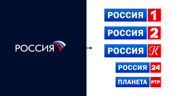
VGTRKV first day of the 2010 TV channels owned holding company VGTRK, came out with a new logo visually combine these channels previously disparate-looking.
TV channel "Vesti 24", "Culture", "Sports", "RTR-Planeta" changed their names and united around the core brand "Russian." For example, "Vesti 24" was called "Russia 24", "Culture" became "Russia to". The TV channel "Sport" changed the concept and was called "Russia 2", and the channel "Russia" added to his name one.
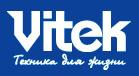
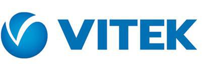
VitekLetom 2010 modernized its logo and the Russian producer of household appliances Vitek. Was greatly simplified font, removed the slogan "Technology for Life" and the symbol appears - ball as if cut sector in the form of letters V.
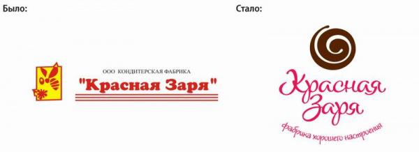
Red ZaryaCoruna Branding Group to rethink the visual image of the factory "Red Dawn". Designers and marketers have decided to make it not so heavy and "Soviet", while retaining the basic promise - to give a good mood. The result was a brown twirl, which was very ambiguously perceived by peers.
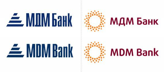
BankMDM MDM Bank launched the rebranding process in February, it should be completed by the end of this year.
As reported in a press release, the new logo MDM Bank became a stylized symbol of the sun, it is intended to reflect its core values: reliability and stability, openness and partnership, friendly attitude to private and corporate clients, accessibility and ease of service. The new visual identity is accompanied by the slogan "My Business World", which form the first letters of the name of the bank.
Logos and other changes late 2009 and 2010 godov
via # image752955
See also the most noticeable change logos 2009.
GoogleSamaya popular search engine of the world in May, without the noise and loud announcements not only modified the search results and add a virtual keyboard, and updated logo.
Now, under the colored letters Google is almost no shadows that have long been out of fashion identity-- if they dropped lower on the surface. Logo began to look brighter, but also more subdued and did not lose bulk.

MTVV February, the first time in its 29-year history MTV channel conducted a rejuvenation and face lifting of its logo.
The main innovation is a departure from the consoles «Music Television» / «Music TV". MTV began to position itself more like an entertainment, not a music channel.
C first glance it seems that the old logo just cut the "legs" and removed a thin stroke. But, in general, the new logo became more brutal and concise.

PeugeotKompaniya Peugeot has updated its brand positioning right after the new year.
Updated logo Peugeot brand is a lion, but the changes. Peugeot designers have simplified his drawing, given the dynamism of the logo, a sense of movement, joined in two symbol texture of the material, matte and glossy, as well as "otrehmerili" him. In addition, the lion is no longer the language.

PricewaterhouseCoppersPricewaterhouseCoopers, one of the most well-known auditing companies, in September this year updated its positioning to be more recognizable and modern in the eyes of customers and employees worldwide.
As part of the new brand logo «pwc» - reducing the first letters of the name written in lowercase.
Since the company's inception in 1998. The reduction of PwC and the full name of PricewaterhouseCoopers were interchangeable in external and internal communications. The official short form of the name of one of his easier use by all firms of the international network of PwC.

WikipediaSvobodnaya Encyclopedia introduced in May 2010, 3D-model of its famous logo of a globe puzzle.
After several attempts to create a real souvenir Globe puzzle on Wikipedia reflect on the creation of a virtual 3D world, completely covered with signs written alphabets in the world. On the creation of 3D-models 3D-logo work animator, art director and graphic designer Philip Metschan, previously worked at Industrial Light, Magic and Pixar.
In addition to being a globe made three-dimensional, change the font Hoefler on Linux Libertine and abandoned italics. All this is done in order to facilitate the work of the volunteers involved in the adaptation of Wikipedia and its logo on 250 languages of the world.

AOL10 December, the American media conglomerate Time Warner Inc. withdraw from the company's subsidiary problematic Internet unit AOL. An independent company has intentions to return to its former glory started working on their own new brand.
In addition to the three letters A, O, and L logo contains the background and the end point as a sign of independence. Brand development was carried out jointly with the consulting firm Wolff Olins and by Universal Everything, which was engaged in rebranding international television network MTV.

MySpaceV new logo MySpace human figures have disappeared, and the word «space» in the new logo was replaced by a space. The word «space» in the English language as the value of "space" and to "gap».
«MySpace - a place where everyone can be what he wants, so we decided to offer users some free space for creativity and self-expression," - commented on the changes Vice President MySpace Mike Macadaan.

RossiyaMTCKrupneyshy Russian mobile operator MTS has updated its logo, retaining its main graphic element - the egg - white and red colors, but, as reported in a press release by a tech style. Egg using BBDO Branding has gained volume and type of icons for twitter or facebook, and the abbreviation MTS - the new writing.

SberbankS on December 14 last year, Sberbank began rebranding its branches, which affect the change of corporate colors and logo change of the bank. According to experts, the cost of the rebranding of all 20 thousand. Compartments for Sberbank could reach about 20 billion rubles. The new logo is designed in the British Fitch.

VGTRKV first day of the 2010 TV channels owned holding company VGTRK, came out with a new logo visually combine these channels previously disparate-looking.
TV channel "Vesti 24", "Culture", "Sports", "RTR-Planeta" changed their names and united around the core brand "Russian." For example, "Vesti 24" was called "Russia 24", "Culture" became "Russia to". The TV channel "Sport" changed the concept and was called "Russia 2", and the channel "Russia" added to his name one.

VitekLetom 2010 modernized its logo and the Russian producer of household appliances Vitek. Was greatly simplified font, removed the slogan "Technology for Life" and the symbol appears - ball as if cut sector in the form of letters V.


Red ZaryaCoruna Branding Group to rethink the visual image of the factory "Red Dawn". Designers and marketers have decided to make it not so heavy and "Soviet", while retaining the basic promise - to give a good mood. The result was a brown twirl, which was very ambiguously perceived by peers.

BankMDM MDM Bank launched the rebranding process in February, it should be completed by the end of this year.
As reported in a press release, the new logo MDM Bank became a stylized symbol of the sun, it is intended to reflect its core values: reliability and stability, openness and partnership, friendly attitude to private and corporate clients, accessibility and ease of service. The new visual identity is accompanied by the slogan "My Business World", which form the first letters of the name of the bank.

Logos and other changes late 2009 and 2010 godov


via # image752955
Tags
See also
Trends in design logos 2012
Design logos
A selection of the most famous ugly models for advertising in England.
Samantha Wright is one of the most notable weightlifters in the world.
A collection of the most notable blunders in famous movies.
Faktrum invites to cooperation!
5 most notable wearable devices with MWC-2015
15 of the original decorations, which will come the New Year
How to make a lamp-moon with their hands