History of Coca-Cola packaging
 Bashny.Net
The original contour Coca-Cola bottle today unmistakable worldwide. But this does not prevent manufacturers are constantly experimenting with packaging napitka.Istoriya Coca-Cola Company began May 8, 1886 in a little while the US city of Atlanta, backyard pharmacist Pemberton. On this day, dear John Pemberton cooked in a copper basin no ordinary syrup, which was sold in pharmacies of the city.
History packaging
Until 1894 Coca-Cola was sold to bottling. Then the owner of a company that has established in his shop equipment for bottling Coca-Cola in the bottle. The drink was dispensed in a conventional glass bottle, which was called Hutchinson (in honor of the developer). And in 1899 he built the first factory for bottling carbonated beverages. But only 29 years later, sales volumes The Coca-Cola bottles exceeded sales "on tap».
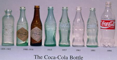
Different variations of the line of the bottle were used up until 1916. Known worldwide contour Coca-Cola bottle was invented in 1915 as a means of protection against counterfeiting. Coca-Cola Company announced among the suppliers of glass bottles for packaging competition, which would clearly be different from all the others. It had to be this bottle, "that man would be able to recognize in the dark by feel, and if it razobet, it could be immediately found in fragments».
In 1977, the contour bottle was registered as a trademark of The Coca-Cola Company, along with signs of «Coca-Cola» and «Coke».
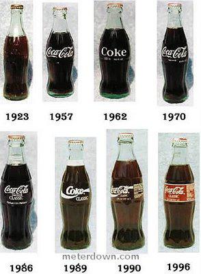
In 1960, the company began to pour their drinks in cans, previously intended only for the army. And since 1977 in plastic PET bottles with a capacity of 2 liters.
Since experiments with packaging has become an integral part of the brand image. Coca-Cola is an annual participant and the winner of the international contest of packaging design Pentawards Awards.
Apart from the traditional variety of material - glass, aluminum cans, plastic bottles - from Coca-Cola there are many concepts and limited edition package, dedicated to a particular event.
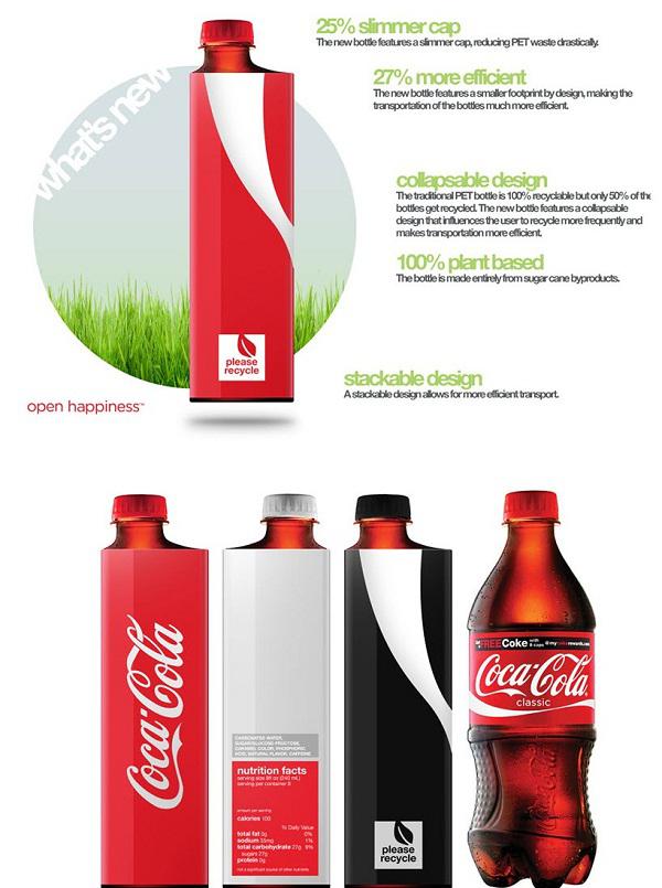
KontseptyPoka Giants producers of soft drinks are thinking about how to make their packaging more environmentally friendly, American 18-year-old student Andrew Kim solved this problem with its simple but ingenious concept. In his view, it makes sense to replace the classic bottle of Coca-Cola (and eventually other companies) foldable prototypes square osnovaniem.Chto it will give? Firstly, according to Kim, after use the bottle can be compressed, making it less than 66% complete. The bottom of a container will be done with a recess for another bottle cork - so they can be tightly packed and save space during transportation. The project of the student, such packaging will be made from 100% natural substances remaining after refining cane.

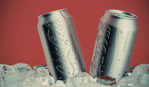
Coca-Cola - a classic example of the cult brand that can be found on the taste, color, smell and sound. Imagine for a moment that the bank will be ... a colorless cola. Will it be less recognizable? This question has offered its original response to the New York designer Hark Lee (Harc Lee) .Seraya aluminum cans with embossed logo is recognizable looks are not dull, as it might seem at first glance. Moreover, as noted by the creator of the concept, a gray bank without colorful prints - a more "advanced" nonpolluting upakovka.Vo First, the rejection of color printing saves energy (matter acquires a high priority at the state level in the developed world). Secondly, the process of recycling aluminum packaging unsealed becomes less toxic, which is also attributed to the unquestionable advantages of the concept.

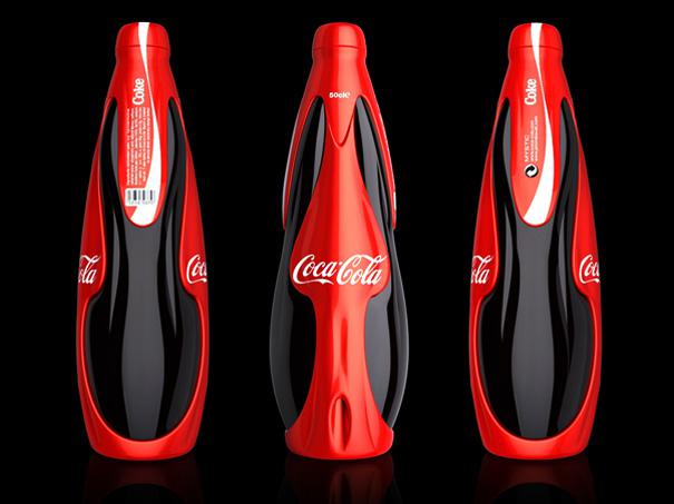
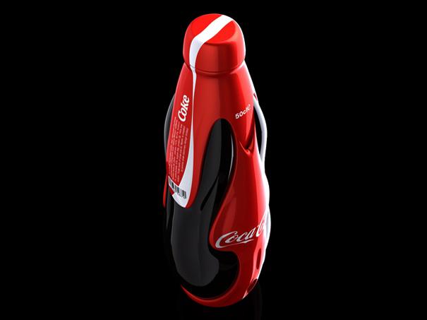
The designer Jerome Olivet created an interesting packaging Coca-Cola called «Mystic» / «The Mystic". Concept is a futuristic look at a normal plastic bottle.

Bank
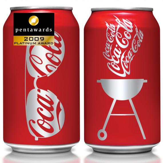
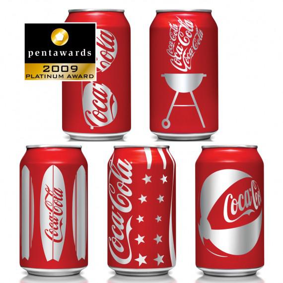
Coca-Cola has produced a design of old cans of its famous drink. Packages banks remained traditional red, but they have caused new figures: beach ball, sunglasses, the US flag, windsurf board and outdoor grill. Packaging won second place and the title of "Best in category Drinks" at the international competition of packaging design.
Pentaward 2009.
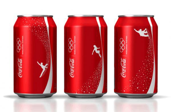
A similar series was made for winter. Packaging is dedicated to the Olympic Games in Vancouver 2010. Banks Coca-Cola decorated Olympic symbols and images of the most popular winter sports - snowboarding, skating and other.
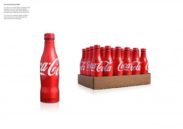
The original packaging of the studio Turner Duckworth is a symbiosis of classic glass bottles and aluminum cans today. The company joins Budweiser, PepsiCo and few other producers of beverages, which are already tested this type of packaging. Aluminum bottle has a number of advantages over glass: firstly, more opportunities for graphic design, and secondly, the visual effect of cold bottles, thirdly, the aluminum content in the container is heated more slowly than in glass. There are drawbacks: aluminum bottle more expensive.
Plastic packaging
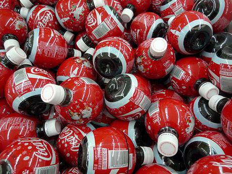
Especially for Christmas Coca-Cola Company is traditionally produced in limited series of carbonated beverage bottles in the shape of Christmas tree balls.

Bottle
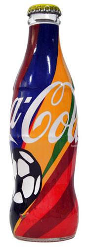
In Saudi Arabia, the Coca Cola Company has released a limited edition dedicated to the World Cup 2010. The design of the glass bottles used corporate colors World Cup.
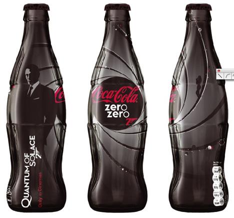
At the threshold of the new Bond movie "Quantum of consolation» (Quantum of Solace) in 2008, Coca-Cola launched in the UK drink bottles in black.
In the style of fashion
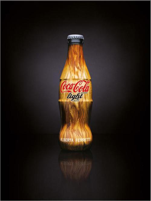
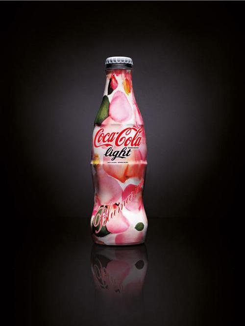
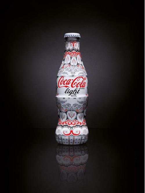
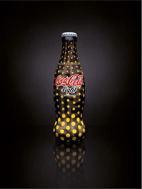
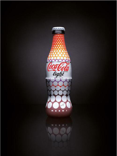
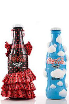
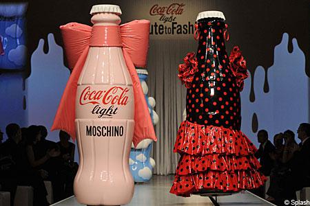
In 2009, the Fashion Week in Milan, 8 female Italian designers presented on 4 different copyright labels Coca-Cola Light. His options are copyright packages presented Donatella Versace (Versace), Alberta Ferretti (Ferretti), Anna Molinari (Blumarine), Veronica Etro (Etro), Silvia Venturini Fendi (Fendi), Consuelo Castiglioni (Marni), Angela Missoni (Missoni) and Rossella Jardini (Moschino).
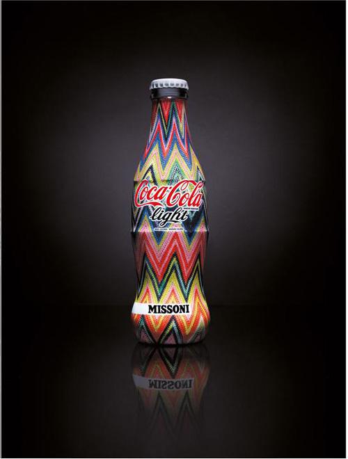

On the show giant bottles themselves took to the podium to a song by Charles Aznavour (Charles Aznavour) «You Are The One For Me» («You are my only»).
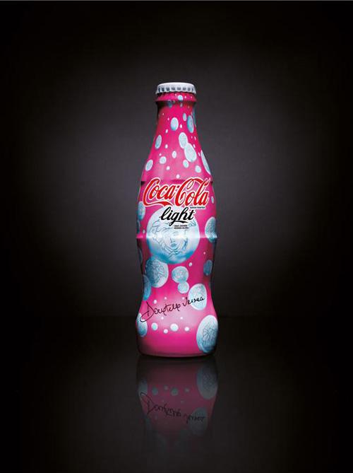
In 2008, in cooperation Coca-Cola with a stylist and designer Patricia Field was released four catchy and bold design options for the original glass bottles of Diet Coke, which express the bitchiness urban style of the modern woman and give the brand Diet Coke special expressiveness and mood.
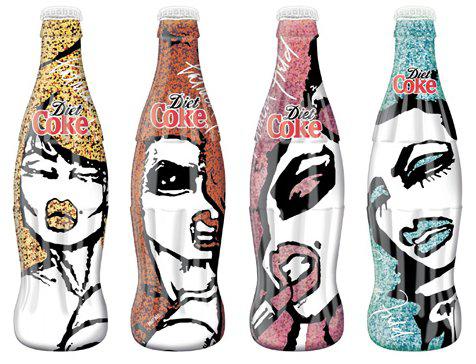
Patricia Field has explained that the new exclusive «Diet Coke City Collection» is focused on independent, confident, sexy, glamorous women, and represents the 4th most important areas of their lives: the golden bottle - "career" red - "passion", pink - "love" Blue - "fashion».
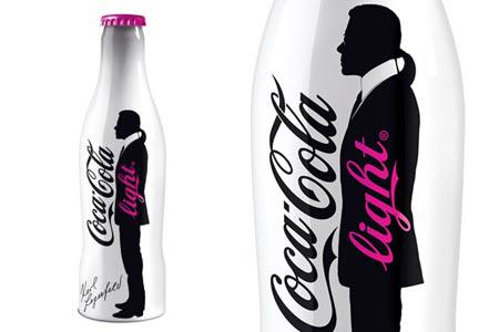
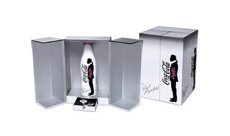
The famous fashion designer Karl Lagerfeld (Karl Lagerfeld) has created this year's design for the aluminum bottle Coca Cola Light. Designer depicted on the bottle its unmistakable silhouette, as well as put the bottle in the box that will be released in limited edition. In addition to the special bottle opener is applied, prudently placed in the drawer pulls.
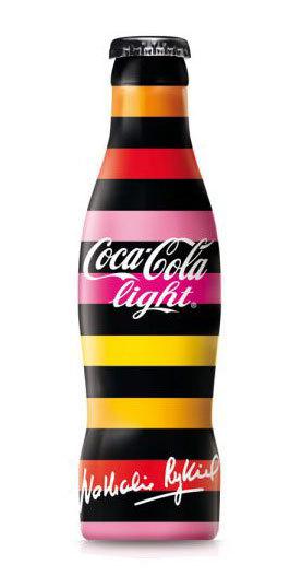
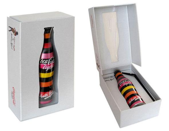
Coca-Cola light by Nathalie Rykiel
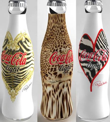
Design bottles Coca-Cola in the African style of Roberto Cavalli
The design of the aluminum bottle of Manolo Blahnik

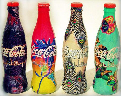
Collectible Four by designer Matthew Williamson
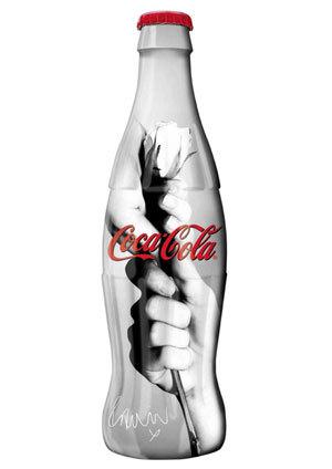
Limited Edition by photographer Rankin
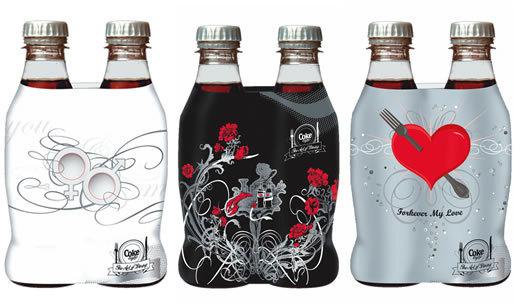
Coca-Cola for lovers of designers Amphion
David Butler (David Butler), Global Design Director, Coca-Cola, - a design policy of Coca-Cola: «In terms of philosophy in our work, we focus on four fundamental principles - simplicity, speed, scale and synergies».
"Sometimes people ask me whether it is good packaging. And I ask in return - whether it helps to sell? Whether it increases sales, and our value? If so, fine. It's good for business. It's not an art contest. And the meaning is not a unique vision of the designer. The idea is to create maximum value for the business ».
"The meaning of design for us first of all to make things better. Make it better - it means to improve the performance of our company, reduce investment and increase sales in the market. So we have a lot of very clear objectives related to sustainable development and the performance of our company. And for these purposes, we use design ».
See also the theme: A blanket advertising Coca Cola the first half of the XX vekaVintazhnaya packaging
via / kreativnyj-obzor / vintazhnaya-upakovka-161055 /
History packaging
Until 1894 Coca-Cola was sold to bottling. Then the owner of a company that has established in his shop equipment for bottling Coca-Cola in the bottle. The drink was dispensed in a conventional glass bottle, which was called Hutchinson (in honor of the developer). And in 1899 he built the first factory for bottling carbonated beverages. But only 29 years later, sales volumes The Coca-Cola bottles exceeded sales "on tap».

Different variations of the line of the bottle were used up until 1916. Known worldwide contour Coca-Cola bottle was invented in 1915 as a means of protection against counterfeiting. Coca-Cola Company announced among the suppliers of glass bottles for packaging competition, which would clearly be different from all the others. It had to be this bottle, "that man would be able to recognize in the dark by feel, and if it razobet, it could be immediately found in fragments».
In 1977, the contour bottle was registered as a trademark of The Coca-Cola Company, along with signs of «Coca-Cola» and «Coke».

In 1960, the company began to pour their drinks in cans, previously intended only for the army. And since 1977 in plastic PET bottles with a capacity of 2 liters.

Since experiments with packaging has become an integral part of the brand image. Coca-Cola is an annual participant and the winner of the international contest of packaging design Pentawards Awards.
Apart from the traditional variety of material - glass, aluminum cans, plastic bottles - from Coca-Cola there are many concepts and limited edition package, dedicated to a particular event.
KontseptyPoka Giants producers of soft drinks are thinking about how to make their packaging more environmentally friendly, American 18-year-old student Andrew Kim solved this problem with its simple but ingenious concept. In his view, it makes sense to replace the classic bottle of Coca-Cola (and eventually other companies) foldable prototypes square osnovaniem.Chto it will give? Firstly, according to Kim, after use the bottle can be compressed, making it less than 66% complete. The bottom of a container will be done with a recess for another bottle cork - so they can be tightly packed and save space during transportation. The project of the student, such packaging will be made from 100% natural substances remaining after refining cane.


Coca-Cola - a classic example of the cult brand that can be found on the taste, color, smell and sound. Imagine for a moment that the bank will be ... a colorless cola. Will it be less recognizable? This question has offered its original response to the New York designer Hark Lee (Harc Lee) .Seraya aluminum cans with embossed logo is recognizable looks are not dull, as it might seem at first glance. Moreover, as noted by the creator of the concept, a gray bank without colorful prints - a more "advanced" nonpolluting upakovka.Vo First, the rejection of color printing saves energy (matter acquires a high priority at the state level in the developed world). Secondly, the process of recycling aluminum packaging unsealed becomes less toxic, which is also attributed to the unquestionable advantages of the concept.


The designer Jerome Olivet created an interesting packaging Coca-Cola called «Mystic» / «The Mystic". Concept is a futuristic look at a normal plastic bottle.


Bank
Coca-Cola has produced a design of old cans of its famous drink. Packages banks remained traditional red, but they have caused new figures: beach ball, sunglasses, the US flag, windsurf board and outdoor grill. Packaging won second place and the title of "Best in category Drinks" at the international competition of packaging design.
Pentaward 2009.


A similar series was made for winter. Packaging is dedicated to the Olympic Games in Vancouver 2010. Banks Coca-Cola decorated Olympic symbols and images of the most popular winter sports - snowboarding, skating and other.

The original packaging of the studio Turner Duckworth is a symbiosis of classic glass bottles and aluminum cans today. The company joins Budweiser, PepsiCo and few other producers of beverages, which are already tested this type of packaging. Aluminum bottle has a number of advantages over glass: firstly, more opportunities for graphic design, and secondly, the visual effect of cold bottles, thirdly, the aluminum content in the container is heated more slowly than in glass. There are drawbacks: aluminum bottle more expensive.

Plastic packaging
Especially for Christmas Coca-Cola Company is traditionally produced in limited series of carbonated beverage bottles in the shape of Christmas tree balls.


Bottle
In Saudi Arabia, the Coca Cola Company has released a limited edition dedicated to the World Cup 2010. The design of the glass bottles used corporate colors World Cup.

At the threshold of the new Bond movie "Quantum of consolation» (Quantum of Solace) in 2008, Coca-Cola launched in the UK drink bottles in black.

In the style of fashion
In 2009, the Fashion Week in Milan, 8 female Italian designers presented on 4 different copyright labels Coca-Cola Light. His options are copyright packages presented Donatella Versace (Versace), Alberta Ferretti (Ferretti), Anna Molinari (Blumarine), Veronica Etro (Etro), Silvia Venturini Fendi (Fendi), Consuelo Castiglioni (Marni), Angela Missoni (Missoni) and Rossella Jardini (Moschino).


On the show giant bottles themselves took to the podium to a song by Charles Aznavour (Charles Aznavour) «You Are The One For Me» («You are my only»).


In 2008, in cooperation Coca-Cola with a stylist and designer Patricia Field was released four catchy and bold design options for the original glass bottles of Diet Coke, which express the bitchiness urban style of the modern woman and give the brand Diet Coke special expressiveness and mood.

Patricia Field has explained that the new exclusive «Diet Coke City Collection» is focused on independent, confident, sexy, glamorous women, and represents the 4th most important areas of their lives: the golden bottle - "career" red - "passion", pink - "love" Blue - "fashion».
The famous fashion designer Karl Lagerfeld (Karl Lagerfeld) has created this year's design for the aluminum bottle Coca Cola Light. Designer depicted on the bottle its unmistakable silhouette, as well as put the bottle in the box that will be released in limited edition. In addition to the special bottle opener is applied, prudently placed in the drawer pulls.


Coca-Cola light by Nathalie Rykiel


Design bottles Coca-Cola in the African style of Roberto Cavalli

The design of the aluminum bottle of Manolo Blahnik

Collectible Four by designer Matthew Williamson

Limited Edition by photographer Rankin

Coca-Cola for lovers of designers Amphion

David Butler (David Butler), Global Design Director, Coca-Cola, - a design policy of Coca-Cola: «In terms of philosophy in our work, we focus on four fundamental principles - simplicity, speed, scale and synergies».
"Sometimes people ask me whether it is good packaging. And I ask in return - whether it helps to sell? Whether it increases sales, and our value? If so, fine. It's good for business. It's not an art contest. And the meaning is not a unique vision of the designer. The idea is to create maximum value for the business ».
"The meaning of design for us first of all to make things better. Make it better - it means to improve the performance of our company, reduce investment and increase sales in the market. So we have a lot of very clear objectives related to sustainable development and the performance of our company. And for these purposes, we use design ».
See also the theme: A blanket advertising Coca Cola the first half of the XX vekaVintazhnaya packaging
via / kreativnyj-obzor / vintazhnaya-upakovka-161055 /
Tags
See also
Marketing Steve Jobs
Brand Story Heinz. Fine red advertising
History of personal computers in the advertisement. Part 3: The 1990s
Stories of great logos
McDonalds: the years of successful advertising
Creative Billboards
Evolution of logos megabrendov
History headphones
Great names by non-professionals
Chapter TBWA told what's going on in advertising