Green - is the new black
 Bashny.Net
BBDO Branding Site and begin a series of articles devoted to the significance of color in color brendinge.O brands in life and the importance of their role has been said enough - we decided to restore justice. The first material of tsvetobrendinge - the spring and summer, the most natural, eco-friendly, natural and fresh. He on the green
Let's try to systematize the causes of treatment to green branding on the example of famous and interesting brands from around the globe. Of course, all these reasons are without foundation: cultural, historical, natural, technical, language and access to these reasons, it would be interesting and useful.
At first, the basic facts, stereotypes and associations related to green:
Green is widely distributed in nature, thanks to chlorophyll - the pigment, with the assistance of which the process of photosynthesis. We used to see trees, grass green. Hence, the following associations: nature, ecology, naturalness, growth, renewal, freshness. It is believed that green calms the nervous system, as It is in the middle of the visible spectrum and almost never causes irritation: its perception requires minimal human effort. Hence, the following associations: peace of mind, security, openness, resolution. green - the color of the US currency. This color label was fixed before the release of the first dollar bills due to non-interest bearing promissory notes, which were also green and were called greenback. Hence, the following associations: money, finance. green - the color of Islam, and the national color of Ireland and its patron Sv.Patrika. Hence, the following associations: Islam and Muslim countries, as well as the Republic, Ireland, CB. Patrick clover. Countries such as New Zealand, Italy and Brazil are also often associated with the color green. Australia generally considered to be "green" continent.
Of course, there are other reasons that may depend on the cultural and historical features, the natural component or linguistic characteristics of individual regions. Do not forget about the personal preferences of the client and, of course, marketing.
We broke into groups of examples, based on the causes of the green color in the corporate style.
NAMING, creativity KONTsEPTsIYaLacoste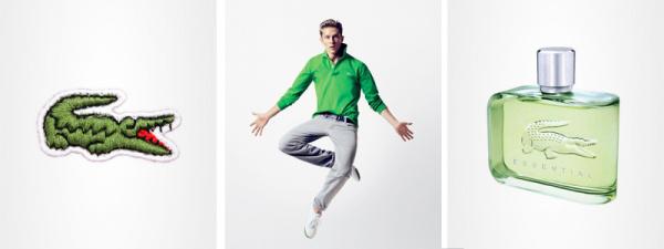
The famous French tennis player Rene Lacoste, nicknamed "alligator" after he made a bet on a suitcase made from crocodile leather. Lacoste is known not only for its sporting success on the tennis court, but that has revolutionized tennis players in the locker room, on the court appearing in the jacket of the new sample, known to us now as a polo. After Lacoste retired from tennis, he founded La Chemise Lacoste, the production of the most revolutionary polo shirts, which became a symbol of a green crocodile. Here the color of the brand is justified this way.
Green perekrestok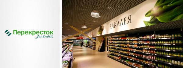
In September 2008, all known network of shops "Crossroads" otkryla first store under the premium brand "Green Crossing". The decor stores familiar blue-and-white coloring gave way to green tones - there is a strong bunch of naming and colors.
Kiwi bank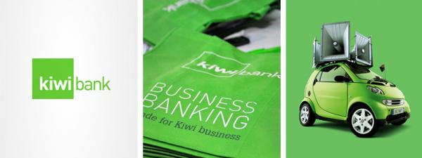
Cimpatichny New Zealand Kiwi Bank is known for its creative solutions, as well as an extremely extensive use of the color green. Indeed, this is New Zealand and kiwi.
Natural (ENVIRONMENT)
Garnier, The body shop, Animal planet
If cosmetic logos Garnier and The Body Shop all clear from the outset (natural cosmetics, unity with nature, and so on. N.), Animal Planet and to rebrand was green (and some even have the logo of the channel about the animal world?), Then with BP and ABC taste, it makes sense to understand a little more detail.
BP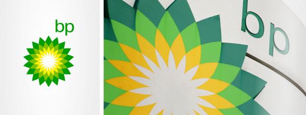
This brand has become a green-yellow, long before the advent of modern character - flower Helios, recall that c 1989 and 2002 logo was a green shield with a yellow abbreviation. The company is known for its social initiatives, however, are of the opinion that all this together with the "eco-friendly" corporate style just an excuse and cover for "dirty" activities of the largest oil and gas company.
Alphabet vkusa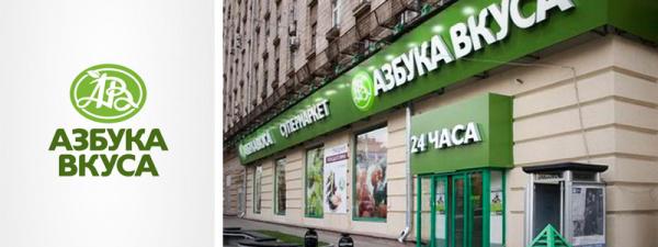
One signature style network acquired in 2002, thanks to the efforts of SCG London. It should be noted that the company operates in the premium segment has gone on quite risky step, the selected primary color green. However, the risk was justified and, in a few years, will follow suit, even competitors. The company is known for his collaboration with the World Wildlife Fund (WWF), which continues in 2004, the basic idea which - enable any person to make our planet a little cleaner and thus preserve it for their children and grandchildren. Customers can network instead of the free
plastic bag ekopaket buy paper that is easily decomposed and does not harm the environment.
I Feel Slovenia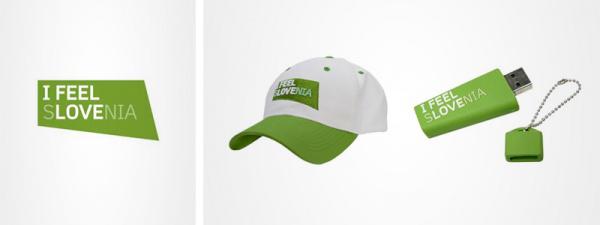
In 2008, Slovenia presented its tourist brand - I Feel Slovenia. Marjan Hribar, director of the Tourist Board of Slovenia, at the presentation noted that the green symbolizes how cpokoyny nature of the inhabitants of Slovenia, and the marvelous nature of the region. We can add that the forests cover almost half of the area of Slovenia - Slovenia is one of the "forest" Country Europe.
Skoda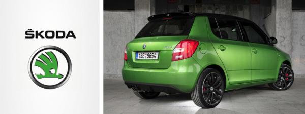
On the topic of green in the logo and communications Skoda have a contradiction: on the one hand, the company claims that the green in the logo symbolizes the environmental (ie: production without harm to the environment, environmental protection, recycling of materials), on the other hand, green in the logo (until 1990, the logo was blue) appeared after the company came under the wing of the Volkswagen Audi Group, in which the blue logo has itself Volkswagen, so that the marketing background, in our opinion, was the place to be.
Corporate green can be seen not only in the logo and advertising communications, but also on the cars themselves - Green Rally is available in the sports line RS (pictured Skoda Fabia RS).
FRESH
Refreshing napitki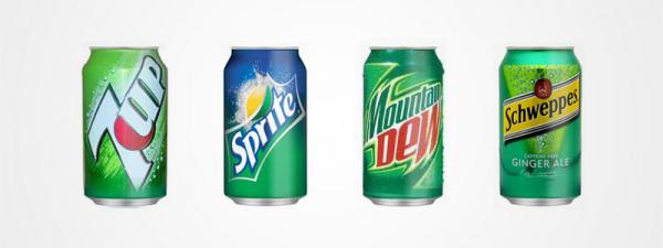
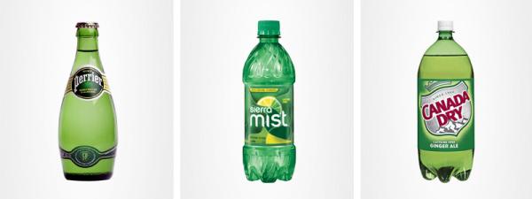

Green is one of the dominant sector of soft drinks. If the premium segment Perrier looks more like an exception, the citrus-ginger group of green packaging - an unambiguous trend. Unfortunately ginger ales by Schweppes and Evervess not often found on the shelves of local supermarkets, not to mention the Canada Dry or Sierra Mist, but can be found Laimon fresh.
Mint / mentol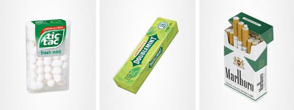
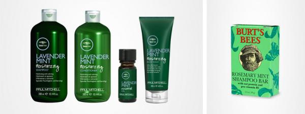
Green is also the identifier presence peppermint / menthol in a product, whether cigarettes, candy, chewing gum or shampoo.
FINANSY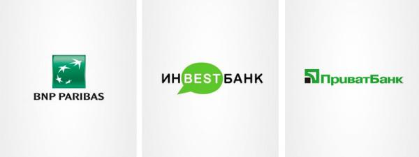
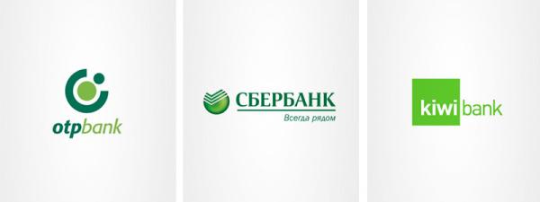
Just above, we wrote about-established thanks to the color of dollar bills associative bundle "money green" and therefore find more than a dozen banks, painted in green, you can only smile wryly. And really - the perfect color for banks: here and tranquility (your money is in safe hands repositories) and growth (associative bunch of "planted - cultivated - has blossomed - bore fruit") and, of course, referring to the most recognized currency - US dollars. Already for the power offensively ...
Cultural and historical aspects
IslamKak we have already mentioned above, the green color - the sacred in Islam: the symbol of paradise gardens, youth and fertility. Rumor has it that some Muslim rigorists would prohibit the use of green carpet, to stepping on them, do not insult the honor and dignity of Islam.

Given the above, the abundance of green in the Islamic world is easily explained since flags, ending brendami.Nizhe presents interesting 'green' brands of Islamic countries:
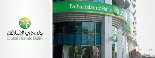
Dubai Islamic Bank - established in 1975, became the first bank, including the principles of Islam in the areas of its operation, is the largest Islamic bank in the UAE.

Etisalat - telecommunications provider headquartered in Abu Dhabi, United Arab Emirates

Nasair - young airline (founded in 2007) from Saudi Arabia
By the way, do not forget about the nearest neighbors: the same Tatarstan very prolific on the green brands - Tatneft, hockey club Ak Bars, chain selling home appliances and electronics Domo and many others ... In Tatarstan, almost everything is green.
Pula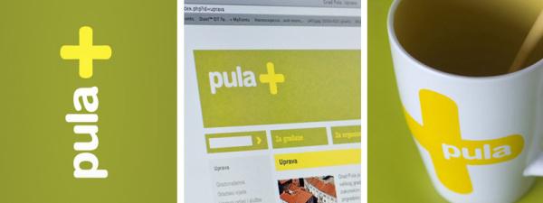
Ironically, the countries of brands and urban brands, built on the rule of green is very small, the feeling that customers almost always want to get something multitsvetnoe and nobody wants to be associated with ecology and greenery. The only exceptions are mentioned tourist brand of Slovenia and the small Croatian town of Pula.
In the case of Pula, in the presence of green corporate style is due to the continuity of the flag and emblem of the city (historically it was a yellow cross on a green background), but it is worth to pay tribute to the designers of Parabureau - topic yellow cross on a green background revealed wonderful!
Boston celtics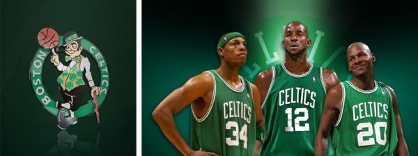
One of the oldest basketball clubs US, 17 times champion of the NBA. The famous Leprechaun logo that was painted in the early 50s and the green form, dictated by ethnic
Boston composition of those years - the city was densely populated by Irish immigrants, and green, as you know, the national color of Ireland.
It is worth mentioning the regular cooperation of the club and the company Adidas: green model of sneakers dedicated Celtics, has repeatedly come out in the context of NBA-series, and separately:
Differentiation from competitors
European breweries kompaniiNa green beer shelves also plays a role: The Dutch Heineken and Grolsch, the Danish Carlsberg and Tuborg green, Austrian Gosser, and that's not to mention the niche and local products: Klin, Green beer and so forth.
The primacy of the green from these brands is closely related to the color of bottle glass. However, it found that the bottle of a dark brown glass transmits less light and thus better maintain the beer. So why is the leading European manufacturers use green glass? There is a clear marketing background, as beer bottles brown glass galore, and how different it is necessary. However, some sources (close to the world of brewing) say that after the Second World War in Europe was a shortage of brown glass and European breweries began to massively use green glass and, as we see, have kept this tradition to this day.
S7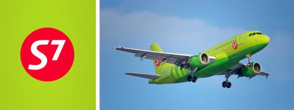
S7 - one of the most prominent airlines on runways around the world. His style green Siberians obliged Landor - one of the best titles of agencies in the field of branding. The bright color scheme makes the aircraft S7 Unlike a lot of blue-blue air carriers - airplanes of this airline are clearly visible at any airport and delight the eye with their juicy and bright color in any weather, especially in the snow. It is not known whether the creators thought corporate identity that would look like a plane on a background of snowy expanses of Siberia, but the result was excellent.
MegaFon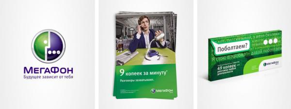
MegaFon is the greenest mobile operator without reason: at the time the green has helped the brand to check out from its main competitors - the blue-yellow Beeline (up to 2005) and yellow mts'a (up to 2006), and at the moment, perfectly conveys the green innovation ( greens - fresh - innovation) and the pioneering spirit of the company pledged to the mission of the brand.
Intouch
Color brand Intouch was just "calculate" Green was chosen due to the fact that the conclusions of a new brand in the insurance market, would stake a claim for a including color gamut, and green are suitable for this most of all, because it was not major federal players.
JUST GREENV this group we have assembled the famous brands that are green for uncertain reasons: someone Historically, someone - at the time the logo is evident stylistic preferences of business owners. Unfortunately, not all the information is open and not all sources can be trusted, and therefore we assume that the relationship with the brands listed below, we keep a touch of intrigue.
And in the end: the one who will answer the question "why Starbucks logo and Benetton green?", A special prize from BBDO Branding and Starbucks!
Continued: My Name is Red Michael Gubergrits, Yuri Lebedev
BBDO Branding for Website
via www.adme.ru/articles/menya-zovut-krasnyj-bbdo-branding-283305/
Let's try to systematize the causes of treatment to green branding on the example of famous and interesting brands from around the globe. Of course, all these reasons are without foundation: cultural, historical, natural, technical, language and access to these reasons, it would be interesting and useful.
At first, the basic facts, stereotypes and associations related to green:
Green is widely distributed in nature, thanks to chlorophyll - the pigment, with the assistance of which the process of photosynthesis. We used to see trees, grass green. Hence, the following associations: nature, ecology, naturalness, growth, renewal, freshness. It is believed that green calms the nervous system, as It is in the middle of the visible spectrum and almost never causes irritation: its perception requires minimal human effort. Hence, the following associations: peace of mind, security, openness, resolution. green - the color of the US currency. This color label was fixed before the release of the first dollar bills due to non-interest bearing promissory notes, which were also green and were called greenback. Hence, the following associations: money, finance. green - the color of Islam, and the national color of Ireland and its patron Sv.Patrika. Hence, the following associations: Islam and Muslim countries, as well as the Republic, Ireland, CB. Patrick clover. Countries such as New Zealand, Italy and Brazil are also often associated with the color green. Australia generally considered to be "green" continent.
Of course, there are other reasons that may depend on the cultural and historical features, the natural component or linguistic characteristics of individual regions. Do not forget about the personal preferences of the client and, of course, marketing.
We broke into groups of examples, based on the causes of the green color in the corporate style.
NAMING, creativity KONTsEPTsIYaLacoste

The famous French tennis player Rene Lacoste, nicknamed "alligator" after he made a bet on a suitcase made from crocodile leather. Lacoste is known not only for its sporting success on the tennis court, but that has revolutionized tennis players in the locker room, on the court appearing in the jacket of the new sample, known to us now as a polo. After Lacoste retired from tennis, he founded La Chemise Lacoste, the production of the most revolutionary polo shirts, which became a symbol of a green crocodile. Here the color of the brand is justified this way.
Green perekrestok

In September 2008, all known network of shops "Crossroads" otkryla first store under the premium brand "Green Crossing". The decor stores familiar blue-and-white coloring gave way to green tones - there is a strong bunch of naming and colors.
Kiwi bank

Cimpatichny New Zealand Kiwi Bank is known for its creative solutions, as well as an extremely extensive use of the color green. Indeed, this is New Zealand and kiwi.
Natural (ENVIRONMENT)
Garnier, The body shop, Animal planet

If cosmetic logos Garnier and The Body Shop all clear from the outset (natural cosmetics, unity with nature, and so on. N.), Animal Planet and to rebrand was green (and some even have the logo of the channel about the animal world?), Then with BP and ABC taste, it makes sense to understand a little more detail.
BP

This brand has become a green-yellow, long before the advent of modern character - flower Helios, recall that c 1989 and 2002 logo was a green shield with a yellow abbreviation. The company is known for its social initiatives, however, are of the opinion that all this together with the "eco-friendly" corporate style just an excuse and cover for "dirty" activities of the largest oil and gas company.
Alphabet vkusa

One signature style network acquired in 2002, thanks to the efforts of SCG London. It should be noted that the company operates in the premium segment has gone on quite risky step, the selected primary color green. However, the risk was justified and, in a few years, will follow suit, even competitors. The company is known for his collaboration with the World Wildlife Fund (WWF), which continues in 2004, the basic idea which - enable any person to make our planet a little cleaner and thus preserve it for their children and grandchildren. Customers can network instead of the free
plastic bag ekopaket buy paper that is easily decomposed and does not harm the environment.
I Feel Slovenia

In 2008, Slovenia presented its tourist brand - I Feel Slovenia. Marjan Hribar, director of the Tourist Board of Slovenia, at the presentation noted that the green symbolizes how cpokoyny nature of the inhabitants of Slovenia, and the marvelous nature of the region. We can add that the forests cover almost half of the area of Slovenia - Slovenia is one of the "forest" Country Europe.
Skoda

On the topic of green in the logo and communications Skoda have a contradiction: on the one hand, the company claims that the green in the logo symbolizes the environmental (ie: production without harm to the environment, environmental protection, recycling of materials), on the other hand, green in the logo (until 1990, the logo was blue) appeared after the company came under the wing of the Volkswagen Audi Group, in which the blue logo has itself Volkswagen, so that the marketing background, in our opinion, was the place to be.
Corporate green can be seen not only in the logo and advertising communications, but also on the cars themselves - Green Rally is available in the sports line RS (pictured Skoda Fabia RS).
FRESH
Refreshing napitki


Green is one of the dominant sector of soft drinks. If the premium segment Perrier looks more like an exception, the citrus-ginger group of green packaging - an unambiguous trend. Unfortunately ginger ales by Schweppes and Evervess not often found on the shelves of local supermarkets, not to mention the Canada Dry or Sierra Mist, but can be found Laimon fresh.
Mint / mentol


Green is also the identifier presence peppermint / menthol in a product, whether cigarettes, candy, chewing gum or shampoo.
FINANSY


Just above, we wrote about-established thanks to the color of dollar bills associative bundle "money green" and therefore find more than a dozen banks, painted in green, you can only smile wryly. And really - the perfect color for banks: here and tranquility (your money is in safe hands repositories) and growth (associative bunch of "planted - cultivated - has blossomed - bore fruit") and, of course, referring to the most recognized currency - US dollars. Already for the power offensively ...
Cultural and historical aspects
IslamKak we have already mentioned above, the green color - the sacred in Islam: the symbol of paradise gardens, youth and fertility. Rumor has it that some Muslim rigorists would prohibit the use of green carpet, to stepping on them, do not insult the honor and dignity of Islam.

Given the above, the abundance of green in the Islamic world is easily explained since flags, ending brendami.Nizhe presents interesting 'green' brands of Islamic countries:

Dubai Islamic Bank - established in 1975, became the first bank, including the principles of Islam in the areas of its operation, is the largest Islamic bank in the UAE.

Etisalat - telecommunications provider headquartered in Abu Dhabi, United Arab Emirates

Nasair - young airline (founded in 2007) from Saudi Arabia
By the way, do not forget about the nearest neighbors: the same Tatarstan very prolific on the green brands - Tatneft, hockey club Ak Bars, chain selling home appliances and electronics Domo and many others ... In Tatarstan, almost everything is green.
Pula

Ironically, the countries of brands and urban brands, built on the rule of green is very small, the feeling that customers almost always want to get something multitsvetnoe and nobody wants to be associated with ecology and greenery. The only exceptions are mentioned tourist brand of Slovenia and the small Croatian town of Pula.
In the case of Pula, in the presence of green corporate style is due to the continuity of the flag and emblem of the city (historically it was a yellow cross on a green background), but it is worth to pay tribute to the designers of Parabureau - topic yellow cross on a green background revealed wonderful!
Boston celtics

One of the oldest basketball clubs US, 17 times champion of the NBA. The famous Leprechaun logo that was painted in the early 50s and the green form, dictated by ethnic
Boston composition of those years - the city was densely populated by Irish immigrants, and green, as you know, the national color of Ireland.
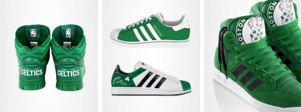
It is worth mentioning the regular cooperation of the club and the company Adidas: green model of sneakers dedicated Celtics, has repeatedly come out in the context of NBA-series, and separately:


Differentiation from competitors
European breweries kompaniiNa green beer shelves also plays a role: The Dutch Heineken and Grolsch, the Danish Carlsberg and Tuborg green, Austrian Gosser, and that's not to mention the niche and local products: Klin, Green beer and so forth.
The primacy of the green from these brands is closely related to the color of bottle glass. However, it found that the bottle of a dark brown glass transmits less light and thus better maintain the beer. So why is the leading European manufacturers use green glass? There is a clear marketing background, as beer bottles brown glass galore, and how different it is necessary. However, some sources (close to the world of brewing) say that after the Second World War in Europe was a shortage of brown glass and European breweries began to massively use green glass and, as we see, have kept this tradition to this day.
S7

S7 - one of the most prominent airlines on runways around the world. His style green Siberians obliged Landor - one of the best titles of agencies in the field of branding. The bright color scheme makes the aircraft S7 Unlike a lot of blue-blue air carriers - airplanes of this airline are clearly visible at any airport and delight the eye with their juicy and bright color in any weather, especially in the snow. It is not known whether the creators thought corporate identity that would look like a plane on a background of snowy expanses of Siberia, but the result was excellent.
MegaFon

MegaFon is the greenest mobile operator without reason: at the time the green has helped the brand to check out from its main competitors - the blue-yellow Beeline (up to 2005) and yellow mts'a (up to 2006), and at the moment, perfectly conveys the green innovation ( greens - fresh - innovation) and the pioneering spirit of the company pledged to the mission of the brand.
Intouch

Color brand Intouch was just "calculate" Green was chosen due to the fact that the conclusions of a new brand in the insurance market, would stake a claim for a including color gamut, and green are suitable for this most of all, because it was not major federal players.
JUST GREENV this group we have assembled the famous brands that are green for uncertain reasons: someone Historically, someone - at the time the logo is evident stylistic preferences of business owners. Unfortunately, not all the information is open and not all sources can be trusted, and therefore we assume that the relationship with the brands listed below, we keep a touch of intrigue.


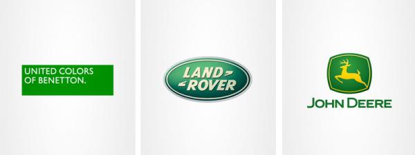
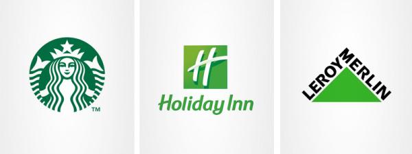
And in the end: the one who will answer the question "why Starbucks logo and Benetton green?", A special prize from BBDO Branding and Starbucks!
Continued: My Name is Red Michael Gubergrits, Yuri Lebedev
BBDO Branding for Website
via www.adme.ru/articles/menya-zovut-krasnyj-bbdo-branding-283305/
Tags
See also
Green Santa Claus in advertising chocolate Alenka
History car branding
Advertising Coca-Cola
On this latest earthquake map shows all earthquakes
Green roof or green roof - a new trend in modern arhitikture.
Rabbit Amy - a new world record
Expectation and reality. 15 wedding dress bought on the Internet. Such deception you have not seen!
Eye color can tell us about the state of human health. The findings, which no one expected!