15 well-known marks, the hidden meaning of which we had no idea
 Bashny.Net
It is always interesting to learn that the logos of our favorite companies carry a lot more than just the beauty and brevity. It turns out that almost every line, its length, thickness and color play a crucial role here.
Website has selected 15 logos that are recognized by the world. They laid the sense that we did not notice before.
Hyundai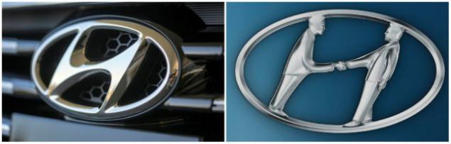
Many tend to think that the logo of the Korean conglomerate Hyundai - the first letter of its name, nothing more. In fact, the letter H represents two people shaking hands (one hand - the customer, the other - representative of the company).
Adidas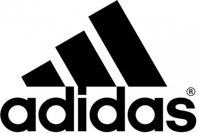
Network name sports Adidas store formed from the name of their founder Adolf Dassler. The logo has changed several times, but has always included a three strips. At the moment they are inclined to form a triangle - the mountain. It's a symbolic depiction of the obstacles that must be overcome all the athletes.
Apple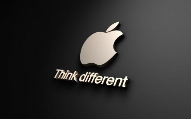
Rob Janov, the designer who invented the logo Apple: «I bought a whole bag of apples, put in a bowl and painted them a week, trying to simplify the details. Nibble on fruit was part of the experiment, and quite by accident bit em> (bite translates as "bite") turned out to be a computer term ».
Sony Vaio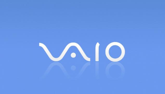
The first two letters of the logo Sony Vaio up wave symbolizing an analog signal, and the last two resemble 1 and 0 - symbols of the digital signal.
Amazon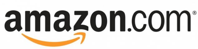
At first glance, the logo Amazon does not hide anything unusual, but it helps to understand the philosophy of the brand. Yellow arrow resembles a smile: Amazon.com want to make customers happy. Arrow also connects the letters A and Z, hinting that this store has everything - "from A to Z».
Baskin Robbins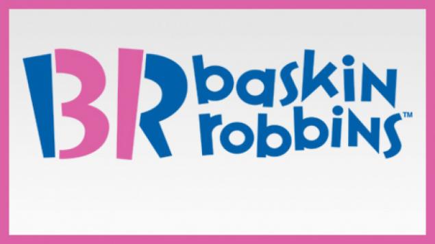
Pink part «BR» make up the number 31 - so much tastes historically had ice cream Baskin Robbins.
Toyota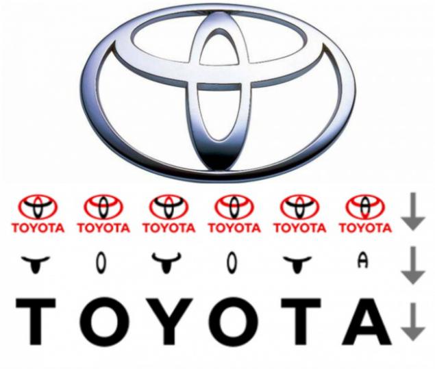
Many compare logo Japanese automaker Toyota's head in a cowboy hat. In fact, it is a stylized eye of a needle threaded with a thread in it. This kind of allusion to past company involved in its formation period looms. However, there is the logo and another little secret: its individual parts make up the letters of the word Toyota.
Continental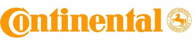
Continental - a manufacturer of tires. One of them can be seen in the first two letters that create the image of the wheel in the long term.
Formula 1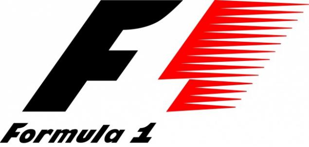
If you look at the empty space between the letter F and the red stripes, one can see the figure 1. The logo conveys a sense of speed.
Pinterest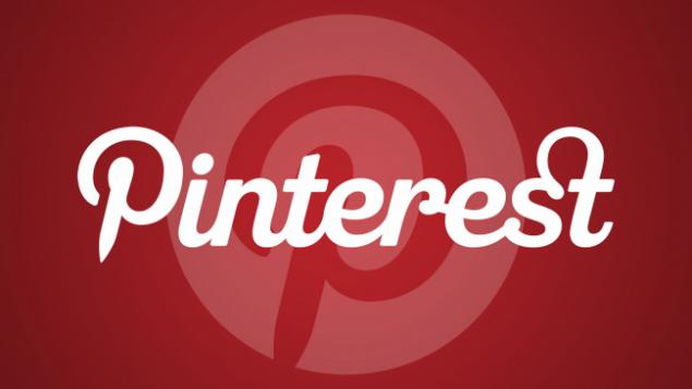
The logo of the popular Internet service Pinterest, where users can collect favorite images and "pinning" them to its online bulletin board, hidden needle. Look to the letter P - namely its sharp "leg" and the stylized needle.
Beats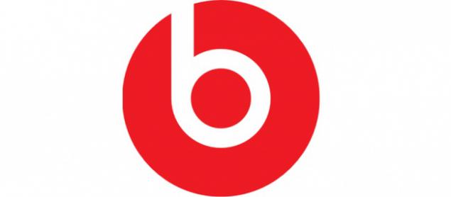
The letter B and the red circle of the logo of the American manufacturer of audio products are positioned as a person Beats headphones.
Toblerone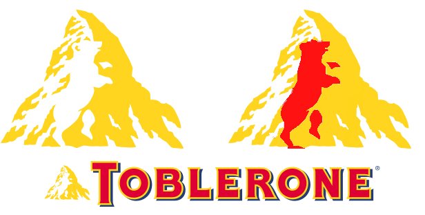
Toblerone - chocolate manufacturing company in the Swiss city of Bern. It is also called the city bears. That is why Toblerone included in your logo silhouette of this animal.
BMW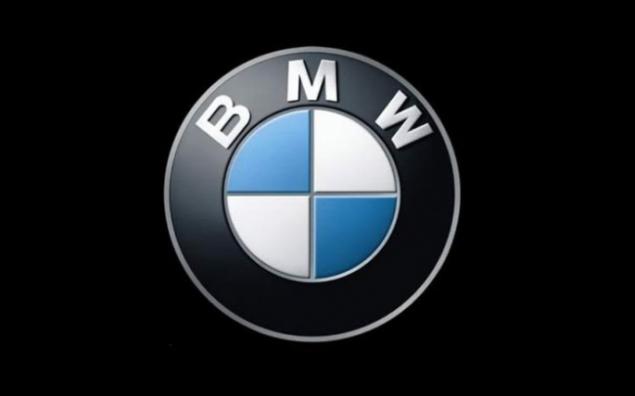
BMW history started with the aircraft, and the company logo remains true to its roots. Contrary to the opinion that the center of the logo BMW - is rotating screw blade, it is only a fragment of the flag of Bavaria, he had them in the box.
LG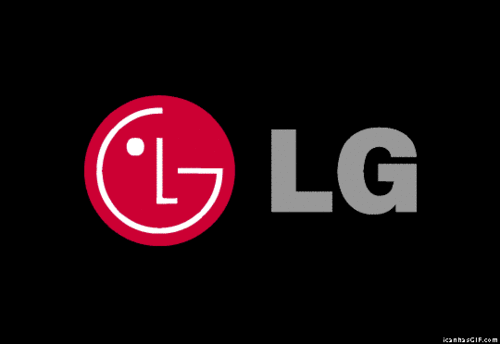
The main symbol of the logo of the South Korean electronics manufacturer LG - stylized face of a smiling man. According to the official description of the brand, the composition indicates a commitment to supporting "human" relationships with all customers.
At the same time on the network for many years now LG logo is compared with the face of the hero of the computer game Pac-Man.
Evernote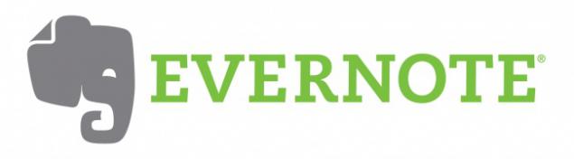
Elephants are known for exceptional memory. It is proved that these animals can remember the faces and events. That is why the logo of the service Evernote notes depicted elephant. And the corner of his ear bent, as they bend the corners of pages. With Evernote notes you will not forget anything.
Coca-Cola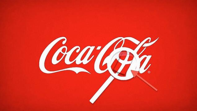
It's rare, but sometimes hidden meaning could be a coincidence. So, in the logo of Coca-Cola in the space between the letters D and L can notice the Danish flag. The company used it to his advantage during the campaign in Denmark.
via # image542210
Website has selected 15 logos that are recognized by the world. They laid the sense that we did not notice before.
Hyundai

Many tend to think that the logo of the Korean conglomerate Hyundai - the first letter of its name, nothing more. In fact, the letter H represents two people shaking hands (one hand - the customer, the other - representative of the company).
Adidas

Network name sports Adidas store formed from the name of their founder Adolf Dassler. The logo has changed several times, but has always included a three strips. At the moment they are inclined to form a triangle - the mountain. It's a symbolic depiction of the obstacles that must be overcome all the athletes.
Apple

Rob Janov, the designer who invented the logo Apple: «I bought a whole bag of apples, put in a bowl and painted them a week, trying to simplify the details. Nibble on fruit was part of the experiment, and quite by accident bit em> (bite translates as "bite") turned out to be a computer term ».
Sony Vaio

The first two letters of the logo Sony Vaio up wave symbolizing an analog signal, and the last two resemble 1 and 0 - symbols of the digital signal.
Amazon

At first glance, the logo Amazon does not hide anything unusual, but it helps to understand the philosophy of the brand. Yellow arrow resembles a smile: Amazon.com want to make customers happy. Arrow also connects the letters A and Z, hinting that this store has everything - "from A to Z».
Baskin Robbins

Pink part «BR» make up the number 31 - so much tastes historically had ice cream Baskin Robbins.
Toyota

Many compare logo Japanese automaker Toyota's head in a cowboy hat. In fact, it is a stylized eye of a needle threaded with a thread in it. This kind of allusion to past company involved in its formation period looms. However, there is the logo and another little secret: its individual parts make up the letters of the word Toyota.
Continental

Continental - a manufacturer of tires. One of them can be seen in the first two letters that create the image of the wheel in the long term.
Formula 1

If you look at the empty space between the letter F and the red stripes, one can see the figure 1. The logo conveys a sense of speed.

The logo of the popular Internet service Pinterest, where users can collect favorite images and "pinning" them to its online bulletin board, hidden needle. Look to the letter P - namely its sharp "leg" and the stylized needle.
Beats

The letter B and the red circle of the logo of the American manufacturer of audio products are positioned as a person Beats headphones.
Toblerone

Toblerone - chocolate manufacturing company in the Swiss city of Bern. It is also called the city bears. That is why Toblerone included in your logo silhouette of this animal.
BMW

BMW history started with the aircraft, and the company logo remains true to its roots. Contrary to the opinion that the center of the logo BMW - is rotating screw blade, it is only a fragment of the flag of Bavaria, he had them in the box.
LG

The main symbol of the logo of the South Korean electronics manufacturer LG - stylized face of a smiling man. According to the official description of the brand, the composition indicates a commitment to supporting "human" relationships with all customers.
At the same time on the network for many years now LG logo is compared with the face of the hero of the computer game Pac-Man.
Evernote

Elephants are known for exceptional memory. It is proved that these animals can remember the faces and events. That is why the logo of the service Evernote notes depicted elephant. And the corner of his ear bent, as they bend the corners of pages. With Evernote notes you will not forget anything.
Coca-Cola

It's rare, but sometimes hidden meaning could be a coincidence. So, in the logo of Coca-Cola in the space between the letters D and L can notice the Danish flag. The company used it to his advantage during the campaign in Denmark.
via # image542210
Tags
See also
Drinks again become personal
Bavaria knows how it ended in the video Heineken
Can trucks come tearing Cadbury to success? (updated)
How much are the famous logo (7 photos)
11 the mathematical techniques that You might use in life
Amy Adams, a red-haired fairy
Brilliant - this is forever
Multiply, divide, add, like Sheldon Cooper? Mathematical hacks...
The implication in the logos of well-known companies