Evolution of logos megabrendov
 Bashny.Net
You know that the Apple logo was not initially laconic apple and Newton sitting under an apple tree, and not made in engraving technique are simple? And the first Nokia logo was hideous fat fish? Watch the evolution of the famous brand logos - it is very entertaining, not devoid of humor and sarcasm. We think it's worth looking as was the case with identity for different companies at different times.
1. Adobe Systems
In 1982, forty years of programmers and Xerox John Warnock Charles Geschke suddenly resigned and formed a company to produce software. They named it Adobe, after the creek that flows behind the house Warnock. It is clear that John and Charles had to save on everything that does not go to the dogs, and do not leave the family destitute. Therefore, the logo they ordered not design bureau and asked to draw his wife Warnock - Marv.

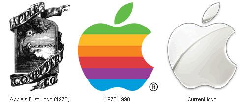
Apple Inc. A little known fact about a very well-known company - in 1976, Apple was founded not only the two Steve (Jobs and Wozniak) and Ronald one. Ronald Wayne has invested in the company 10% of the initial capital (800 dollars) and came up with the first logo for the company - it was shild with Newton sitting under an apple tree. Sign of twine almost heraldic tape on which proudly flaunted Apple Computer & Co. One would like to say a logo, a co-founder. Ronald Wayne and Steve worked exactly two weeks. Then he took his 800 bucks - he believed that Apple - it's too risky undertaking, and did not want to throw capital.
Computer Apple I was sold slowly, Jobs decided that something should be changed, and started with the logo. Polosatenkoe Apple invented the designer Rob Janoff of the Regis McKenna Agency. It served for 23 years before becoming a monochrome and "haytechnym" a year after the return of Jobs to the company.
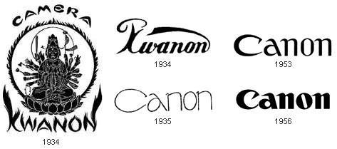
Canon In 1930, Japan Goro Yoshida and his half-brother, Saburo Uchida created a company with nothing telling us the name of Precision Optical Instruments Laboratory in Japan. Four years later, the development led to the creation of their first camera, which they called Kwanon, in honor of the thousand-Buddhist deity of mercy. The logo all one thousand hands would not fit, but as they could - upihali. Added flames and quickly got a picture of the ancient books, rather than the logo.
Company registered to protect their brand a lot of words that are similar in sound to Kwanon. One of them - already known to us and Canon has not Buddhist meaning of "gun" - eventually replace the original name. Existing logo Canon products for over 50 years, and it still looks modern.
Fedex
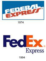
Federal Express logo first appeared in 1973, it did not have any of our usual rate, it does not stand out. In 1994, after the official introduction acronym, coined Leader Lyndon sign that the move recognizes now virtually the entire world.
At first glance, the logo is very simple and nice, but there is one detail - the little arrow pointing to the right, formed by the letters E and x. Many do not see it, but those who know it exists, can no longer ignore it. This arrow - one of the most striking examples of the use of the subconscious in advertising, it symbolizes forward movement and thinking.
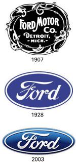
Ford
Logo Car Ford, despite the fact that the logo of car factories rarely undergo significant changes, was not always so, as we know it.
At the beginning of the history of the famous car logo was black and white, very artsy and fintiflyushechkah. It has developed an assistant engineer at the plant. Logo that still exists today, but as history. It is hardly ever used and still little has changed - removed trinkets.
Blue oval appeared in 1928, in 1976 he became attached to any and all cars coming down from Ford's assembly line, and a more modern look to the blue oval was the 100th anniversary of Ford Motors in 2003.
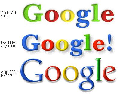
Google 12 years ago, final year students of the University of Stanford, Larry Page and Sergey Brin came up with a new search engine and called it ... do not Goggle. They called it BackRub, thereby indicating its ability to analyze «back links». But very soon they changed the name of the engine on Google. It's a bit reworked the word "googol", denoting the last of having at least some sense of the numbers - yedinichku with a hundred zeros.
The first logo of Google Sergey Brin came up with himself, learning to work with the free graphics package GIMP. A little later he added the exclamation point, apparently, trying to pass as a unit then terribly popular Yahoo! search engine The current logo for the ninth year - old logo has been brought to mind a professor at the Faculty of Arts of the University of Stanford.
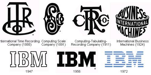
IBM
IBM's history began as a result of an intricate and long association of various companies - ITR, CSC, CTR. They almost baroque logo as shown here. In 1924 reshuffle finally ended, and reopen the company called - International Business Machines.
At the end of the 40s IBM finally switched to the main activity today - computers (before they were engaged, even machines for cutting meat). And in commemoration of such a radical change, IBM introduced a new logo - an extremely simple and intuitive. In contrast to the extravaganza that which they had before.
The last major change occurred with the logo in 1972 - "to transfer the speed and dynamism" monolithic raspolosovat letters and painted in blue color.
Microsoft
In 1975, the year of foundation of the company its name was «Micro-soft». That's right, with a hyphen, which is subsequently removed, creating a logo with a favorite while it is impossible to typography disco.
After 7 years of disco went out of fashion, including in the design, and Microsoft introduced a new logo with the central letter O in the form of a stylized eye. Employees Blibbet called him and loved him so much that when the logo changed in 1987, one of the employees organized a campaign "Save Blibbeta." Glazik not returned, but went to the small concessions - in the cafeteria for employees began to make "Blibbet burgers."
Logo 1987 version is a fact the same as what we see now. Designer Scott Baker came up with that witty people immediately called Pac-Man, because all the same means about very similar to the character of the same name from the old, but many of your favorite computer games.

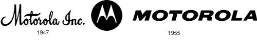
Motorola
The company Motorola - who would have thought! - There are already 80 years old. Since the beginning of the 30s she engaged in production of car phones, and 50 years later moved on to commercial production polutorakilogrammovyh cell phones.
Initially, the name of the company, which is nothing more than the word "motor", combined with the popular while the suffix "ol" wrote curly script, and shaped as letters M in the form in which we know it today appeared in 1955. Announcing the change treydmarka the company stated that "two soaring peaks of the triangular form an arch in the form of abstract M, symbolizing the progressive leadership of opinion».
Mozilla Firefox
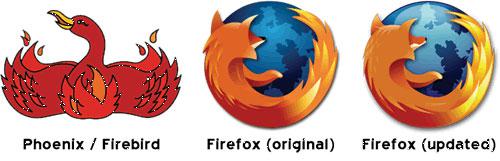
In 2002, the companies are not engaged in the goods or services for children could still occur here such logos as this fabulous bird (although they still appear). Dave Hyatt and Blake Ross created a free web browser Phoenix. Which they immediately renamed to Firebird and immediately renamed in Mozilla Firefox.
In 2003, the guys almost filled up the letters of John Hicks Hicksdesign, interface designer, who was suffering from a terrible branding. After some time, Mozilla has invited him to make a new Identity and got famous logo, which they say can be seen even from space.
Nike
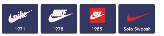
Swoosh Nike, which is perhaps the most recognizable sign in the world, came up with the University of Portland student Caroline Davidson in 1971. She paid him $ 35, even taking into account the prices of those years it - a penny. Logo design is almost not changed in 37 years - only changed the spelling of the brand, and now all gone.
Nokia
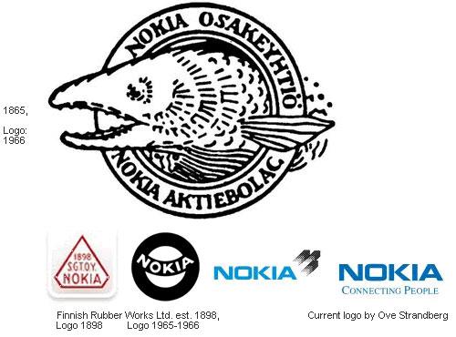
In 1865, Knut Fredrik Idestam founded in the southwest of Finland, pulp and paper factory. Agree, very strange start for the company, now known mobile phones. Name Nokia company began to wear after she moved to the riverbank Nokianvirta the city, in fact, Nokia. Incidentally, the word «Nokia» in Finnish refers to dark, very furry animal, something like a weasel.
Pepsi
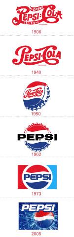
In 1893, a few years after the invention Formatsevt Pemberton drink with coca leaves, the other a young pharmacist from North Carolina, Caleb Bredhem experimenting with different components (in particular pepsin) and got a drink «Brad's drink», enjoyed strong demand in its pharmacy .
After 5 years, Caleb had had to buy for $ 100 the name of Pepsi-Cola, which has already registered it a failed competitor. At the same time, a neighbor Bredhema invented the first logo for Pepsi.
Since then, the logo has changed more than once, and now we see every day pretty striped three-dimensional sphere. By the way, Coca-Cola, unlike his main rival, the logo is not fundamentally changed not once, but only "Restayl" the very first writing.
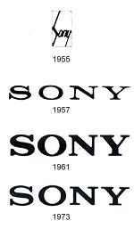
Sony
In the history of the Sony logo interesting point there was only one - the very first logo, which now looks very cute and funny. Already in 1960 was the first step to the logo, which is the company now. The modern version was developed in 1973, and the company does not intend to change it yet, despite the fact that to them regularly receives proposals for restyling or cardinal change. And they can understand - laconic, very simple word by Sony in writing that the whole world knows and does not have any claims to it.
Starbucks
Evolution logo Starbucks, perhaps the most fun of all represented here. Look at the very first siren, mermaid inside the circle. Rubens beauty without the navel, with two tails and lush breasts - excellent, very funny way. Even funnier than the company's explanation: "It was assumed that this siren as seductive as coffee Starbucks».
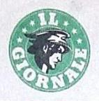
When in 1987, Starbucks has teamed up with the company Il Giornale, the logo has become more chaste and more graphically. "Shame" covered by lush hair, has attached to the right place navel and made a general "zoom" the siren to attract the attention not so much to the audience the idea of what the siren two tails, and whether there is an interesting between them. In 1992, the logo has become the way it is now. Consumers have moved close to the mermaid, and the long-suffering stomach was not seen.
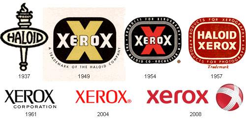
Xerox
In 1938, Chester Carlson invented the technology of photocopying, which he called electrophotography. However, then changed his mind and called xerographically. Like many inventors, he had a very hard - not one large company in which he came to the proposals did not take it and innovations are not appreciated. He went to a small company Haloid, where he also helped make the first photocopier - Haloid Xerox 914. The copier has been so successful that the company pulled the plug on its name, and in 1961 adopted the name of the invention - Xerox.
The first logo of their many consider the best - it has existed for 43 years. Then he lost his projections, and turns red, and this year the company made another attempt to re-branding, deciding otpozitsionirovatsya only on copiers. It is unlikely that an attempt can be called successful - about the copier still think, still called everything copiers company name, but here's to all this added confusion of children's ball from the right.
Posted in [mergetime] 1202572831 [/ mergetime]
all)
Source:
1. Adobe Systems
In 1982, forty years of programmers and Xerox John Warnock Charles Geschke suddenly resigned and formed a company to produce software. They named it Adobe, after the creek that flows behind the house Warnock. It is clear that John and Charles had to save on everything that does not go to the dogs, and do not leave the family destitute. Therefore, the logo they ordered not design bureau and asked to draw his wife Warnock - Marv.

Apple Inc. A little known fact about a very well-known company - in 1976, Apple was founded not only the two Steve (Jobs and Wozniak) and Ronald one. Ronald Wayne has invested in the company 10% of the initial capital (800 dollars) and came up with the first logo for the company - it was shild with Newton sitting under an apple tree. Sign of twine almost heraldic tape on which proudly flaunted Apple Computer & Co. One would like to say a logo, a co-founder. Ronald Wayne and Steve worked exactly two weeks. Then he took his 800 bucks - he believed that Apple - it's too risky undertaking, and did not want to throw capital.
Computer Apple I was sold slowly, Jobs decided that something should be changed, and started with the logo. Polosatenkoe Apple invented the designer Rob Janoff of the Regis McKenna Agency. It served for 23 years before becoming a monochrome and "haytechnym" a year after the return of Jobs to the company.

Canon In 1930, Japan Goro Yoshida and his half-brother, Saburo Uchida created a company with nothing telling us the name of Precision Optical Instruments Laboratory in Japan. Four years later, the development led to the creation of their first camera, which they called Kwanon, in honor of the thousand-Buddhist deity of mercy. The logo all one thousand hands would not fit, but as they could - upihali. Added flames and quickly got a picture of the ancient books, rather than the logo.
Company registered to protect their brand a lot of words that are similar in sound to Kwanon. One of them - already known to us and Canon has not Buddhist meaning of "gun" - eventually replace the original name. Existing logo Canon products for over 50 years, and it still looks modern.

Fedex
Federal Express logo first appeared in 1973, it did not have any of our usual rate, it does not stand out. In 1994, after the official introduction acronym, coined Leader Lyndon sign that the move recognizes now virtually the entire world.
At first glance, the logo is very simple and nice, but there is one detail - the little arrow pointing to the right, formed by the letters E and x. Many do not see it, but those who know it exists, can no longer ignore it. This arrow - one of the most striking examples of the use of the subconscious in advertising, it symbolizes forward movement and thinking.

Ford
Logo Car Ford, despite the fact that the logo of car factories rarely undergo significant changes, was not always so, as we know it.
At the beginning of the history of the famous car logo was black and white, very artsy and fintiflyushechkah. It has developed an assistant engineer at the plant. Logo that still exists today, but as history. It is hardly ever used and still little has changed - removed trinkets.
Blue oval appeared in 1928, in 1976 he became attached to any and all cars coming down from Ford's assembly line, and a more modern look to the blue oval was the 100th anniversary of Ford Motors in 2003.

Google 12 years ago, final year students of the University of Stanford, Larry Page and Sergey Brin came up with a new search engine and called it ... do not Goggle. They called it BackRub, thereby indicating its ability to analyze «back links». But very soon they changed the name of the engine on Google. It's a bit reworked the word "googol", denoting the last of having at least some sense of the numbers - yedinichku with a hundred zeros.
The first logo of Google Sergey Brin came up with himself, learning to work with the free graphics package GIMP. A little later he added the exclamation point, apparently, trying to pass as a unit then terribly popular Yahoo! search engine The current logo for the ninth year - old logo has been brought to mind a professor at the Faculty of Arts of the University of Stanford.

IBM
IBM's history began as a result of an intricate and long association of various companies - ITR, CSC, CTR. They almost baroque logo as shown here. In 1924 reshuffle finally ended, and reopen the company called - International Business Machines.
At the end of the 40s IBM finally switched to the main activity today - computers (before they were engaged, even machines for cutting meat). And in commemoration of such a radical change, IBM introduced a new logo - an extremely simple and intuitive. In contrast to the extravaganza that which they had before.
The last major change occurred with the logo in 1972 - "to transfer the speed and dynamism" monolithic raspolosovat letters and painted in blue color.

Microsoft
In 1975, the year of foundation of the company its name was «Micro-soft». That's right, with a hyphen, which is subsequently removed, creating a logo with a favorite while it is impossible to typography disco.
After 7 years of disco went out of fashion, including in the design, and Microsoft introduced a new logo with the central letter O in the form of a stylized eye. Employees Blibbet called him and loved him so much that when the logo changed in 1987, one of the employees organized a campaign "Save Blibbeta." Glazik not returned, but went to the small concessions - in the cafeteria for employees began to make "Blibbet burgers."
Logo 1987 version is a fact the same as what we see now. Designer Scott Baker came up with that witty people immediately called Pac-Man, because all the same means about very similar to the character of the same name from the old, but many of your favorite computer games.

Motorola
The company Motorola - who would have thought! - There are already 80 years old. Since the beginning of the 30s she engaged in production of car phones, and 50 years later moved on to commercial production polutorakilogrammovyh cell phones.
Initially, the name of the company, which is nothing more than the word "motor", combined with the popular while the suffix "ol" wrote curly script, and shaped as letters M in the form in which we know it today appeared in 1955. Announcing the change treydmarka the company stated that "two soaring peaks of the triangular form an arch in the form of abstract M, symbolizing the progressive leadership of opinion».

Mozilla Firefox
In 2002, the companies are not engaged in the goods or services for children could still occur here such logos as this fabulous bird (although they still appear). Dave Hyatt and Blake Ross created a free web browser Phoenix. Which they immediately renamed to Firebird and immediately renamed in Mozilla Firefox.
In 2003, the guys almost filled up the letters of John Hicks Hicksdesign, interface designer, who was suffering from a terrible branding. After some time, Mozilla has invited him to make a new Identity and got famous logo, which they say can be seen even from space.

Nike
Swoosh Nike, which is perhaps the most recognizable sign in the world, came up with the University of Portland student Caroline Davidson in 1971. She paid him $ 35, even taking into account the prices of those years it - a penny. Logo design is almost not changed in 37 years - only changed the spelling of the brand, and now all gone.

Nokia
In 1865, Knut Fredrik Idestam founded in the southwest of Finland, pulp and paper factory. Agree, very strange start for the company, now known mobile phones. Name Nokia company began to wear after she moved to the riverbank Nokianvirta the city, in fact, Nokia. Incidentally, the word «Nokia» in Finnish refers to dark, very furry animal, something like a weasel.

Pepsi
In 1893, a few years after the invention Formatsevt Pemberton drink with coca leaves, the other a young pharmacist from North Carolina, Caleb Bredhem experimenting with different components (in particular pepsin) and got a drink «Brad's drink», enjoyed strong demand in its pharmacy .
After 5 years, Caleb had had to buy for $ 100 the name of Pepsi-Cola, which has already registered it a failed competitor. At the same time, a neighbor Bredhema invented the first logo for Pepsi.
Since then, the logo has changed more than once, and now we see every day pretty striped three-dimensional sphere. By the way, Coca-Cola, unlike his main rival, the logo is not fundamentally changed not once, but only "Restayl" the very first writing.

Sony
In the history of the Sony logo interesting point there was only one - the very first logo, which now looks very cute and funny. Already in 1960 was the first step to the logo, which is the company now. The modern version was developed in 1973, and the company does not intend to change it yet, despite the fact that to them regularly receives proposals for restyling or cardinal change. And they can understand - laconic, very simple word by Sony in writing that the whole world knows and does not have any claims to it.

Starbucks
Evolution logo Starbucks, perhaps the most fun of all represented here. Look at the very first siren, mermaid inside the circle. Rubens beauty without the navel, with two tails and lush breasts - excellent, very funny way. Even funnier than the company's explanation: "It was assumed that this siren as seductive as coffee Starbucks».
When in 1987, Starbucks has teamed up with the company Il Giornale, the logo has become more chaste and more graphically. "Shame" covered by lush hair, has attached to the right place navel and made a general "zoom" the siren to attract the attention not so much to the audience the idea of what the siren two tails, and whether there is an interesting between them. In 1992, the logo has become the way it is now. Consumers have moved close to the mermaid, and the long-suffering stomach was not seen.

Xerox
In 1938, Chester Carlson invented the technology of photocopying, which he called electrophotography. However, then changed his mind and called xerographically. Like many inventors, he had a very hard - not one large company in which he came to the proposals did not take it and innovations are not appreciated. He went to a small company Haloid, where he also helped make the first photocopier - Haloid Xerox 914. The copier has been so successful that the company pulled the plug on its name, and in 1961 adopted the name of the invention - Xerox.
The first logo of their many consider the best - it has existed for 43 years. Then he lost his projections, and turns red, and this year the company made another attempt to re-branding, deciding otpozitsionirovatsya only on copiers. It is unlikely that an attempt can be called successful - about the copier still think, still called everything copiers company name, but here's to all this added confusion of children's ball from the right.
Posted in [mergetime] 1202572831 [/ mergetime]
all)

Source:
Tags
See also
Remembering Nokia phones
It mobilka - or a full-fledged computer ?!
Chewing - do not chew!
Steam engines
Evolution of logos of famous brands
History of the Apple logo
Subaru - the Pleiades Skyflare
Secrets of Starbucks
Stories of great logos
13 BP logo after environmental disaster