Flags prefectures of Japan (48 photos)
 Bashny.Net
Japanese design is very often beautiful and very often incomprehensible. Very much different from us ideas about beauty, different notions of beautiful and aesthetically pleasing.
To be honest, I have no comment would not have understood.
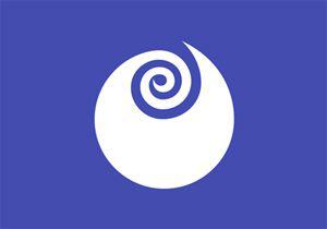
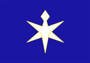
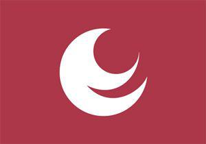
Hokkaido
Seven-rayed star symbolizes hope and growth. Blue background of the flag represents the sea and sky in Hokkaido, red denotes the energy of the people, and white - light and snow.

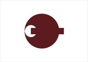
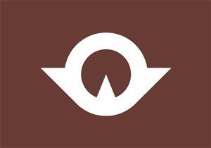
Aomori
Placed on the flag stylized image of the geographical shape of the prefecture - "Crown of Honshu," made up of peninsulas Tsugaru, Natsudomari and Shimokita. White background color symbolizes infinite horizons (boundless horizons) Prefecture, and rich green color - hope for the development and prosperity. Emblem and flag of the prefecture were selected January 1, 1961.
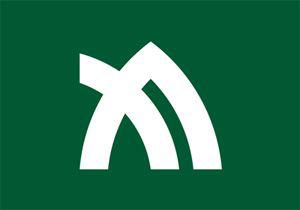
Iwate
At the heart of the logo is a stylized kanji "willow" (Jap.?), Which symbolizes progress. Green flag - the color of the forests of the prefecture. The flag was adopted in 1965.
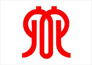
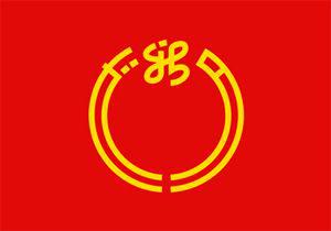
Miyagi
The symbol of the prefecture was established on the basis of hiragana character "mi" (Jap.?) And is a three sheet lespitsedy capitate. Sheet, which is located in the middle symbolizes the development of the prefecture, left sheet is a collaboration residents of the prefecture, and the right - the love for the native inhabitants of the prefecture. The emblem of the prefecture was selected from 1,615 works submitted for the contest.
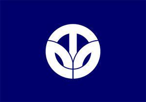
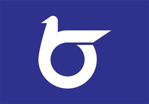
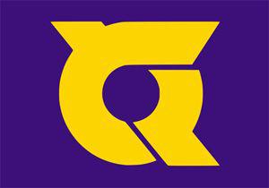
Akita
Sign Prefecture - a stylized image of the sign katakana "a" (Jap.?) - The first letter of the name of the prefecture. In addition, the sign is intended to symbolize the rigorous development of the prefecture. Sign Akita was chosen November 3, 1959.

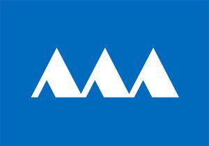
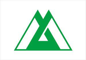
Yamagata
Triangles in the symbol of Yamagata Prefecture - mountains Prefecture. Three peaks form a sinuous line, resembling the shape of the river channel Mogami. In addition, the sharp ends of the triangles symbolize the growth and development of the prefecture. The emblem of the prefecture was approved August 21, 1967.
Fukushima
Emblem Fukushima Prefecture - stylized hiragana "Fu" (Jap.?) - The first syllable of the name of the prefecture. Emblem and flag of the prefecture were introduced October 23, 1968.

Ibaraki
Emblem Ibaraki - Expand rosebud symbolizes progress and development. The sign was created in 1991.
Tochigi
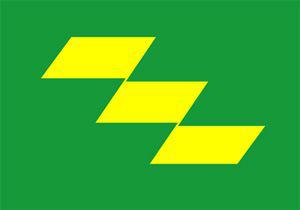
Tochigi emblem - abstract image of the Chinese character "Toti" (Jap.?) And three arrows, refers to the ancient writing of the character "ki" (Jap.?). Emblem and flag of the prefecture were announced December 1, 1962.

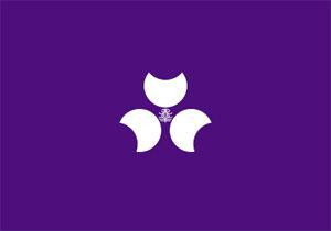
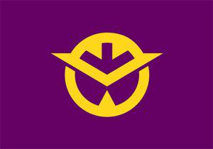
Gunma
Gunma Prefecture is surrounded by mountains, so the symbol of a stylized character Prefecture? ("Modes" herd) is surrounded by three stylized mountains - "mountain Kozuke trinity" - mountains Akagi, Haruna and Mёgi. Flag colors - purple, which symbolizes elegance and the preservation of traditions and white, signifying peace. The flag was approved in 1968, and the symbol (different from that used on the flag) - in 1926.
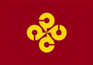
Saitama
Sixteen-magatama beads symbolize the sun, and in addition - the development and strength. White background - symbol of purity and friendship. Emblem and flag were approved by September 1, 1964.
Chiba
The emblem of the prefecture was established December 28, 1909. It is a combination of stylized katakana "ti" (Jap.?) And "ha" (Jap.?). The blue color of the flag symbolizes the hope and the development of the prefecture, and yellow - flower turnip, which is chosen people as the flower of the prefecture. Prefecture flag was approved July 29, 1963.
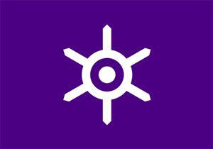
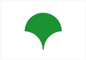
Tokyo
Tokyo Prefecture got himself once two flags that are used at the same time.
First - based on the coat of arms of Tokyo, established in 1889 Hiromoto Watanabe. The coat of arms depicts the sun with six rays representing Tokyo as the center of Japan. It is believed that the character is based on the character "kyo" (Jap.?), Which is part of the word "Tokyo" (Jap. ??). Purple color of the flag - one of the traditional colors of the Edo period. This flag adopted October 1, 1964.
On the second flag is placed modern symbol of Tokyo - in the form of a stylized letter "T" leaf ginkgo tree, symbolizing dynamism, prosperity and wealth of the city. Sign, created by Ray Yoshimura, and the flag on its base were selected from 20 options in 1989.
In addition, Tokyo has 23 special districts, each of which is actually an independent city and has its own flag.
Kanagawa
Kanagawa emblem - a stylized character of the first name of the prefecture (Jap. 神奈川). The emblem was chosen November 3, 1948.
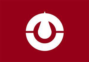
Niigata
Sign of Niigata Prefecture - circle, broken stylized katakana "ha" (Jap. ガ). This emblem was adopted Prefecture August 23, 1963. At the moment, the emblem of Niigata different from that used on the flag.
Toyama
The green line in the center of the emblem Hiragana characters "that" (Jap. と), the first syllable of the word "Toyama", and high mountains symbolize tending upwards, constantly evolving Prefecture. The emblem of the prefecture was introduced December 27, 1988.
Ishikawa
Depicted on the flag of the prefecture stylized characters included in the name of Ishikawa Prefecture (Jap. 石川), inscribed in the contours of the prefecture. The blue background symbolizes the rich nature of the prefecture: the sea, forests, clean water and clear air. The flag was proclaimed on October 1 1972.

Fukui
The emblem of the prefecture was adopted March 28, 1952. It is a stylized account name in katakana Fukui Prefecture (Jap. フ ク イ). Young leaves in the sign of the Prefecture - a symbol of the district.
Yamanashi
Sign frame is an outline of Mount Fuji, which symbolizes honesty, integrity and sincerity. In the center are three character "person" (Jap. 人) - it symbolizes peace, harmony and cooperation prefectural residents. Flag Prefecture approved December 1, 1966. The symbol on the flag and emblem of the prefecture are slightly different from each other.
Nagano
Nagano Prefecture emblem is a stylized katakana "on" (Jap. ナ). The emblem of the prefecture was adopted December 26, 1966.
Gifu
Symbol Prefecture - stylized character "gi" (Jap. 岐), surrounded by a ring that symbolizes peace and harmony of the population of the prefecture. The emblem was chosen Prefecture August 10, 1932.
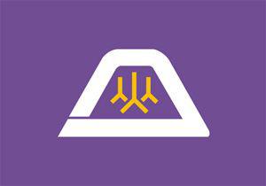
Shizuoka
Emblem combines form and outline Prefecture Mount Fuji. The blue color of the flag represents the endless sky and the Pacific Ocean and symbolizes the development and success of the prefecture. Orange means the cohesion of the residents of the prefecture and the bright sunlight of heaven Shizuoka. Emblem and flag of the prefecture were approved in 1968.

Aichi
Aichi symbol depicts the rising of the sun and the waves symbolizes the role of the prefecture, located on the Pacific coast, in international cooperation. In addition, it is a stylized representation of the name of the prefecture (Jap. あ い ち). The symbol of the prefecture was selected in 1950 from more than 1,600 options submitted for the contest from all over Japan.
Mie
Sign Prefecture formed from hiragana character "mi" (Jap. み), the first syllable in the name of the prefecture. Outlines symbolize the progress of the prefecture, and the circle in the center - the famous pearls of Mie. The emblem of the prefecture was adopted April 20, 1964.

Shiga
Shiga Prefecture emblem - a stylized image of katakana characters "B" and "n" (Jap. シ ガ). Blue background of the flag and the circle in the center symbolizes Lake Biwa and the "wings" - the harmony and progress. The emblem was chosen Prefecture 3 May 1957 from the works submitted for the contest.

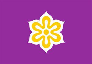
Kyoto
Kyoto emblem - stylized kanji "kyo" (Jap. 京). Flag and emblem of the prefecture were chosen Nov. 2, 1976.
Osaka
The symbol of the prefecture is a stylized letter «O», and circles above it symbolize hope, prosperity and harmony. The emblem is called "Sennar bёtan" (Thousand pumpkins), and was created on the basis of kamon, who used Toyotomi Hideyoshi, unified Japan and built Osaka Castle. Until 1984 was a green leaf color, and then was replaced by blue. The emblem of the prefecture was proclaimed June 21, 1968.

Hyogo
The emblem is in the form of a stylized sea waves kanji "Hyo" (Jap. 兵), and in addition - a stylized map of the prefecture. White means brightness and honesty, and blue - the color of Japan and the Inland Sea. Flag with a new logo was adopted June 10, 1964 (old logo, designed in 1921, after the adoption of the flag is no longer used).

Nara
The emblem is a stylized katakana "on" (Jap. ナ). Large disk symbolizes nature Nara, white disk of smaller diameter - the spirit of harmony and a rectangle in the center - constant progress. Emblem and flag of the prefecture were announced March 1, 1968.
Wakayama
The emblem is a stylized katakana "wa" (Jap. ワ). Emblem expresses the harmony of people and endless progressa.Znak was approved October 23, 1968.

Tottori
Sign of Tottori Prefecture is a stylized hiragana "that" (Jap. と), reminiscent of a flying bird. The emblem symbolizes freedom, peace and development of the prefecture. Emblem Prefecture officially proclaimed October 23, 1968.
Shimane
Depicted on the flag of Shimane 4 katakana "ma" (Jap. マ), symbolizing the harmonious development and progress. Taken together, they represent the unity of the residents of the prefecture. "Four" in Japanese "shi", so sign on the flag can be read as "shi-ma" - the first syllables of the names of the prefecture. Emblem and flag of the prefecture were taken November 8, 1968.
Okayama
On the flag depicts a stylized kanji "eye" (Jap. 岡) Logo Prefecture was adopted November 22, 1967.
Hiroshima
The emblem of Hiroshima Prefecture - a stylized image of the sign katakana "chi" (Jap. ヒ), which begins with the word "Hiroshima" (Jap. ヒ ロ シ マ). Emblem inscribed in a circle - a symbol of harmony and unity prefectural residents. Approved July 16, 1968.
Yamaguchi
Yamaguchi Prefecture emblem is a combination of stylized characters "pit" (Jap. 山) and "Guti" (Jap. 口), depicting a bird soars to the sun, which symbolizes the progress and cooperation residents of the prefecture. Emblem and flag of the prefecture were taken Sept. 3, 1962.
Tokushima
The emblem of the prefecture was established March 18, 1966. It consists of a stylized Hiragana "current" (Jap. と く) and a flying bird. The emblem symbolizes the desire for harmony Prefecture, unity and development.
Kagawa
The emblem is a stylized and slightly rotated katakana character "ka" (Jap. カ). The emblem also shows mountains. Flag color - the color of the leaves of the olive tree - the tree of the prefecture and the official symbol of peace. Emblem and flag of the prefecture were approved October 1, 1977.
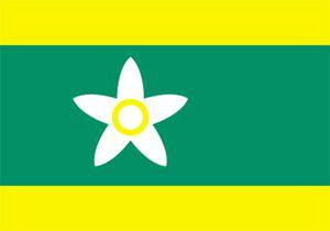
Ehime
Yellow color on the flag represents happiness, green - the world, and the white symbolizes the purity and simplicity. Flower on the flag - this orange blossom, the official tree of the prefecture. Flag Prefecture was chosen May 5, 1952, and the emblem (different from that used on the flag) - November 1, 1989
Kochi
Depicted on the flag Kochi Prefecture stylized ancient name - "Tosa" (Jap. と さ). Furthermore, the same mark is hidden rotated 90 ° katakana character "ko" (Jap. コ). In terms of the logo reflects peace and cooperation, and the upward edge of the sword - the development of the prefecture. The emblem of the prefecture was selected April 15, 1953.
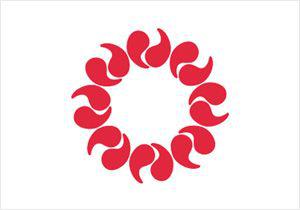
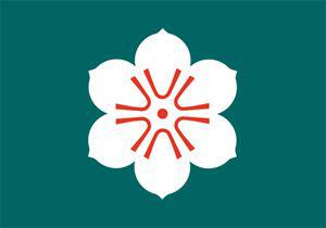
Fukuoka
Sign of the prefecture is a combination of stylized Hiragana "Fu" (Jap. ふ) and "Ku" (Jap. く), that is, the first syllables of the words "Fukuoka". Hieroglyphs are arranged in the form of five petals plum blossom and symbolize peace, development, harmony and progress. The emblem was adopted May 10, 1966.

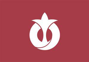
Saga
Saga Prefecture on the flag depicts a stylized flower of the cinnamon tree (tree Prefecture) with six petals. White color represents sincerity and passion, and green - hope and peace. The flag adopted December 11, 1968. Emblem Prefecture differ from those used on the flag.
Nagasaki
Nagasaki is an emblem stilizovovannuyu letter «N», and blue emblem symbolizes the sea and sky Prefecture. In addition, in the sign used symbol of peace - a dove. The logo was introduced April 1, 1991.

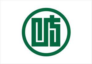
Kumamoto
The creators of logos joined Kumamoto Prefecture, the first syllable of the name - "ku" (Jap. く) - with the outline of the island of Kyushu. Circle in the center symbolizes the Kumamoto Prefecture, located in the center of the island. The emblem of the prefecture was adopted March 31, 1966.

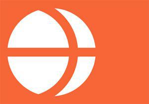
Oita
Oita on the flag shows three character "o" (Jap. 大) in the form of flying birds. All three characters together symbolize the sun. Red emblem on the flag symbolizes sincerity of the inhabitants of the prefecture, and the white background - peace and equality. The emblem used on the flag differs from the established in 1911, the symbol of the prefecture.

Miyazaki
In the center of the flag is a symbol of a stylized katakana "mi" (Jap. ミ). The emblem is in the form of steps, which symbolizes progress Miyazaki. Yellow represents the sun. The flag was announced December 22, 1964. The emblem used on the flag differs from the established in 1912, a symbol of the prefecture.
Kagoshima
The flag have a stylized outline of the prefecture with Sakurajima volcanic island in the center. The first emblem of the prefecture was declared in March 1967. At the moment, the symbol remained on the flag, as well as the emblem of the prefecture in 1994, elected a new sign.
Okinawa
The emblem of the prefecture was published May 15, 1972. It is a stylized letter «O». In addition, the outer circle symbolizes the ocean, the white circle indicates the peacefulness, and the inner circle - the development of Okinawa.
To be honest, I have no comment would not have understood.
Hokkaido
Seven-rayed star symbolizes hope and growth. Blue background of the flag represents the sea and sky in Hokkaido, red denotes the energy of the people, and white - light and snow.

Aomori
Placed on the flag stylized image of the geographical shape of the prefecture - "Crown of Honshu," made up of peninsulas Tsugaru, Natsudomari and Shimokita. White background color symbolizes infinite horizons (boundless horizons) Prefecture, and rich green color - hope for the development and prosperity. Emblem and flag of the prefecture were selected January 1, 1961.

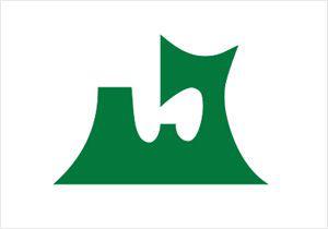
Iwate
At the heart of the logo is a stylized kanji "willow" (Jap.?), Which symbolizes progress. Green flag - the color of the forests of the prefecture. The flag was adopted in 1965.

Miyagi
The symbol of the prefecture was established on the basis of hiragana character "mi" (Jap.?) And is a three sheet lespitsedy capitate. Sheet, which is located in the middle symbolizes the development of the prefecture, left sheet is a collaboration residents of the prefecture, and the right - the love for the native inhabitants of the prefecture. The emblem of the prefecture was selected from 1,615 works submitted for the contest.

Akita
Sign Prefecture - a stylized image of the sign katakana "a" (Jap.?) - The first letter of the name of the prefecture. In addition, the sign is intended to symbolize the rigorous development of the prefecture. Sign Akita was chosen November 3, 1959.

Yamagata
Triangles in the symbol of Yamagata Prefecture - mountains Prefecture. Three peaks form a sinuous line, resembling the shape of the river channel Mogami. In addition, the sharp ends of the triangles symbolize the growth and development of the prefecture. The emblem of the prefecture was approved August 21, 1967.

Fukushima
Emblem Fukushima Prefecture - stylized hiragana "Fu" (Jap.?) - The first syllable of the name of the prefecture. Emblem and flag of the prefecture were introduced October 23, 1968.

Ibaraki
Emblem Ibaraki - Expand rosebud symbolizes progress and development. The sign was created in 1991.

Tochigi
Tochigi emblem - abstract image of the Chinese character "Toti" (Jap.?) And three arrows, refers to the ancient writing of the character "ki" (Jap.?). Emblem and flag of the prefecture were announced December 1, 1962.

Gunma
Gunma Prefecture is surrounded by mountains, so the symbol of a stylized character Prefecture? ("Modes" herd) is surrounded by three stylized mountains - "mountain Kozuke trinity" - mountains Akagi, Haruna and Mёgi. Flag colors - purple, which symbolizes elegance and the preservation of traditions and white, signifying peace. The flag was approved in 1968, and the symbol (different from that used on the flag) - in 1926.

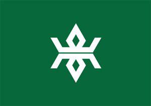
Saitama
Sixteen-magatama beads symbolize the sun, and in addition - the development and strength. White background - symbol of purity and friendship. Emblem and flag were approved by September 1, 1964.

Chiba
The emblem of the prefecture was established December 28, 1909. It is a combination of stylized katakana "ti" (Jap.?) And "ha" (Jap.?). The blue color of the flag symbolizes the hope and the development of the prefecture, and yellow - flower turnip, which is chosen people as the flower of the prefecture. Prefecture flag was approved July 29, 1963.

Tokyo
Tokyo Prefecture got himself once two flags that are used at the same time.
First - based on the coat of arms of Tokyo, established in 1889 Hiromoto Watanabe. The coat of arms depicts the sun with six rays representing Tokyo as the center of Japan. It is believed that the character is based on the character "kyo" (Jap.?), Which is part of the word "Tokyo" (Jap. ??). Purple color of the flag - one of the traditional colors of the Edo period. This flag adopted October 1, 1964.

On the second flag is placed modern symbol of Tokyo - in the form of a stylized letter "T" leaf ginkgo tree, symbolizing dynamism, prosperity and wealth of the city. Sign, created by Ray Yoshimura, and the flag on its base were selected from 20 options in 1989.
In addition, Tokyo has 23 special districts, each of which is actually an independent city and has its own flag.

Kanagawa
Kanagawa emblem - a stylized character of the first name of the prefecture (Jap. 神奈川). The emblem was chosen November 3, 1948.

Niigata
Sign of Niigata Prefecture - circle, broken stylized katakana "ha" (Jap. ガ). This emblem was adopted Prefecture August 23, 1963. At the moment, the emblem of Niigata different from that used on the flag.

Toyama
The green line in the center of the emblem Hiragana characters "that" (Jap. と), the first syllable of the word "Toyama", and high mountains symbolize tending upwards, constantly evolving Prefecture. The emblem of the prefecture was introduced December 27, 1988.

Ishikawa
Depicted on the flag of the prefecture stylized characters included in the name of Ishikawa Prefecture (Jap. 石川), inscribed in the contours of the prefecture. The blue background symbolizes the rich nature of the prefecture: the sea, forests, clean water and clear air. The flag was proclaimed on October 1 1972.

Fukui
The emblem of the prefecture was adopted March 28, 1952. It is a stylized account name in katakana Fukui Prefecture (Jap. フ ク イ). Young leaves in the sign of the Prefecture - a symbol of the district.

Yamanashi
Sign frame is an outline of Mount Fuji, which symbolizes honesty, integrity and sincerity. In the center are three character "person" (Jap. 人) - it symbolizes peace, harmony and cooperation prefectural residents. Flag Prefecture approved December 1, 1966. The symbol on the flag and emblem of the prefecture are slightly different from each other.

Nagano
Nagano Prefecture emblem is a stylized katakana "on" (Jap. ナ). The emblem of the prefecture was adopted December 26, 1966.

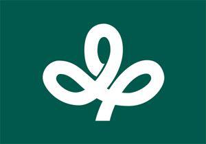
Gifu
Symbol Prefecture - stylized character "gi" (Jap. 岐), surrounded by a ring that symbolizes peace and harmony of the population of the prefecture. The emblem was chosen Prefecture August 10, 1932.

Shizuoka
Emblem combines form and outline Prefecture Mount Fuji. The blue color of the flag represents the endless sky and the Pacific Ocean and symbolizes the development and success of the prefecture. Orange means the cohesion of the residents of the prefecture and the bright sunlight of heaven Shizuoka. Emblem and flag of the prefecture were approved in 1968.

Aichi
Aichi symbol depicts the rising of the sun and the waves symbolizes the role of the prefecture, located on the Pacific coast, in international cooperation. In addition, it is a stylized representation of the name of the prefecture (Jap. あ い ち). The symbol of the prefecture was selected in 1950 from more than 1,600 options submitted for the contest from all over Japan.

Mie
Sign Prefecture formed from hiragana character "mi" (Jap. み), the first syllable in the name of the prefecture. Outlines symbolize the progress of the prefecture, and the circle in the center - the famous pearls of Mie. The emblem of the prefecture was adopted April 20, 1964.

Shiga
Shiga Prefecture emblem - a stylized image of katakana characters "B" and "n" (Jap. シ ガ). Blue background of the flag and the circle in the center symbolizes Lake Biwa and the "wings" - the harmony and progress. The emblem was chosen Prefecture 3 May 1957 from the works submitted for the contest.

Kyoto
Kyoto emblem - stylized kanji "kyo" (Jap. 京). Flag and emblem of the prefecture were chosen Nov. 2, 1976.

Osaka
The symbol of the prefecture is a stylized letter «O», and circles above it symbolize hope, prosperity and harmony. The emblem is called "Sennar bёtan" (Thousand pumpkins), and was created on the basis of kamon, who used Toyotomi Hideyoshi, unified Japan and built Osaka Castle. Until 1984 was a green leaf color, and then was replaced by blue. The emblem of the prefecture was proclaimed June 21, 1968.

Hyogo
The emblem is in the form of a stylized sea waves kanji "Hyo" (Jap. 兵), and in addition - a stylized map of the prefecture. White means brightness and honesty, and blue - the color of Japan and the Inland Sea. Flag with a new logo was adopted June 10, 1964 (old logo, designed in 1921, after the adoption of the flag is no longer used).

Nara
The emblem is a stylized katakana "on" (Jap. ナ). Large disk symbolizes nature Nara, white disk of smaller diameter - the spirit of harmony and a rectangle in the center - constant progress. Emblem and flag of the prefecture were announced March 1, 1968.

Wakayama
The emblem is a stylized katakana "wa" (Jap. ワ). Emblem expresses the harmony of people and endless progressa.Znak was approved October 23, 1968.

Tottori
Sign of Tottori Prefecture is a stylized hiragana "that" (Jap. と), reminiscent of a flying bird. The emblem symbolizes freedom, peace and development of the prefecture. Emblem Prefecture officially proclaimed October 23, 1968.

Shimane
Depicted on the flag of Shimane 4 katakana "ma" (Jap. マ), symbolizing the harmonious development and progress. Taken together, they represent the unity of the residents of the prefecture. "Four" in Japanese "shi", so sign on the flag can be read as "shi-ma" - the first syllables of the names of the prefecture. Emblem and flag of the prefecture were taken November 8, 1968.

Okayama
On the flag depicts a stylized kanji "eye" (Jap. 岡) Logo Prefecture was adopted November 22, 1967.

Hiroshima
The emblem of Hiroshima Prefecture - a stylized image of the sign katakana "chi" (Jap. ヒ), which begins with the word "Hiroshima" (Jap. ヒ ロ シ マ). Emblem inscribed in a circle - a symbol of harmony and unity prefectural residents. Approved July 16, 1968.

Yamaguchi
Yamaguchi Prefecture emblem is a combination of stylized characters "pit" (Jap. 山) and "Guti" (Jap. 口), depicting a bird soars to the sun, which symbolizes the progress and cooperation residents of the prefecture. Emblem and flag of the prefecture were taken Sept. 3, 1962.

Tokushima
The emblem of the prefecture was established March 18, 1966. It consists of a stylized Hiragana "current" (Jap. と く) and a flying bird. The emblem symbolizes the desire for harmony Prefecture, unity and development.

Kagawa
The emblem is a stylized and slightly rotated katakana character "ka" (Jap. カ). The emblem also shows mountains. Flag color - the color of the leaves of the olive tree - the tree of the prefecture and the official symbol of peace. Emblem and flag of the prefecture were approved October 1, 1977.

Ehime
Yellow color on the flag represents happiness, green - the world, and the white symbolizes the purity and simplicity. Flower on the flag - this orange blossom, the official tree of the prefecture. Flag Prefecture was chosen May 5, 1952, and the emblem (different from that used on the flag) - November 1, 1989

Kochi
Depicted on the flag Kochi Prefecture stylized ancient name - "Tosa" (Jap. と さ). Furthermore, the same mark is hidden rotated 90 ° katakana character "ko" (Jap. コ). In terms of the logo reflects peace and cooperation, and the upward edge of the sword - the development of the prefecture. The emblem of the prefecture was selected April 15, 1953.

Fukuoka
Sign of the prefecture is a combination of stylized Hiragana "Fu" (Jap. ふ) and "Ku" (Jap. く), that is, the first syllables of the words "Fukuoka". Hieroglyphs are arranged in the form of five petals plum blossom and symbolize peace, development, harmony and progress. The emblem was adopted May 10, 1966.

Saga
Saga Prefecture on the flag depicts a stylized flower of the cinnamon tree (tree Prefecture) with six petals. White color represents sincerity and passion, and green - hope and peace. The flag adopted December 11, 1968. Emblem Prefecture differ from those used on the flag.

Nagasaki
Nagasaki is an emblem stilizovovannuyu letter «N», and blue emblem symbolizes the sea and sky Prefecture. In addition, in the sign used symbol of peace - a dove. The logo was introduced April 1, 1991.

Kumamoto
The creators of logos joined Kumamoto Prefecture, the first syllable of the name - "ku" (Jap. く) - with the outline of the island of Kyushu. Circle in the center symbolizes the Kumamoto Prefecture, located in the center of the island. The emblem of the prefecture was adopted March 31, 1966.

Oita
Oita on the flag shows three character "o" (Jap. 大) in the form of flying birds. All three characters together symbolize the sun. Red emblem on the flag symbolizes sincerity of the inhabitants of the prefecture, and the white background - peace and equality. The emblem used on the flag differs from the established in 1911, the symbol of the prefecture.

Miyazaki
In the center of the flag is a symbol of a stylized katakana "mi" (Jap. ミ). The emblem is in the form of steps, which symbolizes progress Miyazaki. Yellow represents the sun. The flag was announced December 22, 1964. The emblem used on the flag differs from the established in 1912, a symbol of the prefecture.

Kagoshima
The flag have a stylized outline of the prefecture with Sakurajima volcanic island in the center. The first emblem of the prefecture was declared in March 1967. At the moment, the symbol remained on the flag, as well as the emblem of the prefecture in 1994, elected a new sign.

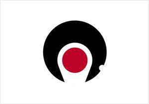
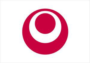
Okinawa
The emblem of the prefecture was published May 15, 1972. It is a stylized letter «O». In addition, the outer circle symbolizes the ocean, the white circle indicates the peacefulness, and the inner circle - the development of Okinawa.

Tags
See also
Packing in Japanese
Photos taken at the right moment. Part 13 (58 photos)
Photos taken at the right moment. Part 2.
Photos taken at the right moment. Part 14.
Beautiful photos of 2013
The evolution of goals from all CHM Cup since 1930 (22 photos)
World - Pacific Theater of Operations (45 photos)
In Japan Mount Fuji will be Wi-Fi
The life of a man from a tree (25 photos)
Best photos for November 2012